Project Brief
Research a specific demographic in order to identify a problem you can solve by creating a brand, products, accompanying packaging and more.
The Timeline
5 weeks.
The Problem
Dog treat packaging.
The Current Experience
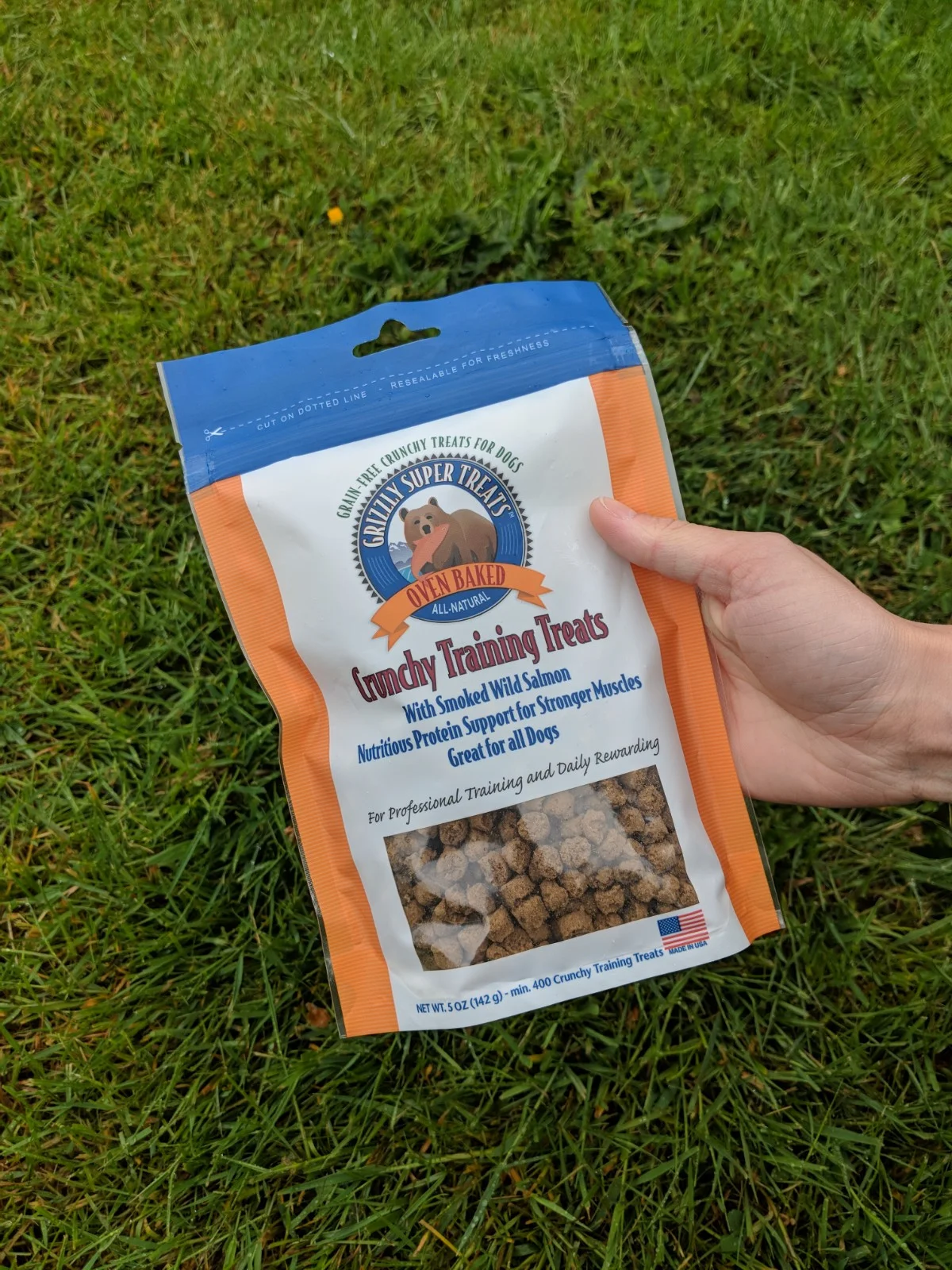
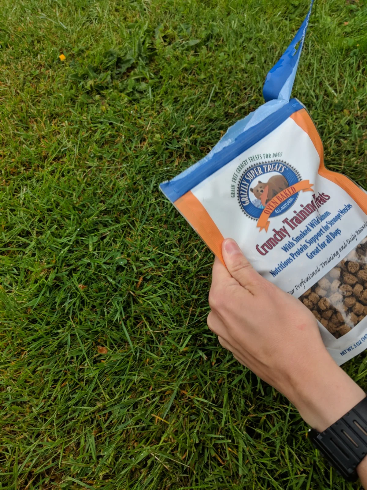
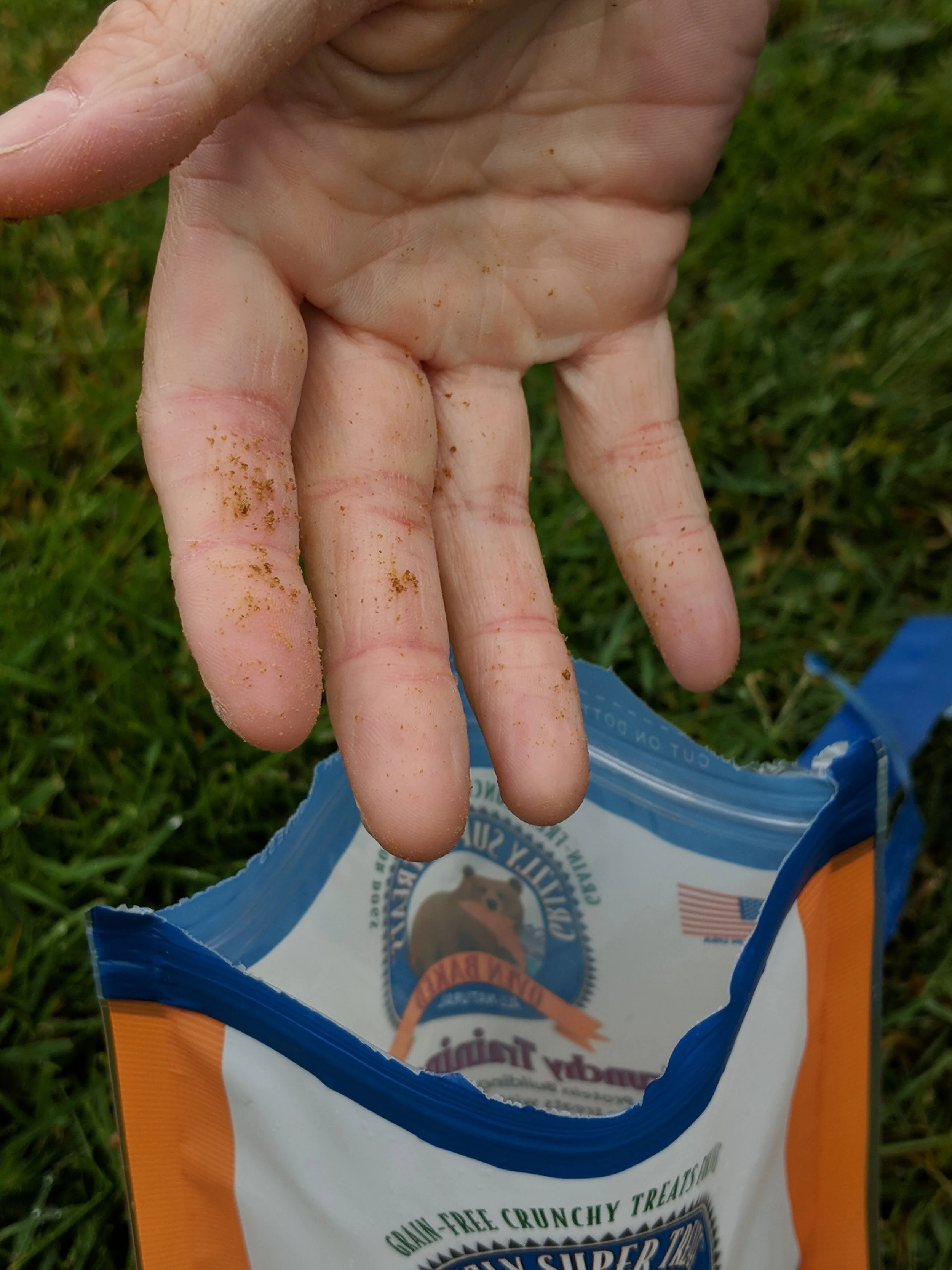
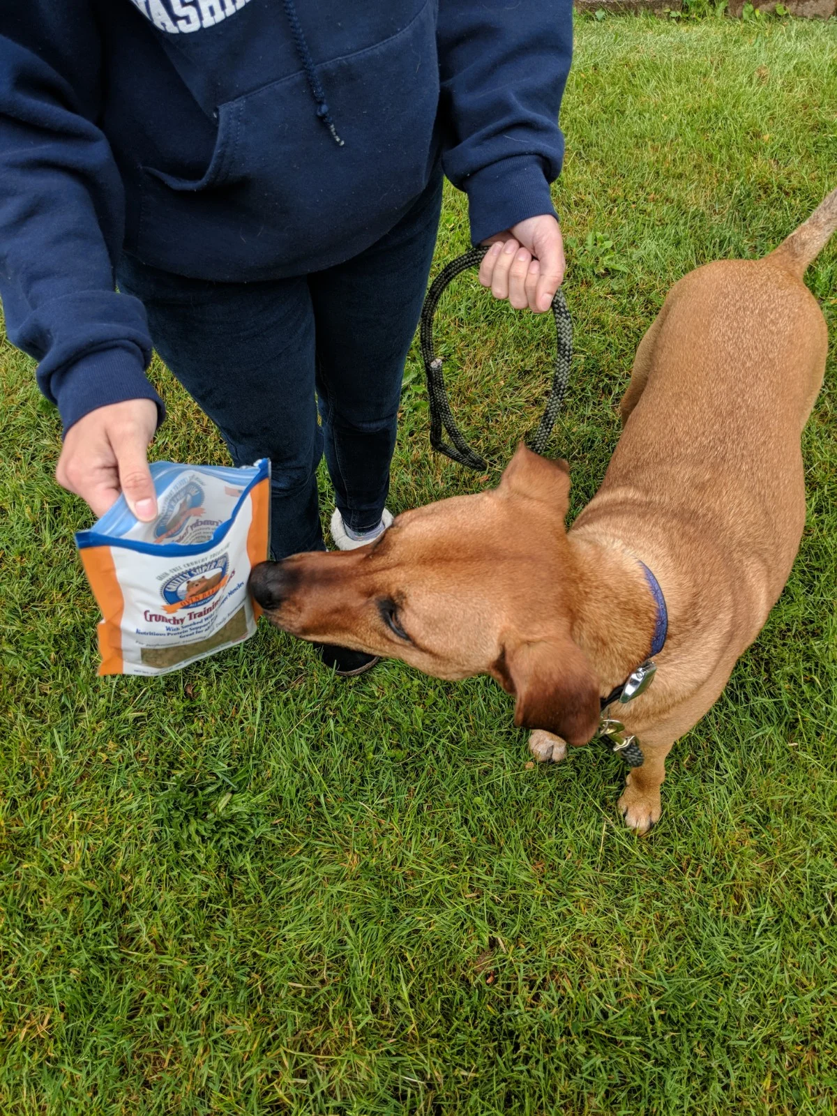
Pain Points
Most treats are packaged in a plastic bag.
The zip-lock mouth can be difficult to peal apart and open.
Plastic is a wasteful material that cannot be recycled.
Bags are bulky, are sized to fit the pantry—not a pocket.
Hands get covered in crumbs when you reach in.
Greasy fingers are almost guaranteed.
Your pants suffer the consequences.
Especially difficult to open while holding a dog leash.
For dog owners who are training their pets, they are constantly rewarding their pets’ good behavior whether its at home, at a park or on a walk. Putting treats straight into their pockets or into a separate zip lock are solutions dog owners commonly use.
How can I make it more convenient for dog owners to handle and dispense treats?
How can I make it enjoyable for them to reward their dog's good behavior?
RESEARCH
The Target Audience
New dog owners.
People who are excited about their new pet, and are ready to teach it some manners. These individuals often have treats on them all the time, because training is ongoing.
People who value quality products.
One of the brand goals is to use nutritious and natural ingredients. New dog owners are eager to give only the best to their new companion.
People who don't take themselves too seriously.
Having an ill-mannered dog can be embarrassing and stressful, but the most important thing is to play it cool and have patience. This audience doesn't get angry when their dog misbehaves, they laugh it off and do their best to keep it together. These users appreciate a good sense of humor when it comes to their dogs.
Brand Objectives
Provide a delicious and healthy product to dogs.
Deliver a unique and convenient experience to new dog owners.
Make training your dog a fun and easy task!
Logo Design
Moodboard
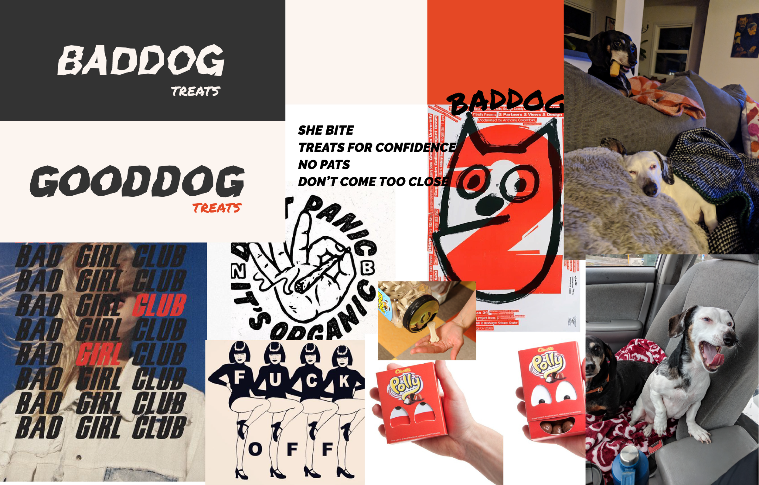
The name “BADDOG” led to the creation of this mood-board with grungy, “bad” elements. Distorted text, rough textures, a bold typeface, and some obnoxious elements. The goal for the color palette was to stick to dark colors and apply red in a meaningful way. Also my very own bad dogs (on the right) were an inspiration to me.
Sketching
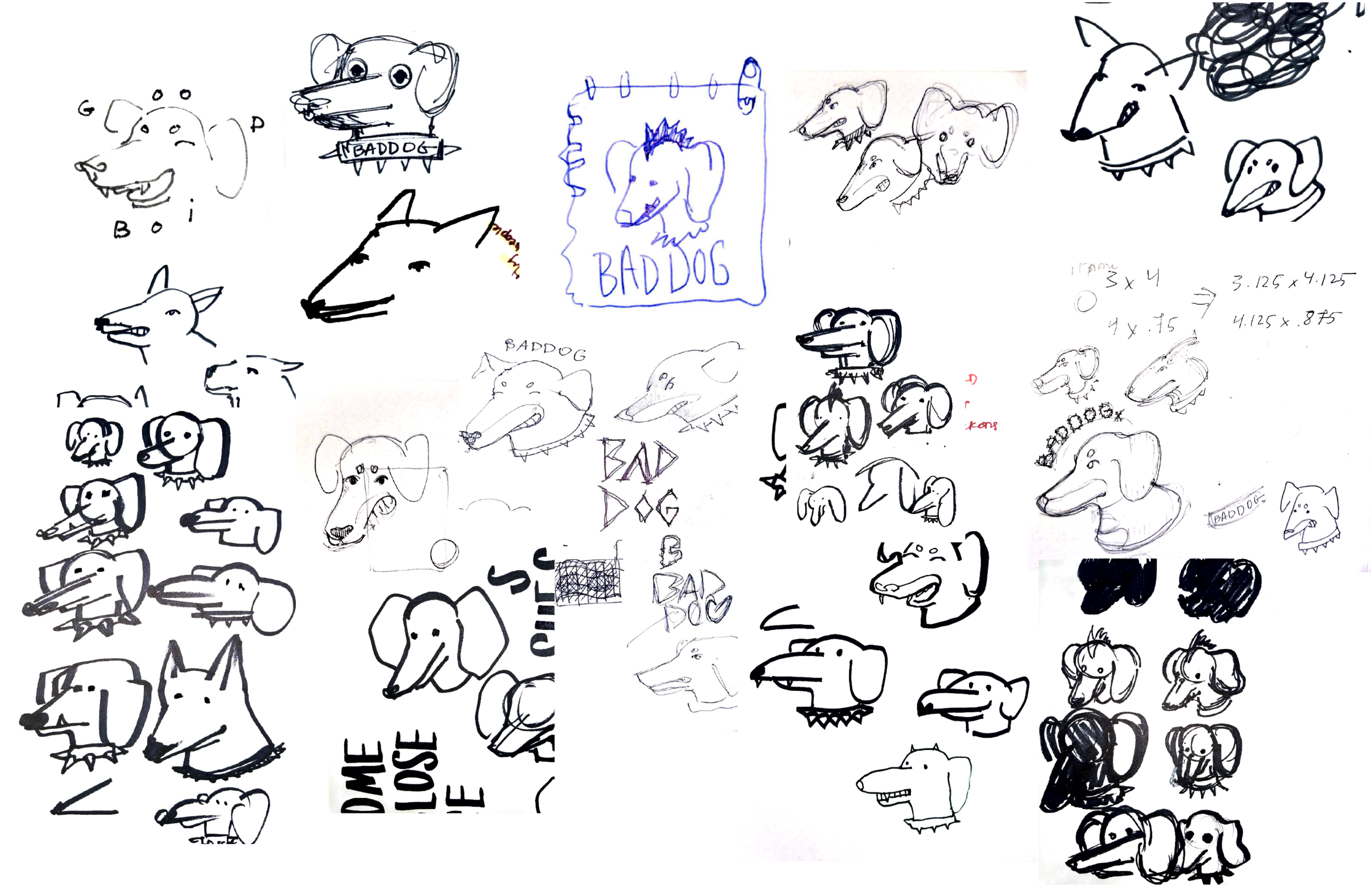
During the sketching process I keep it quick and loose to give it a silly and uneven effect. I start with pens and markers then I turn a few ideas into digital iterations.
Top 3 Doggos
Three variations of a logo were put up for a vote.
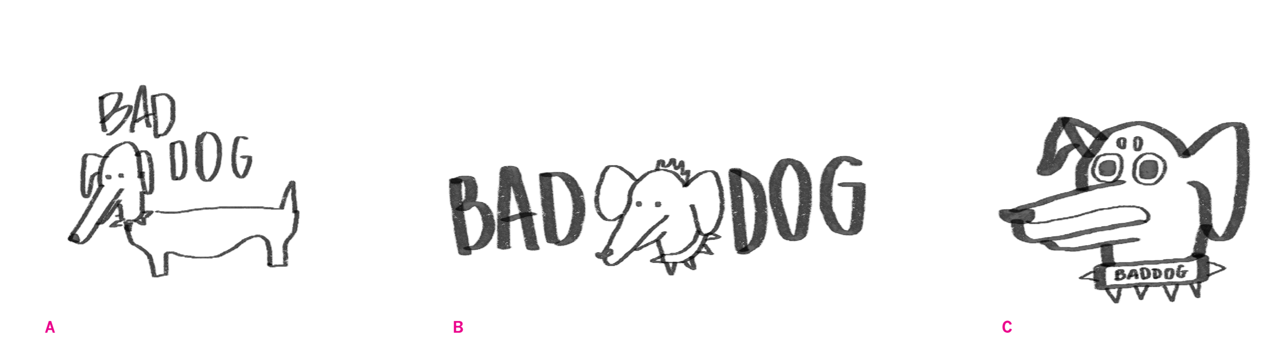
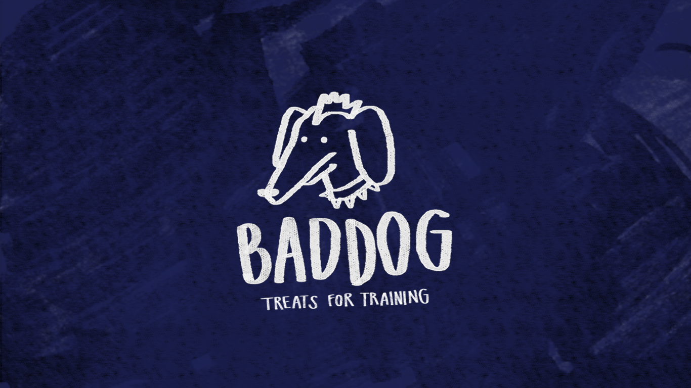
My peers agreed on logo B, which was the right amount of "badness" while still being approachable and quirky. Some concerns with the chosen logo were that the dog looks like a mouse at first glance. People also wanted to see the mohawk more distinct, to emphasize its punk appearance.
The Final Logo
The Packaging
Sketching
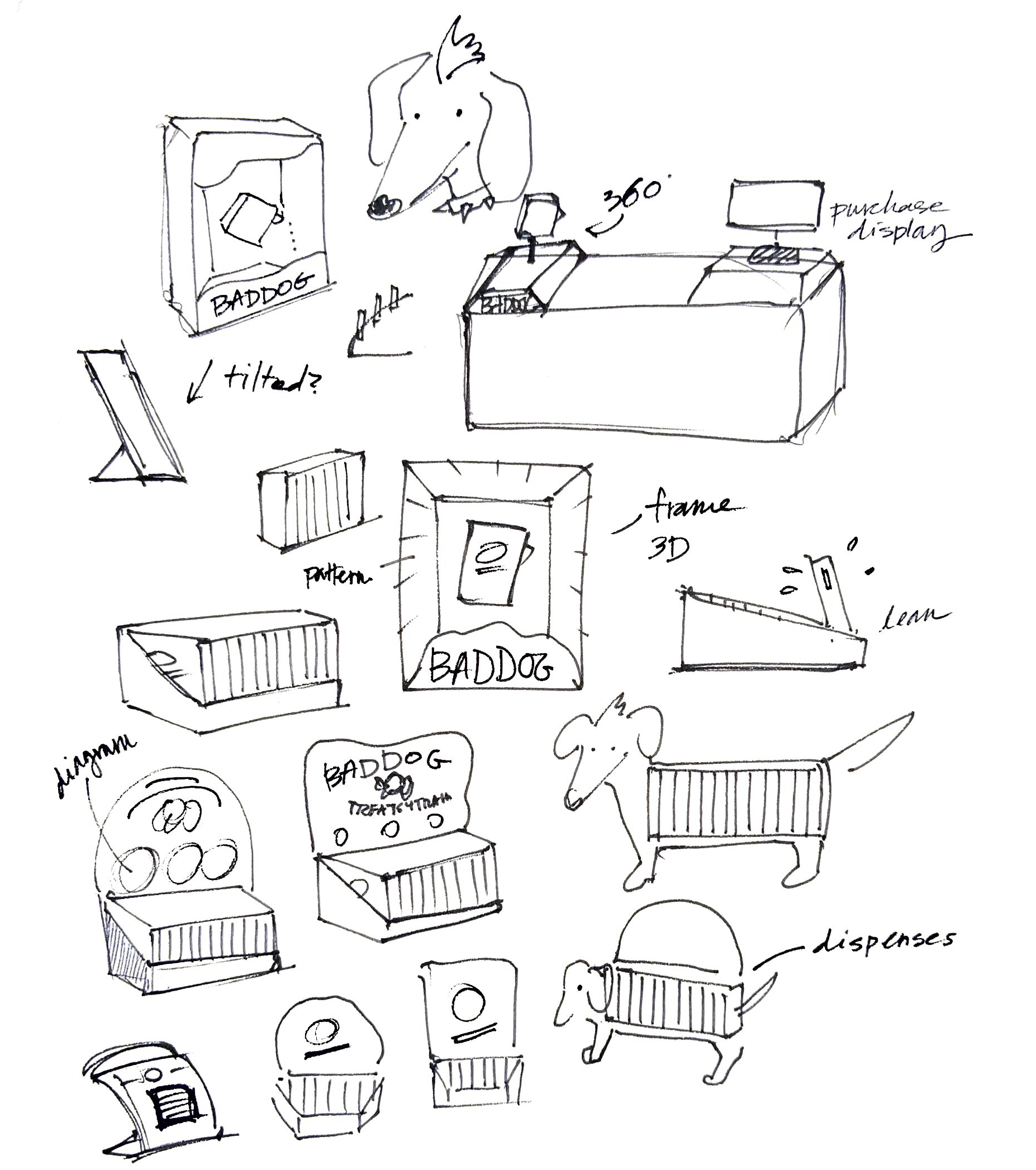
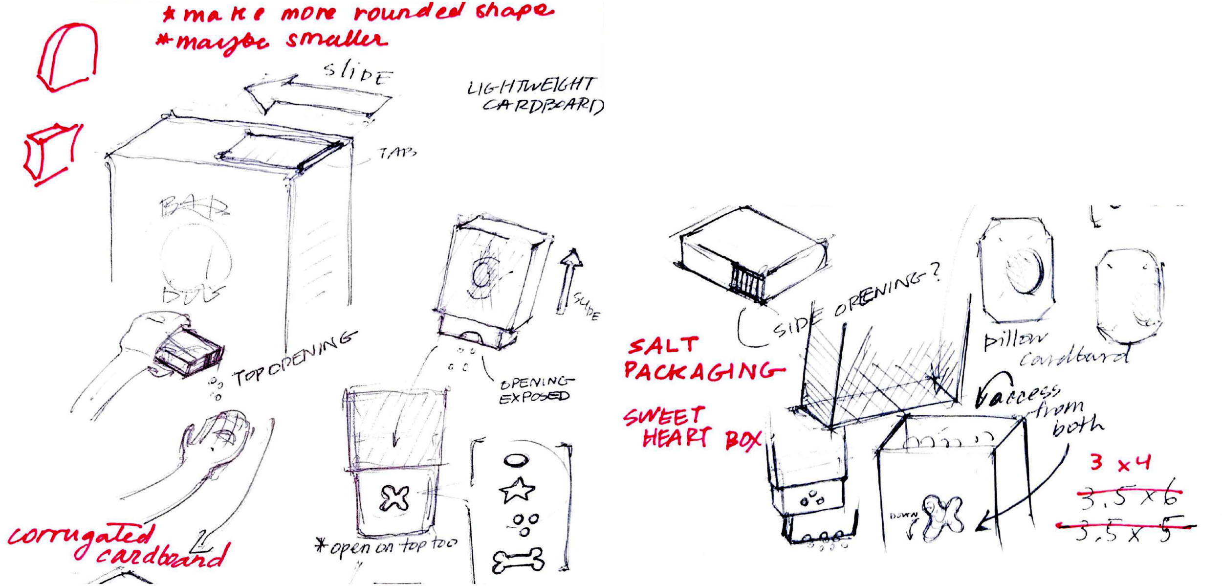
It’s important for this package to be made of recyclable paper; Baddog treats are a consciously made product–the materials and usability should reflect that. While sketching I keep in mind that the treats should be quick and easy to access, ideally with one hand.
3 Concepts
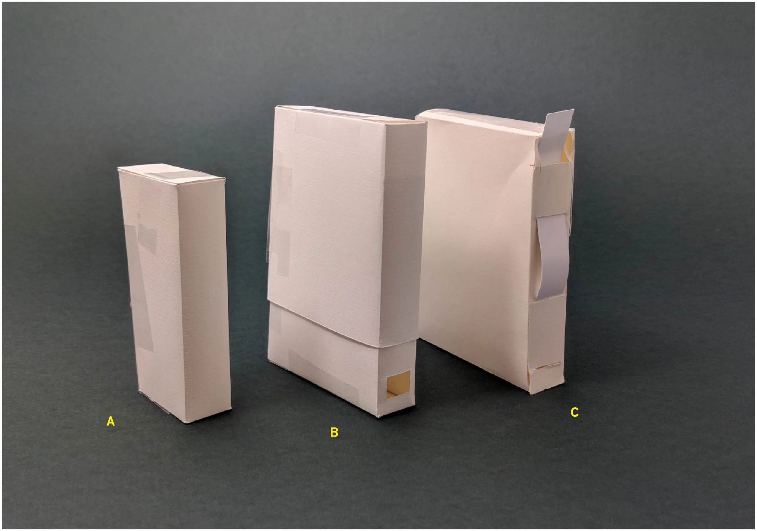
The first three concepts varied in shape and function.
A was the most compact, but it could be bigger to fit more treats while staying small.
B had a cover that would slide up and reveal a hole that dispenses treat, but the package was bulky.
C represents a concept that has a sliding tab that would open and close the hole, but the tab carries a potential risk of breaking off.
The Solution
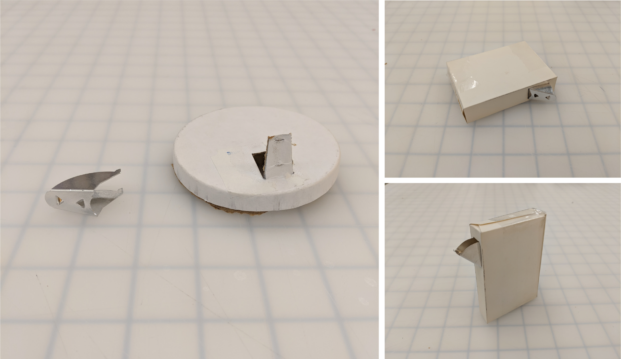
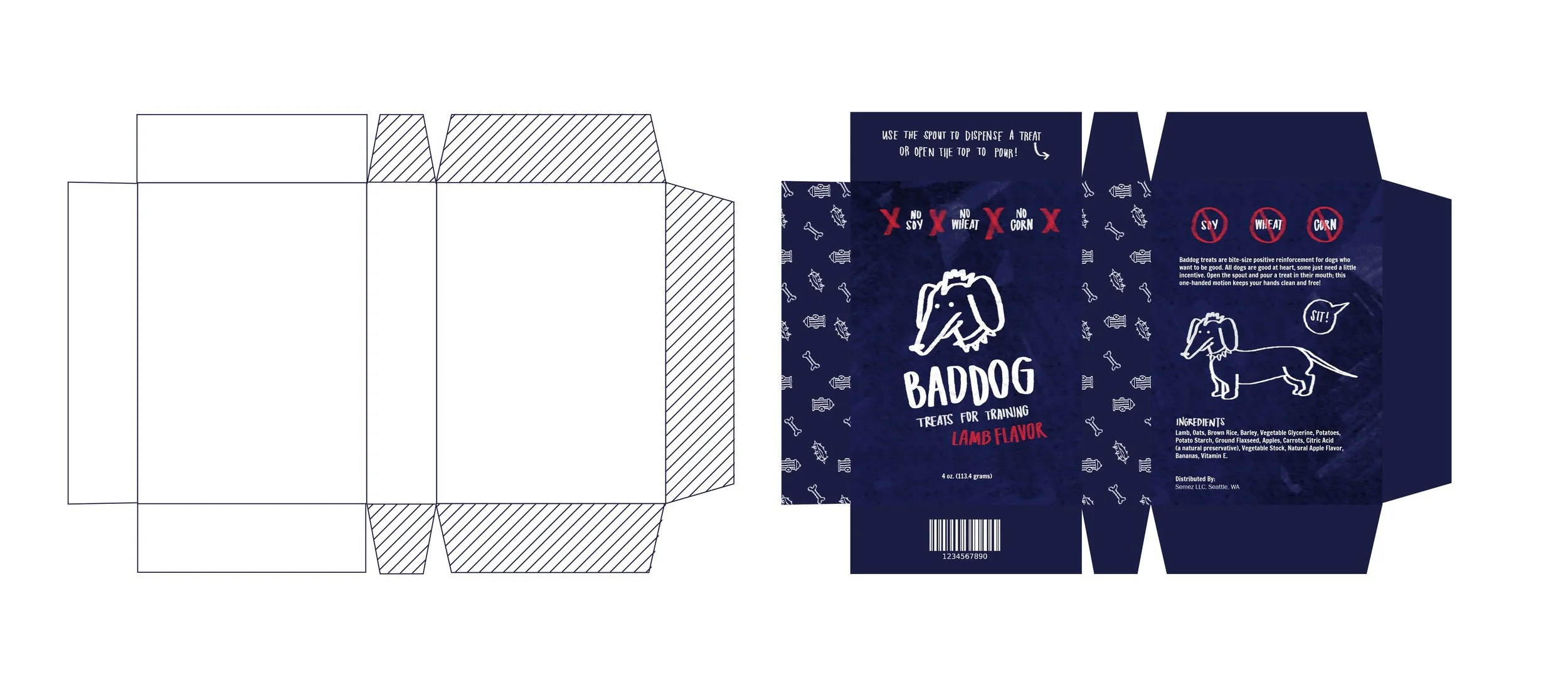
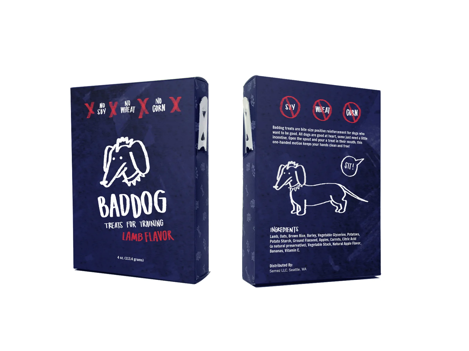
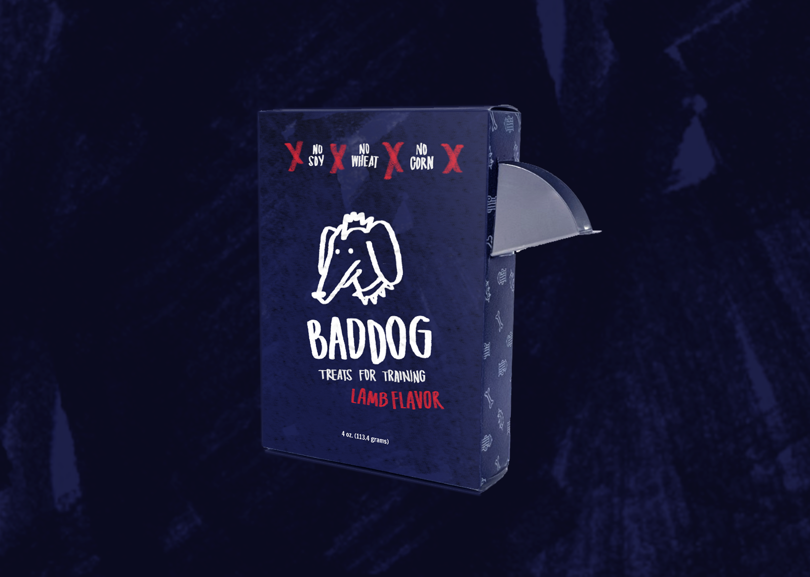
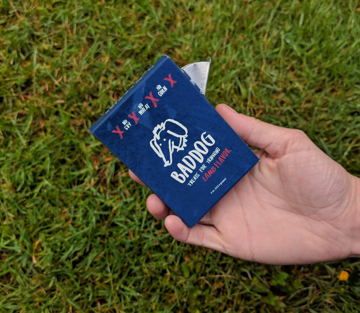
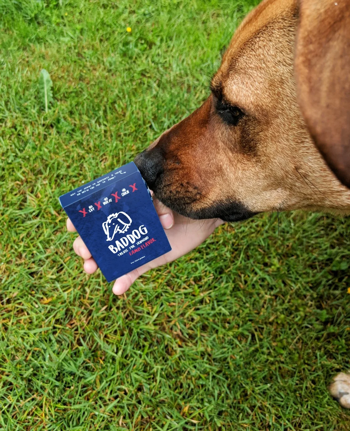
Salt dispensers have a unique and efficient feature that I could apply to my design; the metal tab they use is a simple solution to dog treat dispensing. I prototyped a box with the tab attached, and it worked perfectly. Users can easily pop the tab open with their thumb while their other hand is occupied, and avoid getting greasy dog-treat fingers.