
Project Background
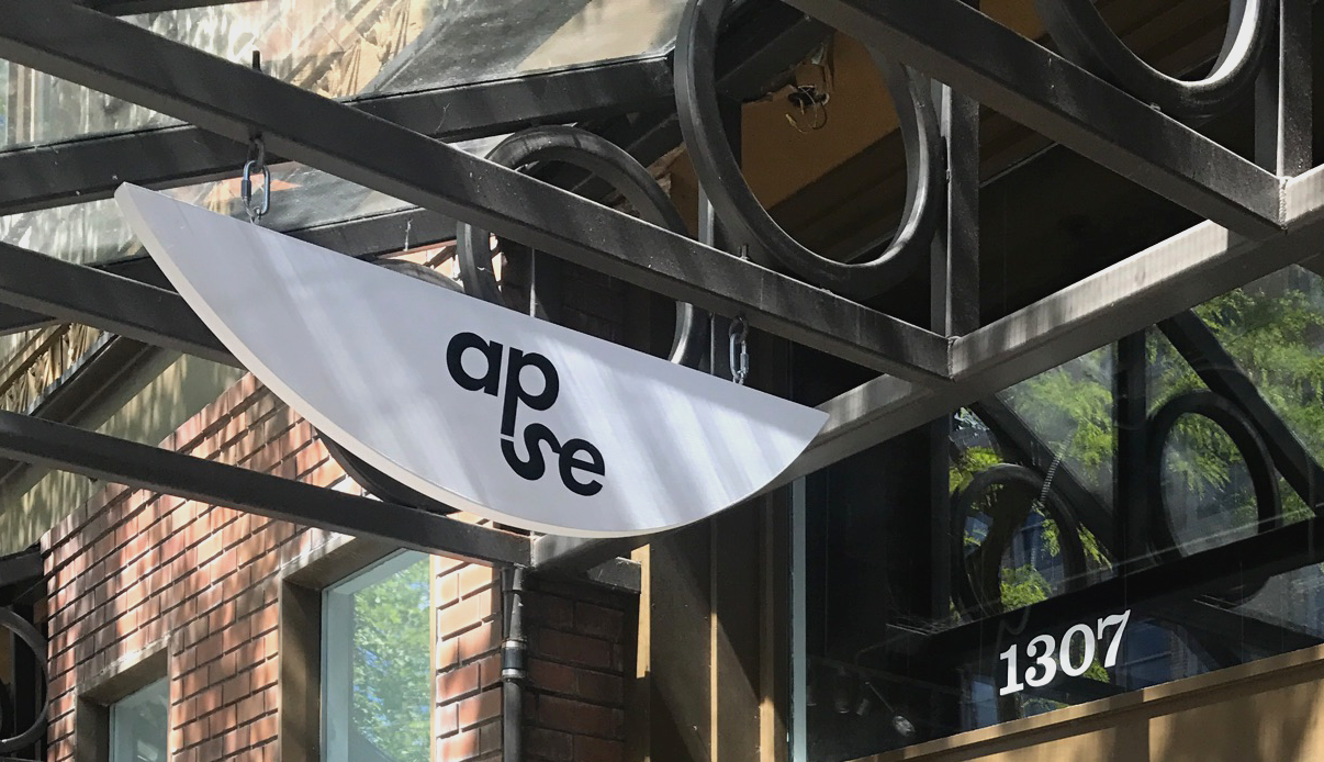
For my last two years in college I had the opportunity to work as a jeweler and graphic designer for a business I am proud to represent. APSE started as a jewelry line in 2015 on Etsy, and has grown into a beautiful store in downtown Bellingham. There, they not only produce their personally designed and hand-crafted jewelry but also curate a selection of consciously-made clothing and home goods. Months into their new space I was assigned the task of re-imagining the brand identity.
Project Goal
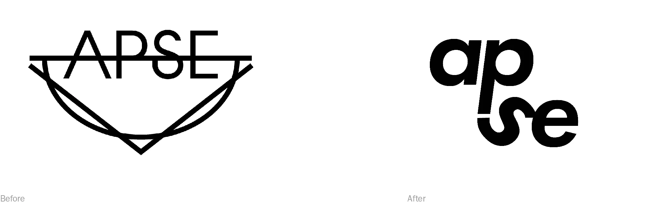
Create a new logo that represents the modernity of the brand, while carrying symbolism and meaning behind each graphic element. The new design should be easy to read, and easily applied in interesting ways to all printed and digital content.
The Business
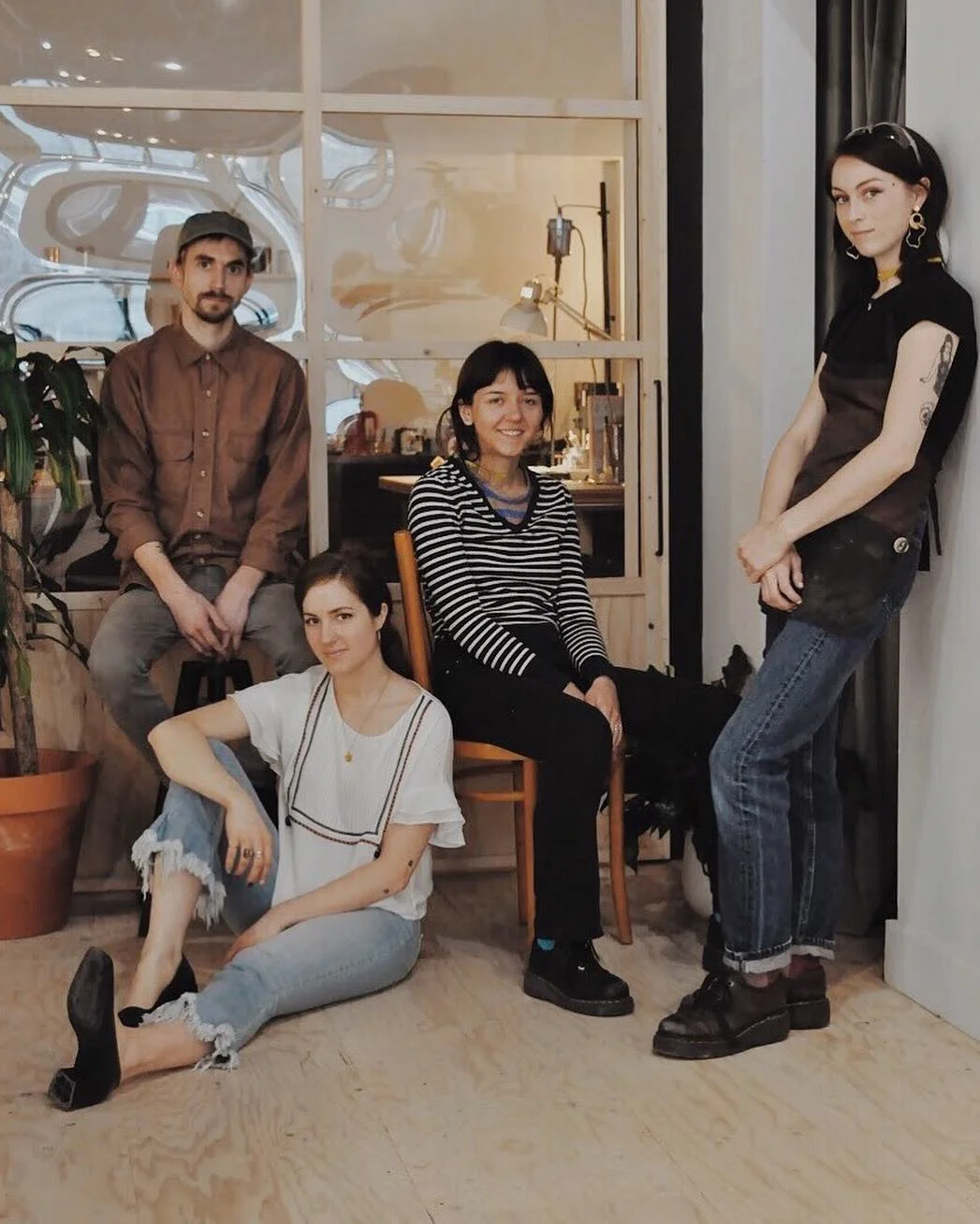
On the left: Jarod and Hayley (the owners)
On the right: Marina (me) and Jocelyn (jewelers & idea contributors)
The Current Logo + Application
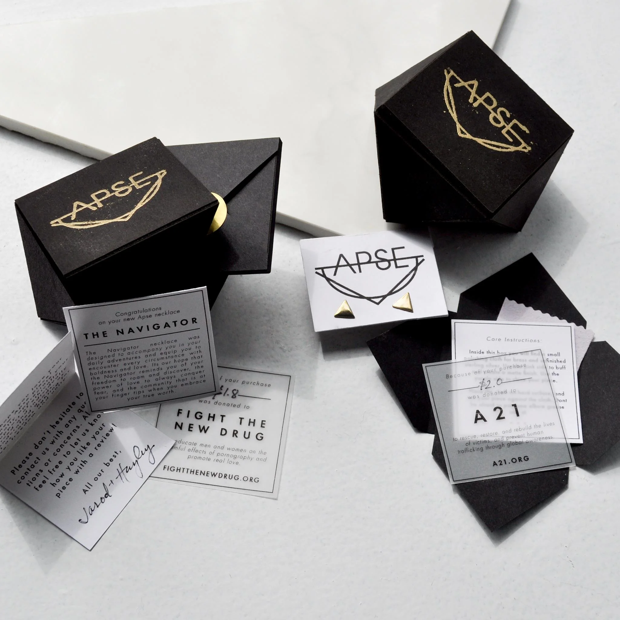
The original logo represents the geometric inspiration behind the pieces of jewelry that APSE created in its early days. Since its beginning in a living room, this brand has grown into a respected business in their community. Each year they contribute more to notable causes both locally and internationally. The logo needs a refresh that will represent their progressive and unique business.

The Process: Logo
Beginning Iterations
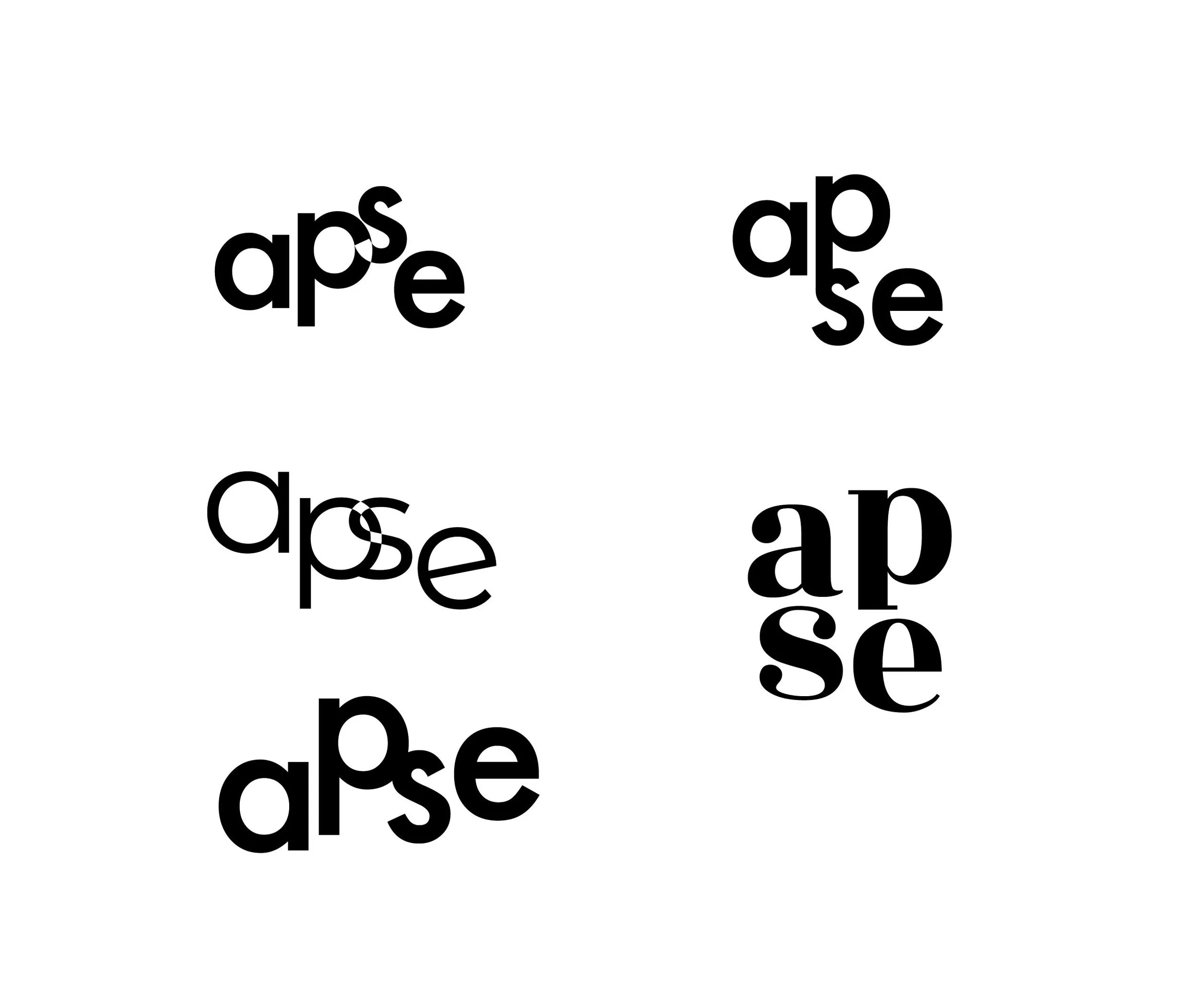
After a few pages of sketches on paper, I move to Illustrator to experiment more with typefaces. At this stage I often check in with the team to get feedback on which type treatments stand out in the best way.
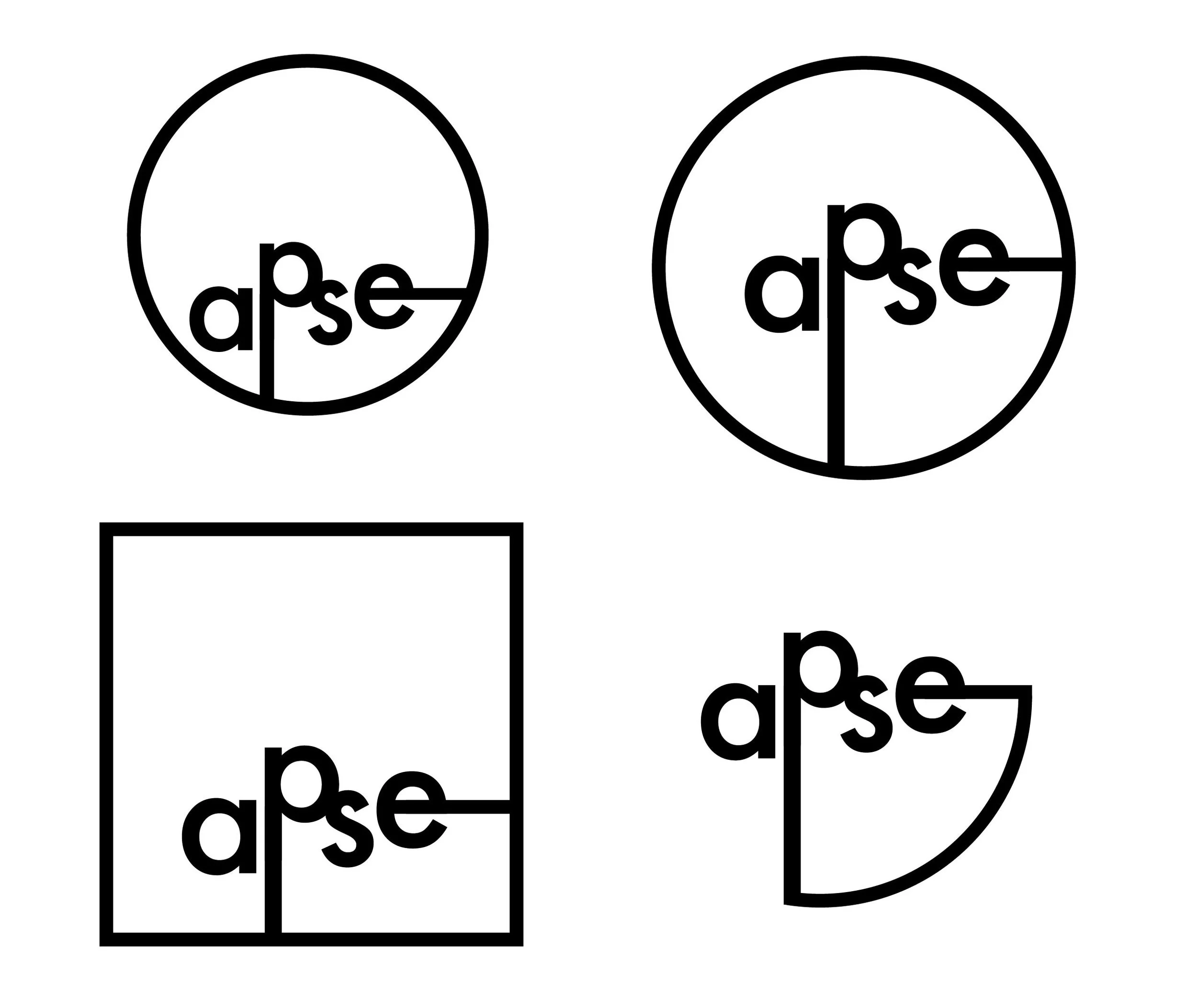
refinements
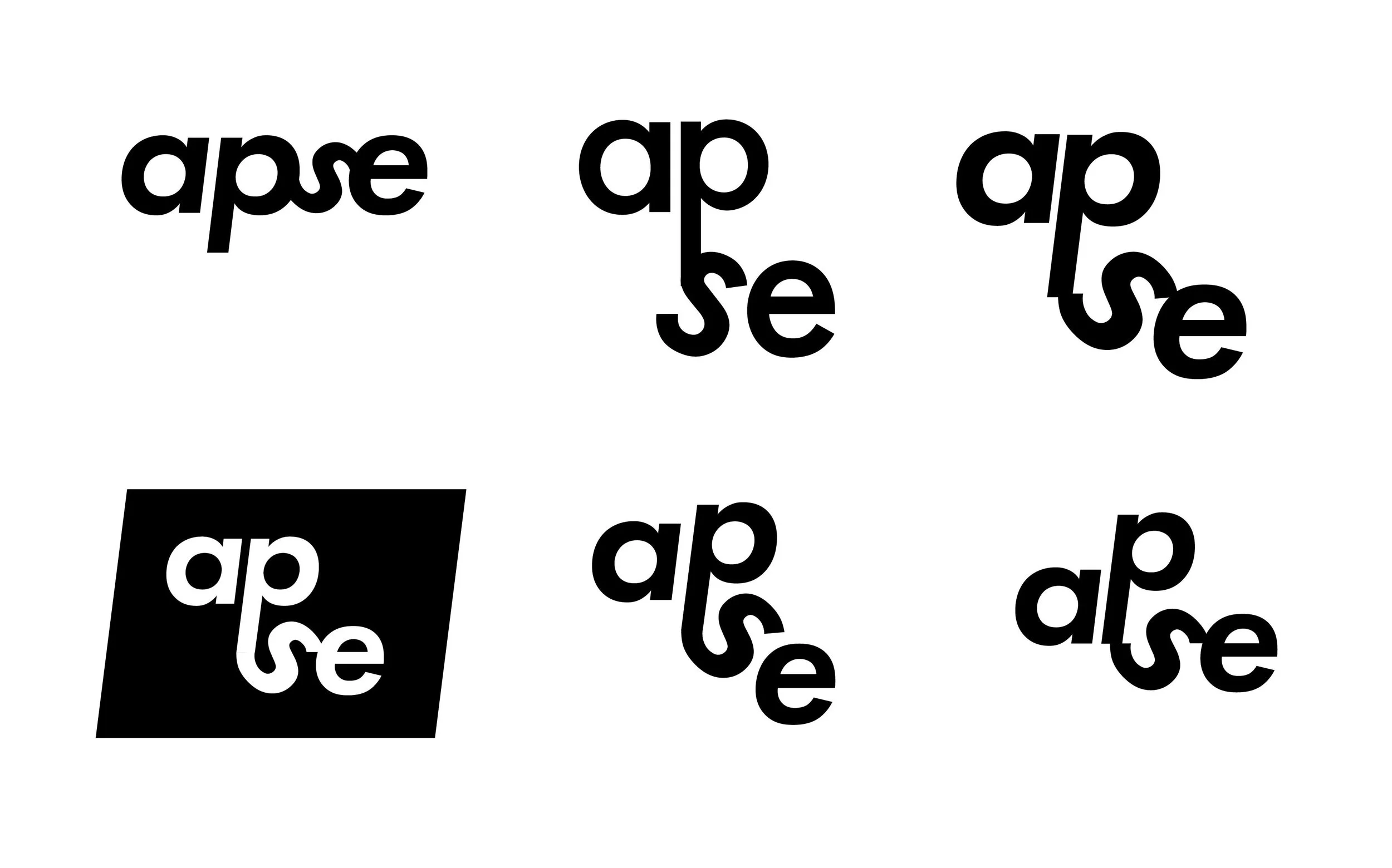
Final Two Concepts
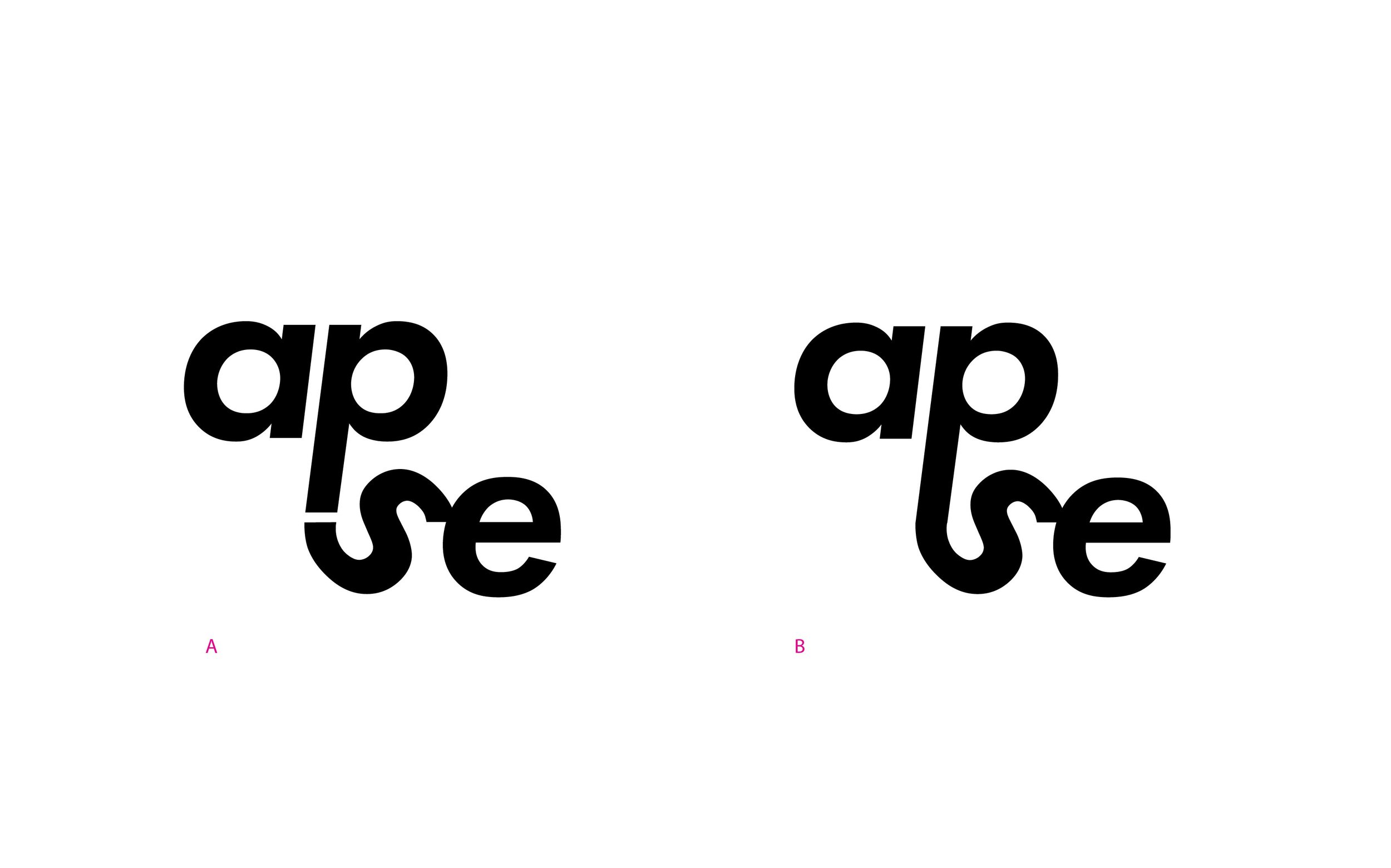
We narrowed the options down to two concepts which we released to the public for their votes.
The Final Logo
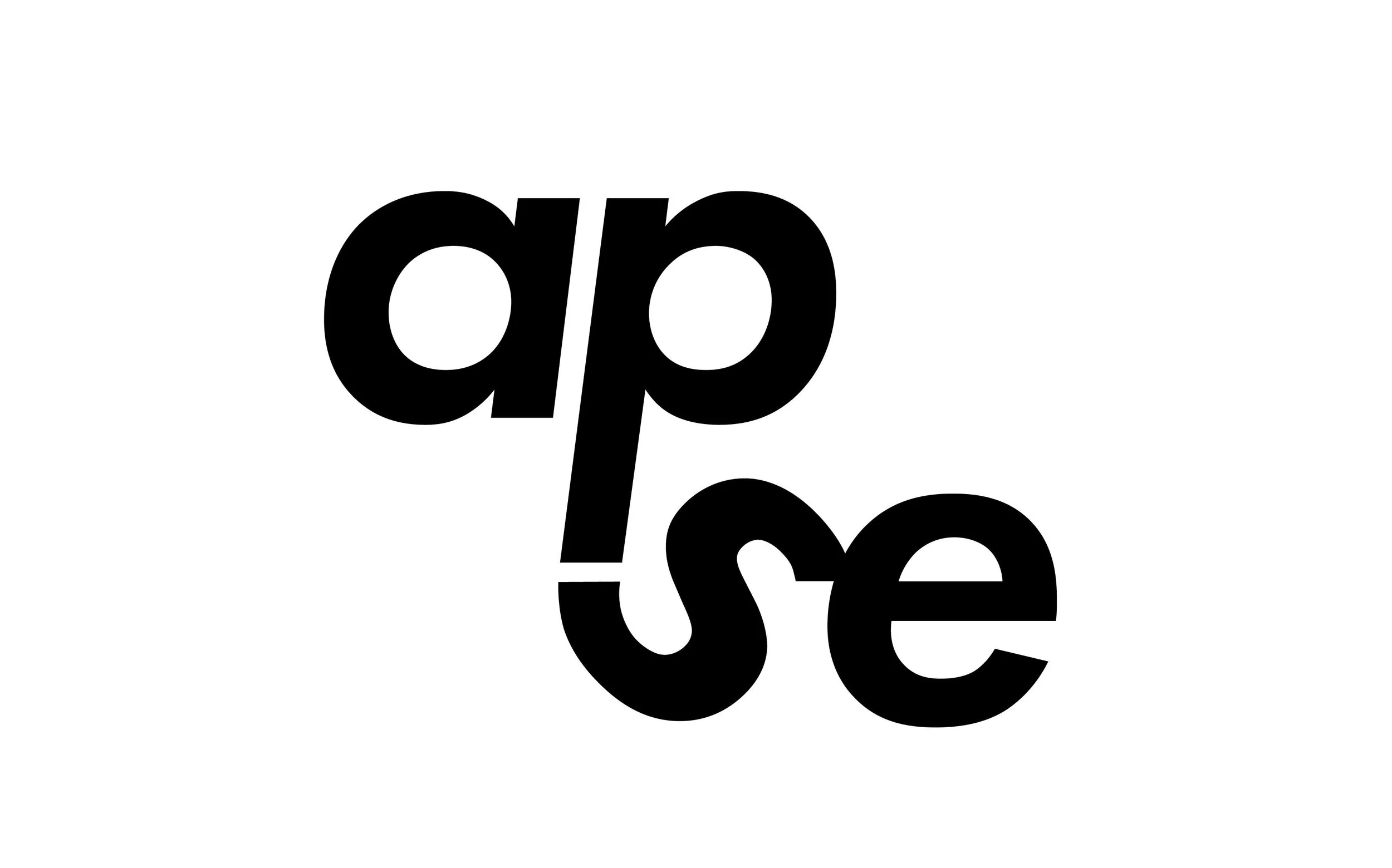
The chosen logo represents a chain fallen on a surface. The loops and curves of the letter forms mimic the natural shapes that come from a necklace chain. We kept Futura as the typeface because it doesn't need supporting graphics to express the geometric and contemporary style of Apse.