The Brief
Create an infographic that will be part of an Education Story deck for all of Microsoft. An asset that can be read and consumed by anyone who wants to not only understand Microsoft’s mission in Education, but also who their customers are, what the available products and services are, how they interact with these products, and what plans are available to them.
The Goal
Showcase the wide reach that Education has across the Microsoft ecosystem while highlighting key partners, applications, and services.
Deliverable
A 16:9 high-resolution image that can be used in a deck or printed as a poster.
Individual Role
User research / Product research / Competitor research / Moodboarding / Wireframing / Data collection and organization / Conceptualization / Final deliverable
The Problem
Microsoft provides incredible products and services to schools across the world but there is no way for our new-hires, partners, or executives to visualize not only the breadth of these products and services, but also the positive influence they have on students, educators, and administrators at these school.
Solution
Create an infographic to represent Microsoft Education. A visual that can be interactive, that has possibility for motion, and that can also stand alone as a poster.
Phase 1: Research
Data collection & organization
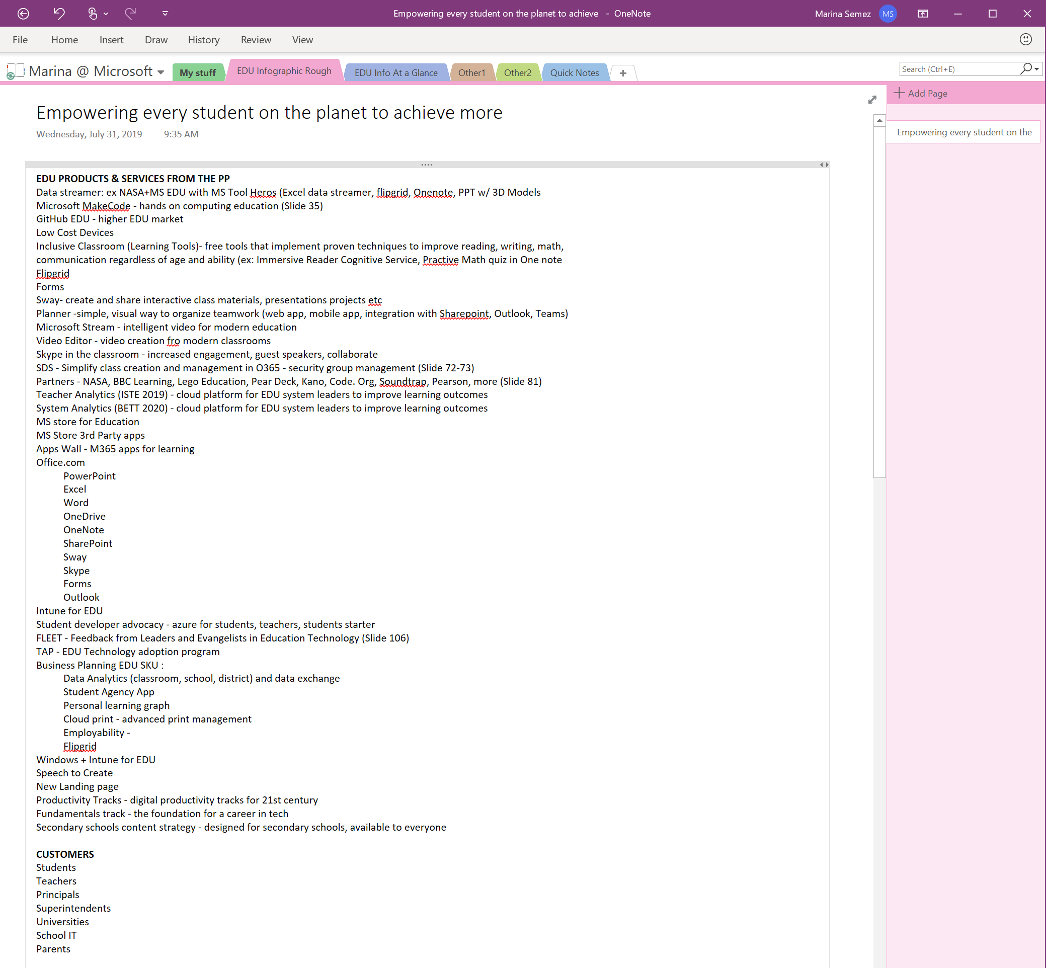
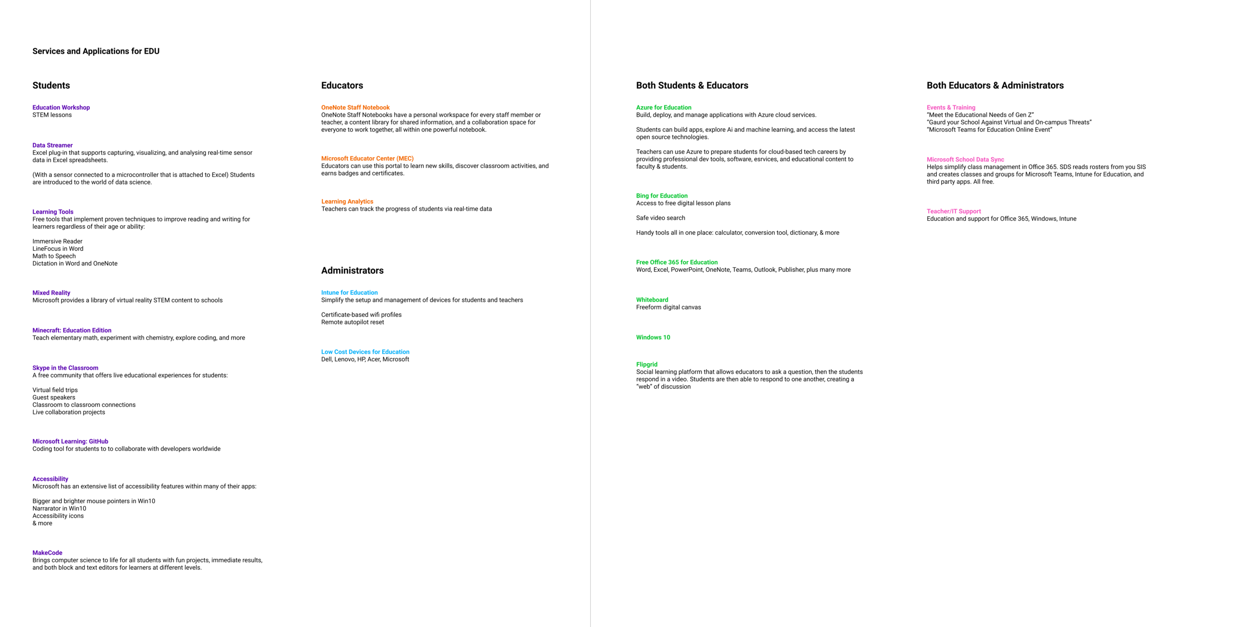
Before meeting with the EDU (Education) team, I was given a rough list of all the Microsoft EDU products and services found in their website and an internal deck.
Customer Research
Understanding who our products are benefiting is essential to represent in the final graph. The Education website (see below) is busy with photos and text, requiring extra effort to find specific product details. How can this infographic be a reference/inspiration for those who contribute to designing the website?
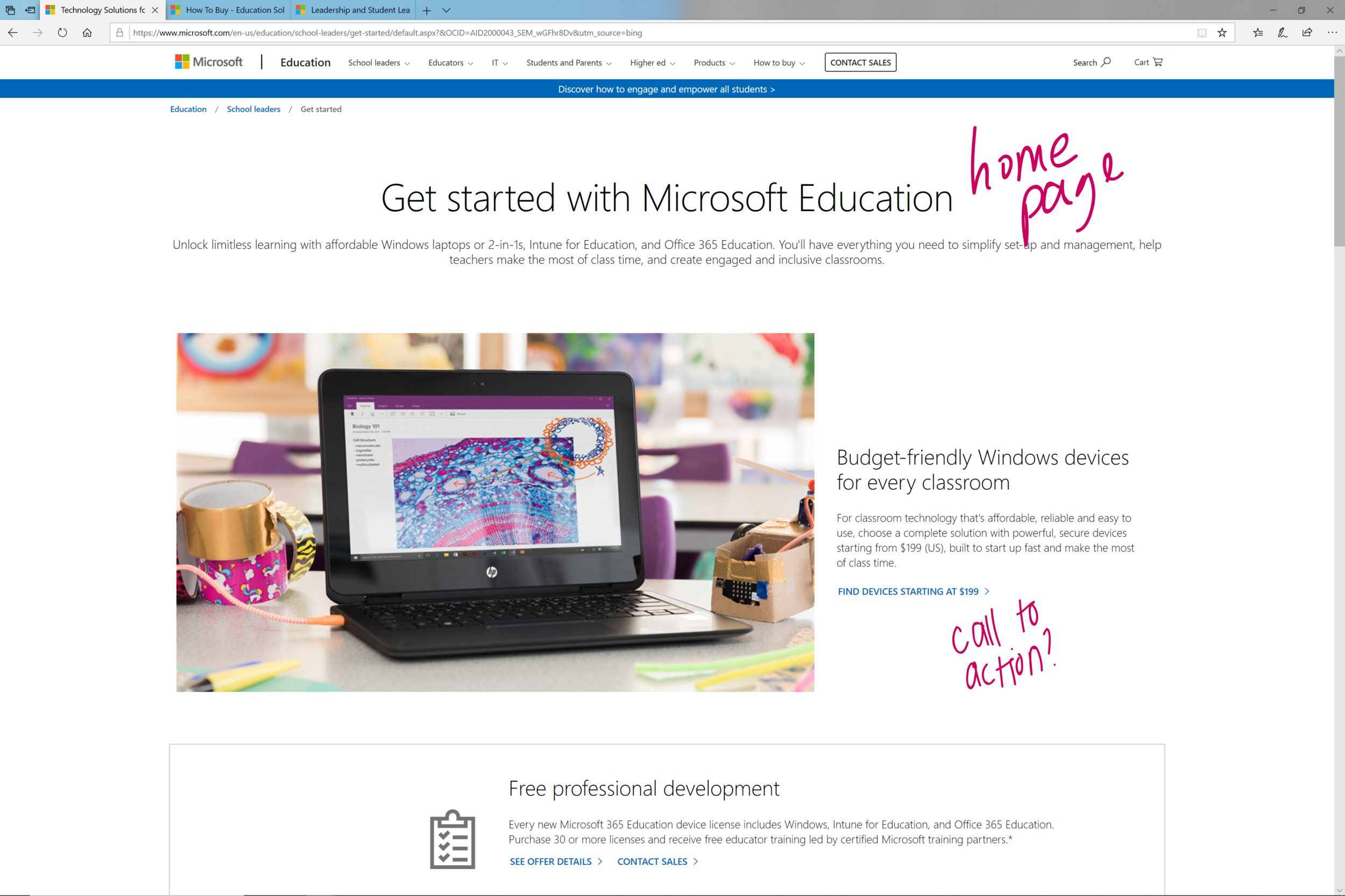
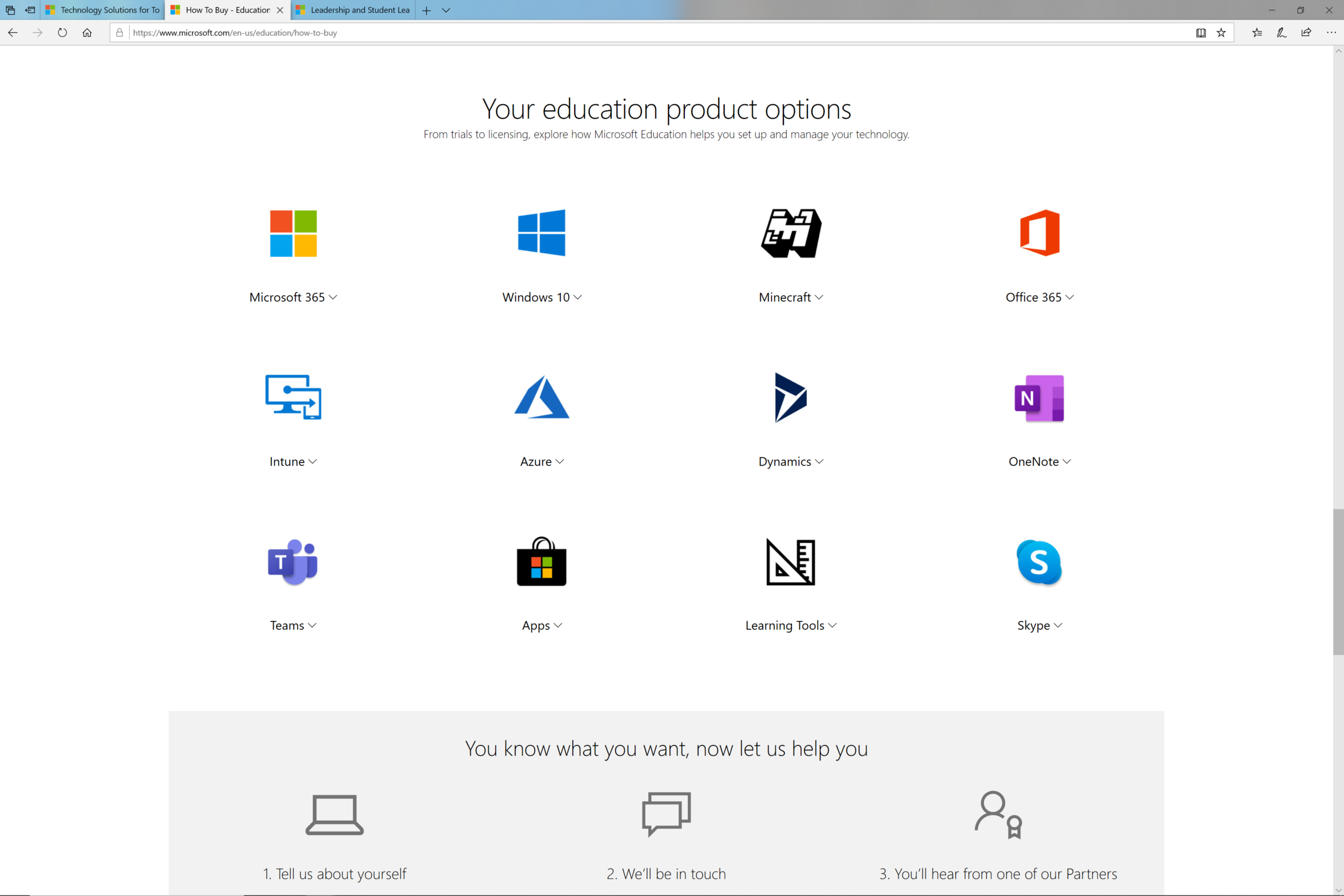
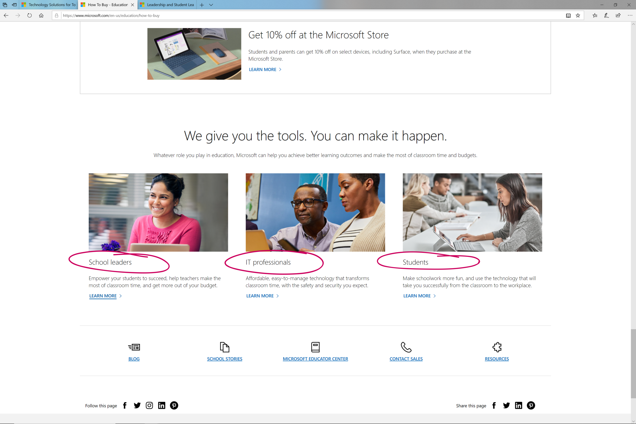
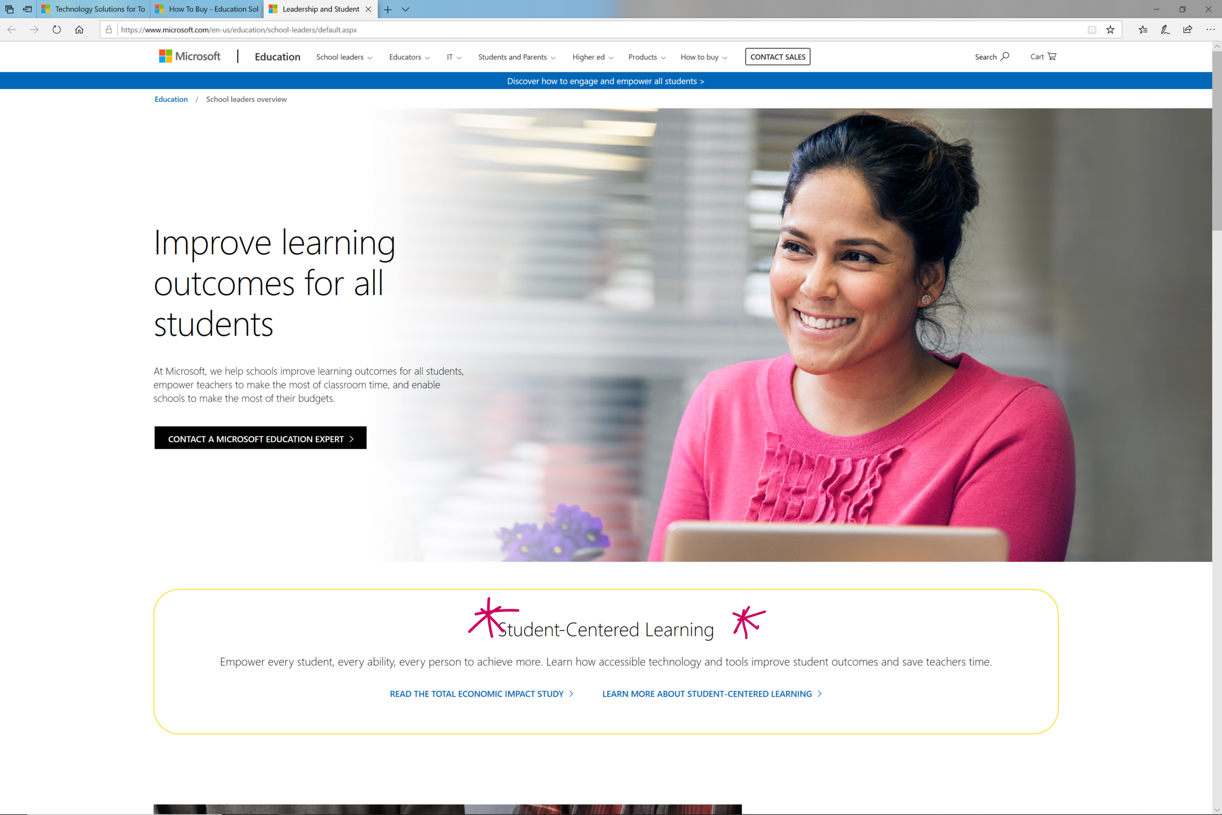
Data collection & organization
Referencing the website and an internal EDU deck, I created an “at a glance” collection of services and products that would later be built upon with the EDU team. In order to put the focus on the customers, I organized the following list with the three primary users: students (including K-12 and higher education), educators, and administrators (including school IT, principals, superintendents, etc.). This list was only the tip of the iceberg.
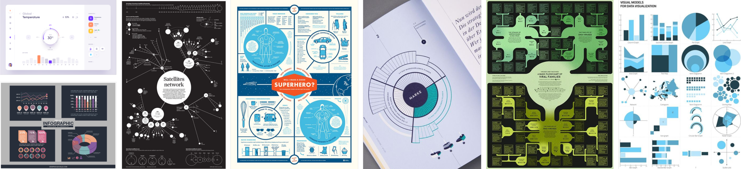
Moodboard
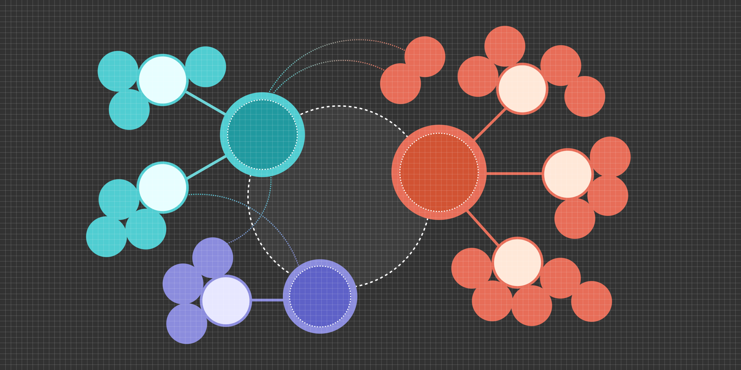
The EDU team request that the “tone” of the graphic be professional and modern, following Microsoft visual guidelines. I created a mood board that was a mix of graphics that have a similar visual style, and graphics that had an interesting structure to their information.
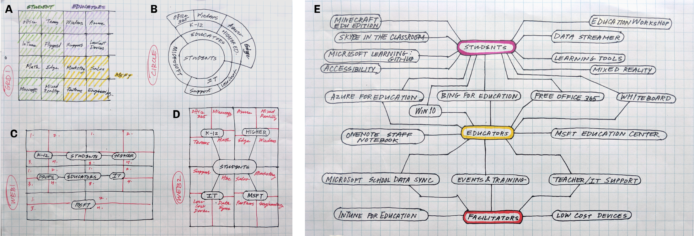
Phase 2: sketches
sketches
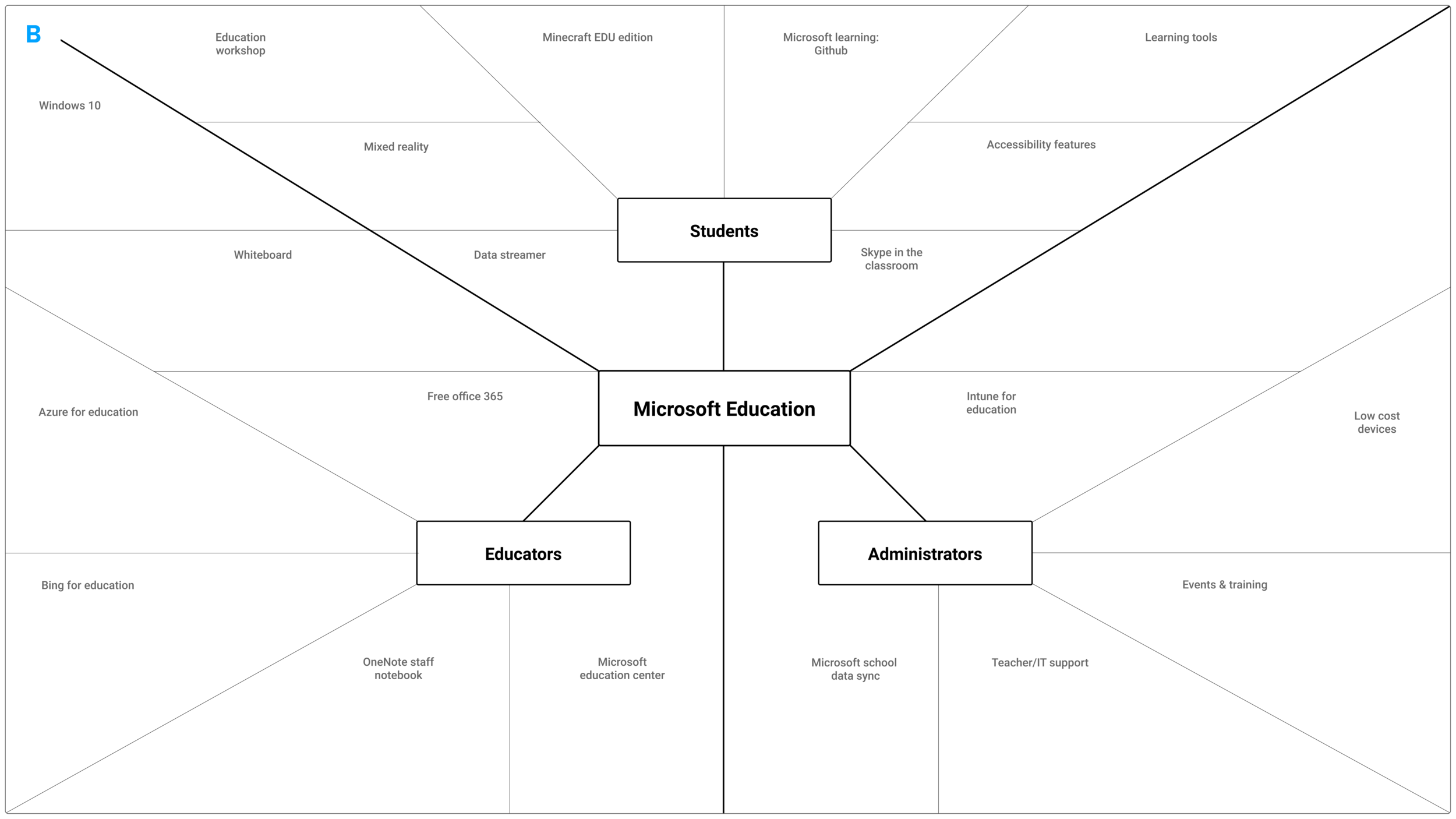
This step was meant to move through quickly and elicit feedback from my leads. The drawings below show 5 distinct directions that the graph could go, 3 designs were chosen to move into higher fidelity: B, D, E.
Phase 3: Figma comps v1
v1
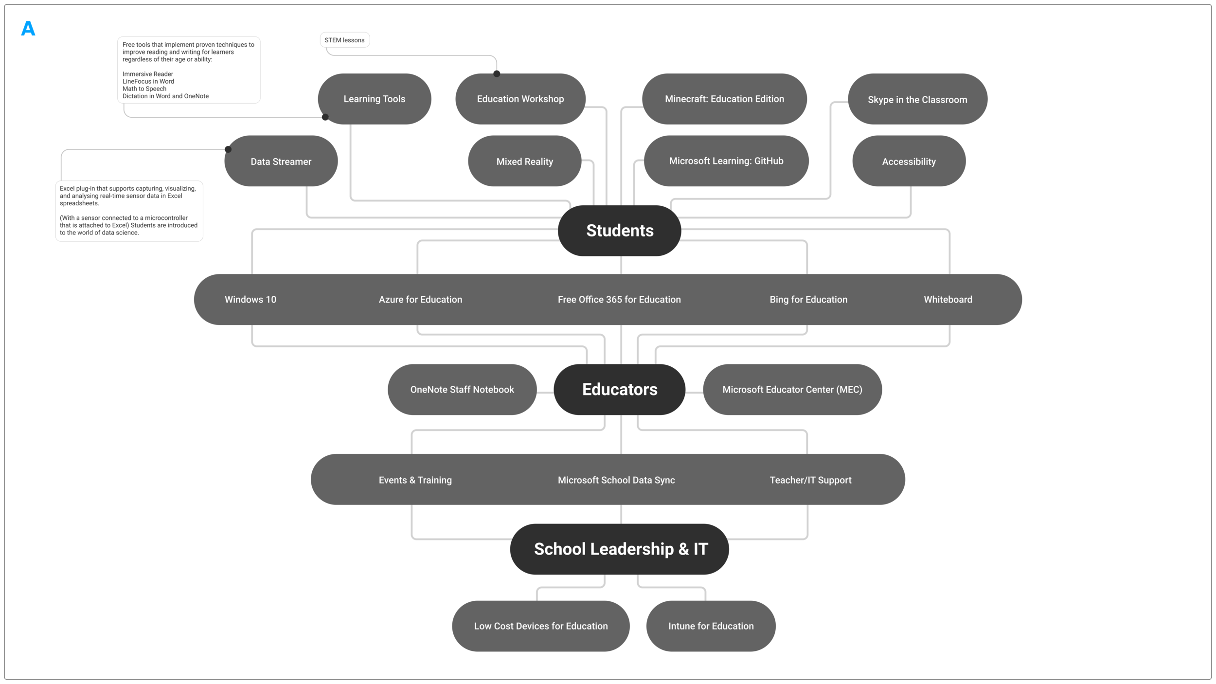
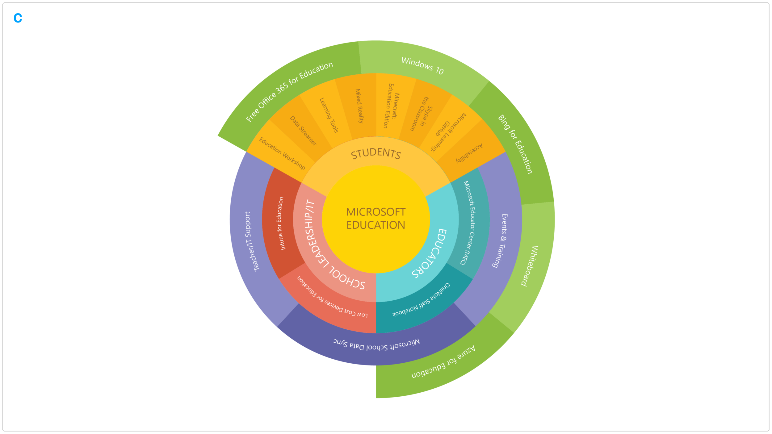
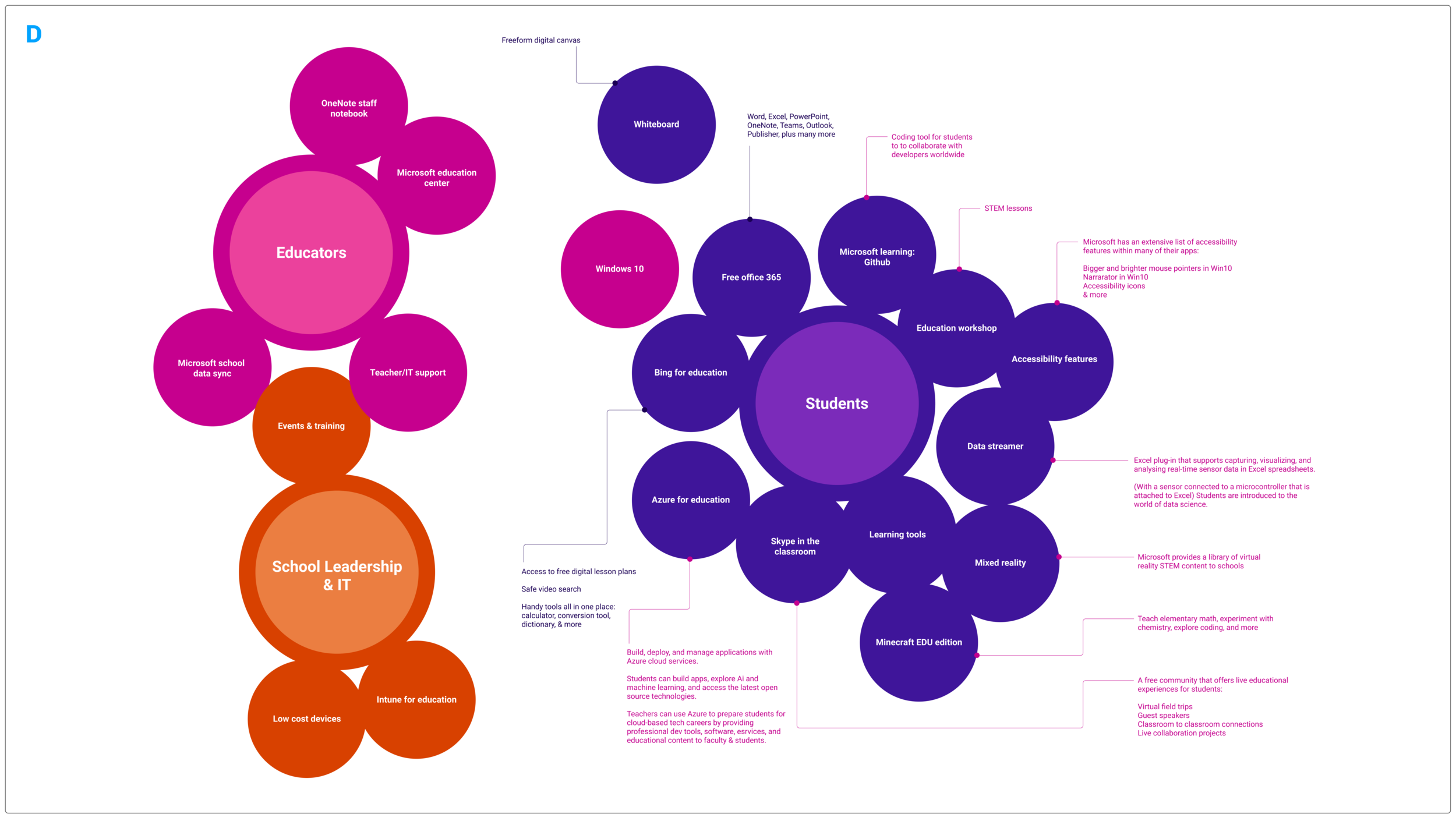
3 of the strongest sketches were created in Figma to take our understanding of Education a step further. Out of those three, option A was the strongest in clarity and organization of the information. I added option D below because it was more dynamic than A but also easy to read and understand. See below for my team’s feedback.
V1 Feedback
Option A: Classic design but difficult to skim. Add more hierarchy to the content, show “Students” as a more distinct and important user.
Option B: Is the least organized and hard to understand from first glance. Could become messy when more of our products and services are added.
Option C: Looks beautiful but isn’t practical to read the upside down/tilted text. Would be a great option for a more complex infographic that incorporated heavy animation and motion design.
Option D: Also visually appealing and has potential for interesting motion and interaction. Colors need more thought.
Phase 4: Figma comps v2
v2
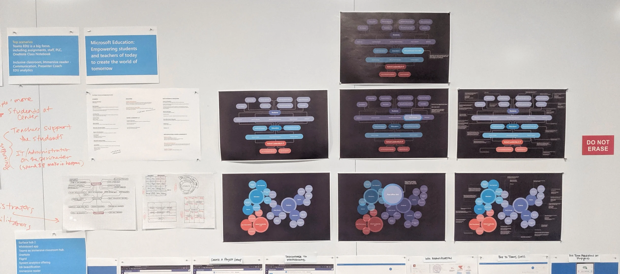
Option A and D were revised with the feedback above. In this step I created a short flow showing how a certain product could be highlighted in a presentation, as well as an example of how each option could look as a poster with all the information expanded. The colors were updated using Education’s official color palette, and clearly show our three focus points.
At this check-in I was able to show the EDU team my work. Scroll down for the feedback.
infograph 1 (previously a)
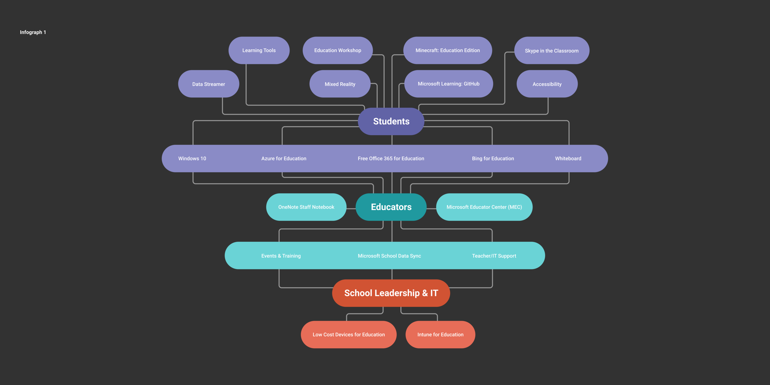
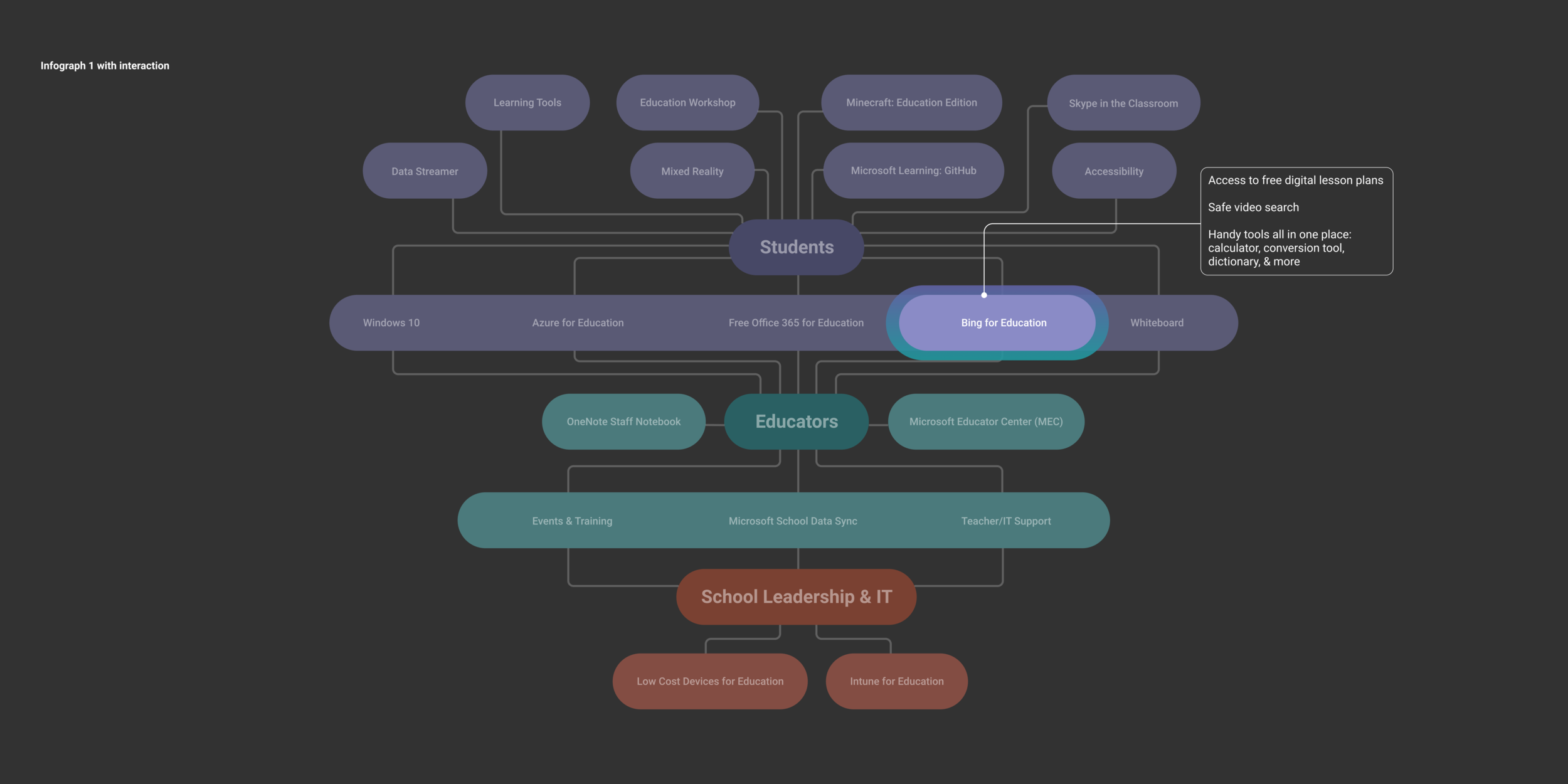
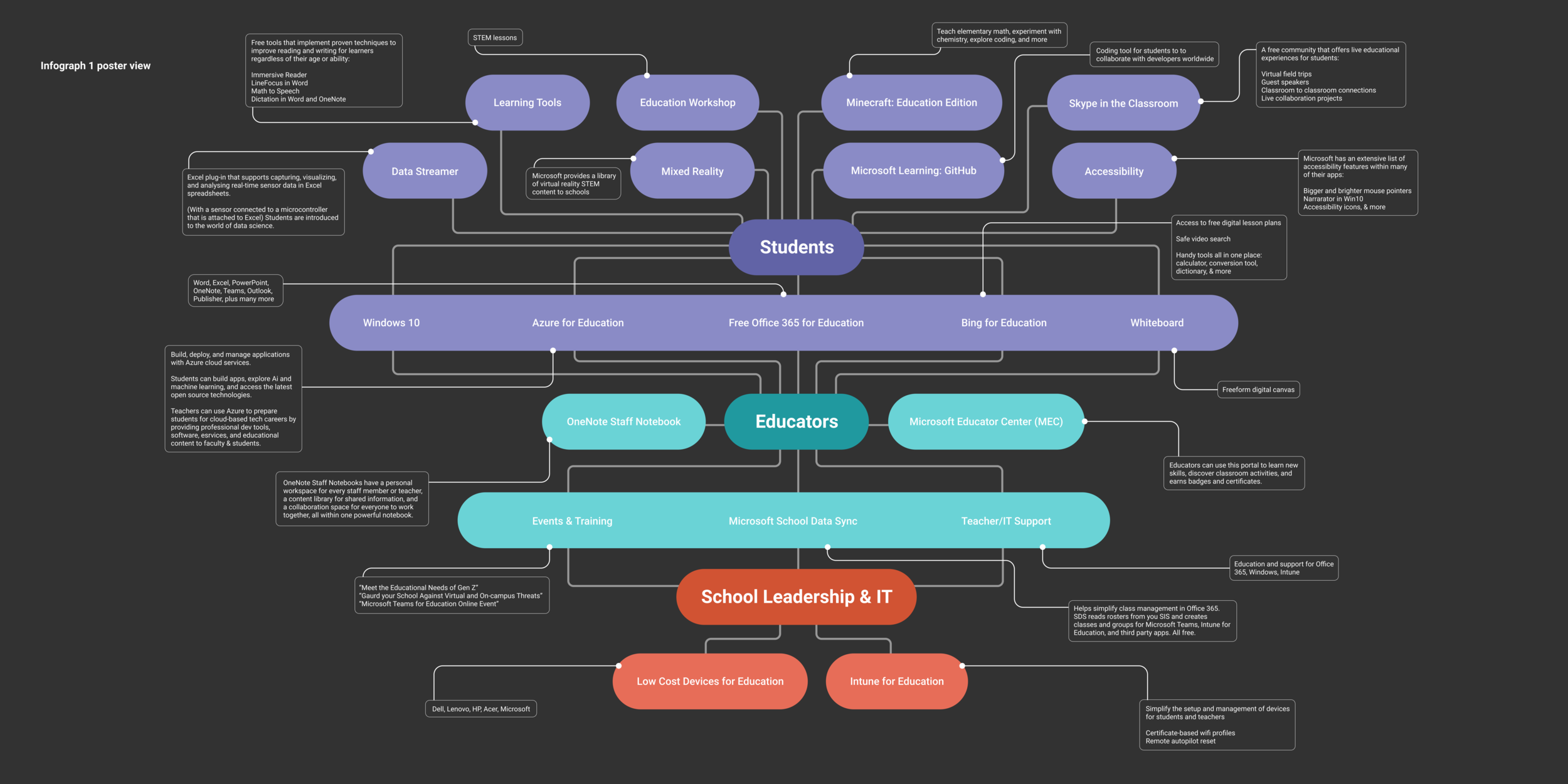
School Leadership & IT = “Administrators.”
Lines are busy and hard to follow. Try using less perpendicular lines like the original sketch had.
Students are the #1 most important focus and should stand out more.
All three users should pop more.
infograph 2 (previously D)
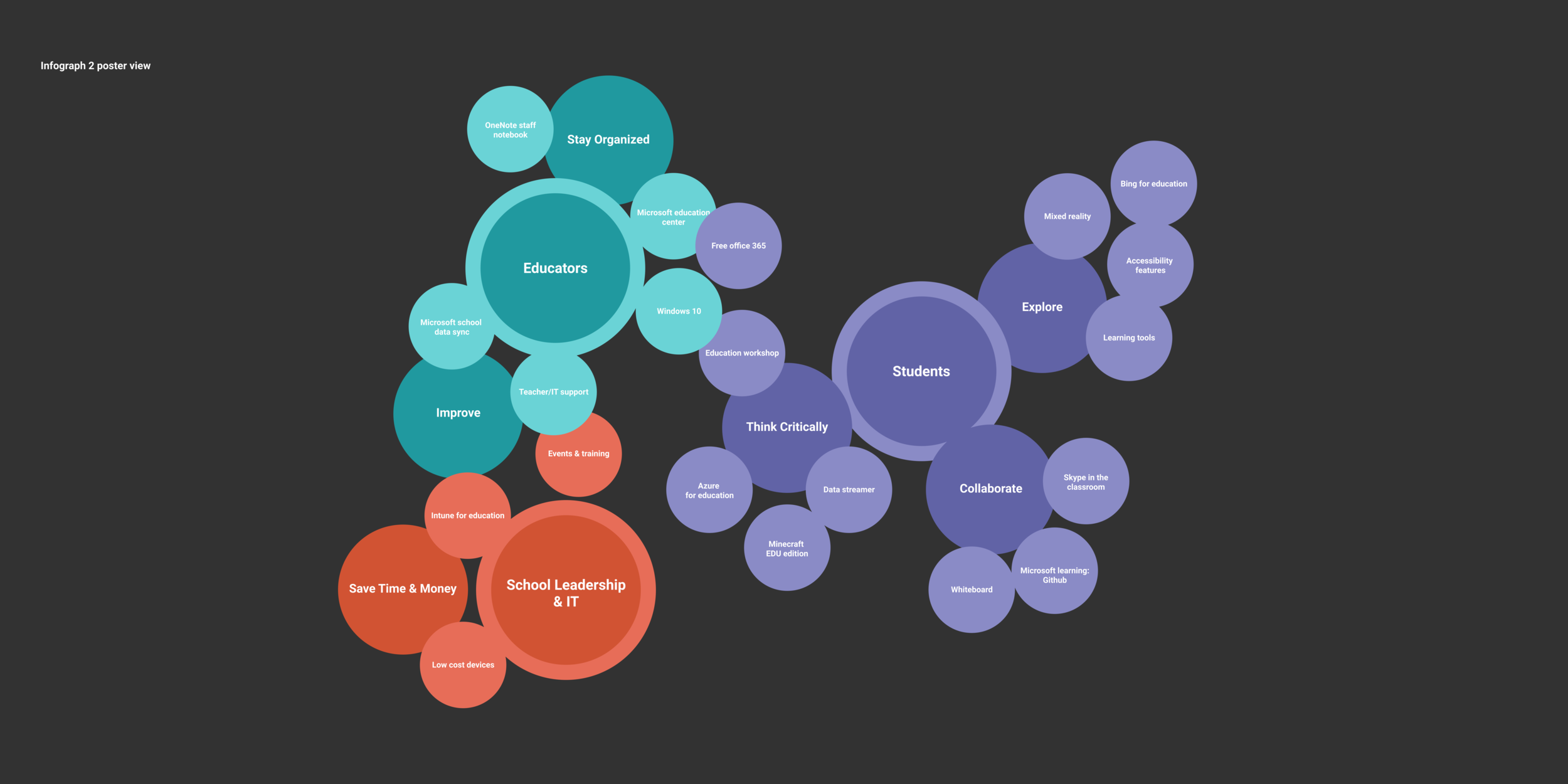
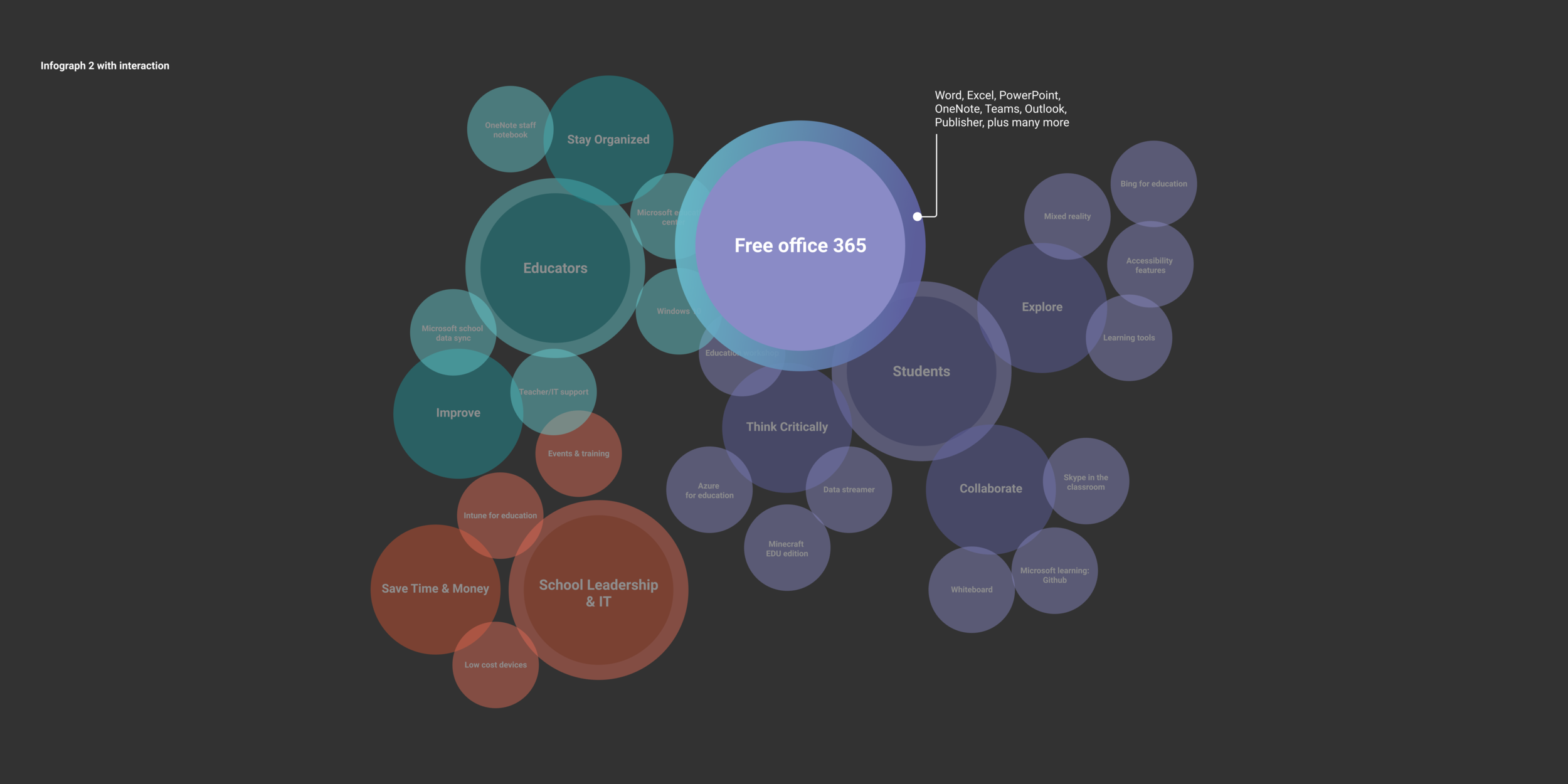
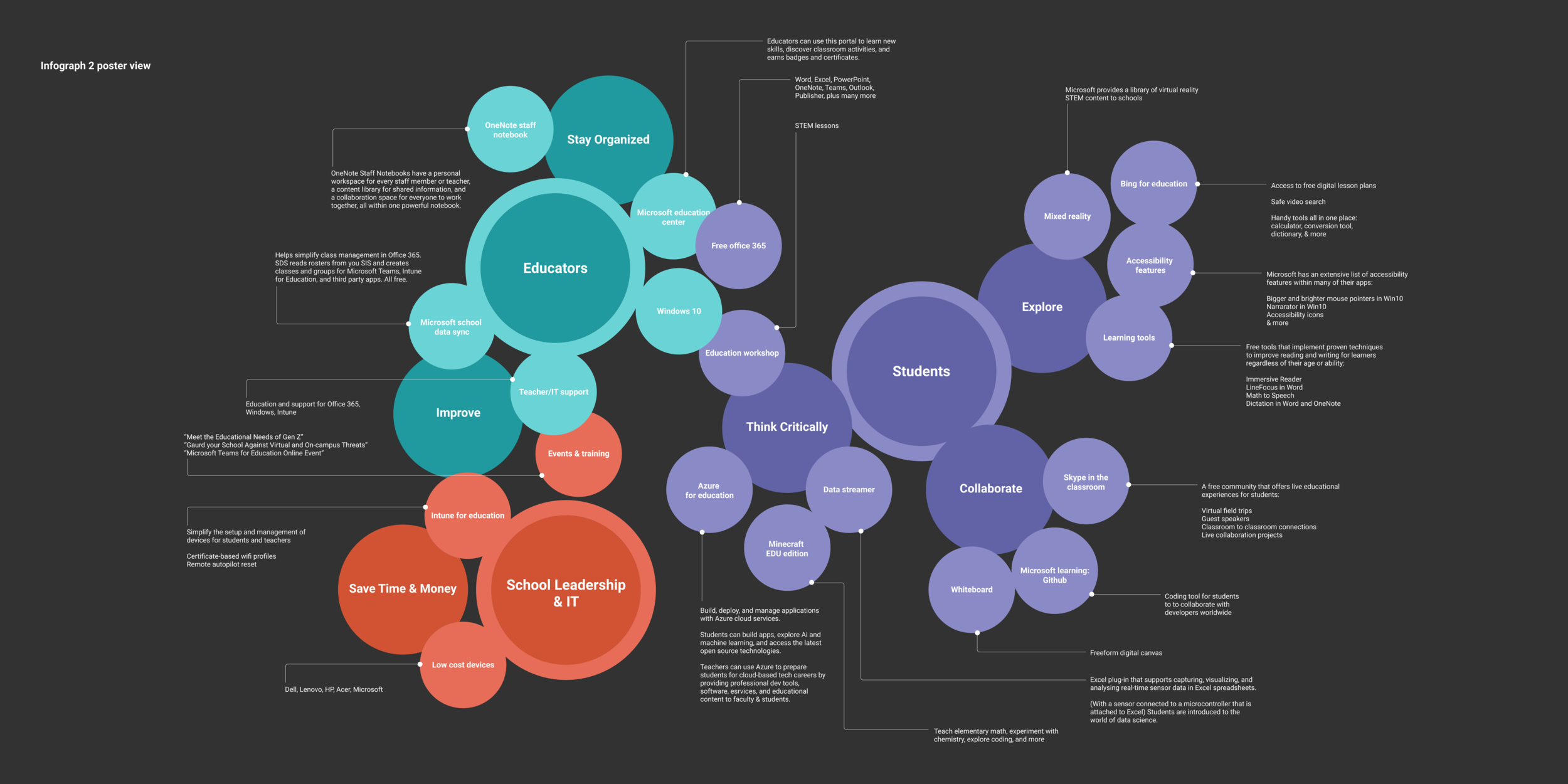
All three user bubbles should stand out more.
Be more intentional with the negative space.
Consider different arrangements of the three sections to improve hierarchy.
All three users should have more of a visual relationship to each other.
Phase 5: Figma comps v3
revisions
Using EDU’s feedback, the following changes were applied:
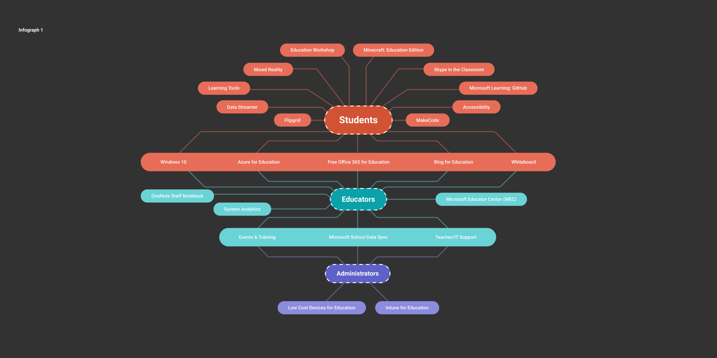
Lines become slanted to give a more “expanding” feel to the graphic.
The three users are emphasized with a dashed line.
Colors are tweaked to appear more vibrant against the black background.
Student’s bubble is scaled up and becomes orange for even more contrast.
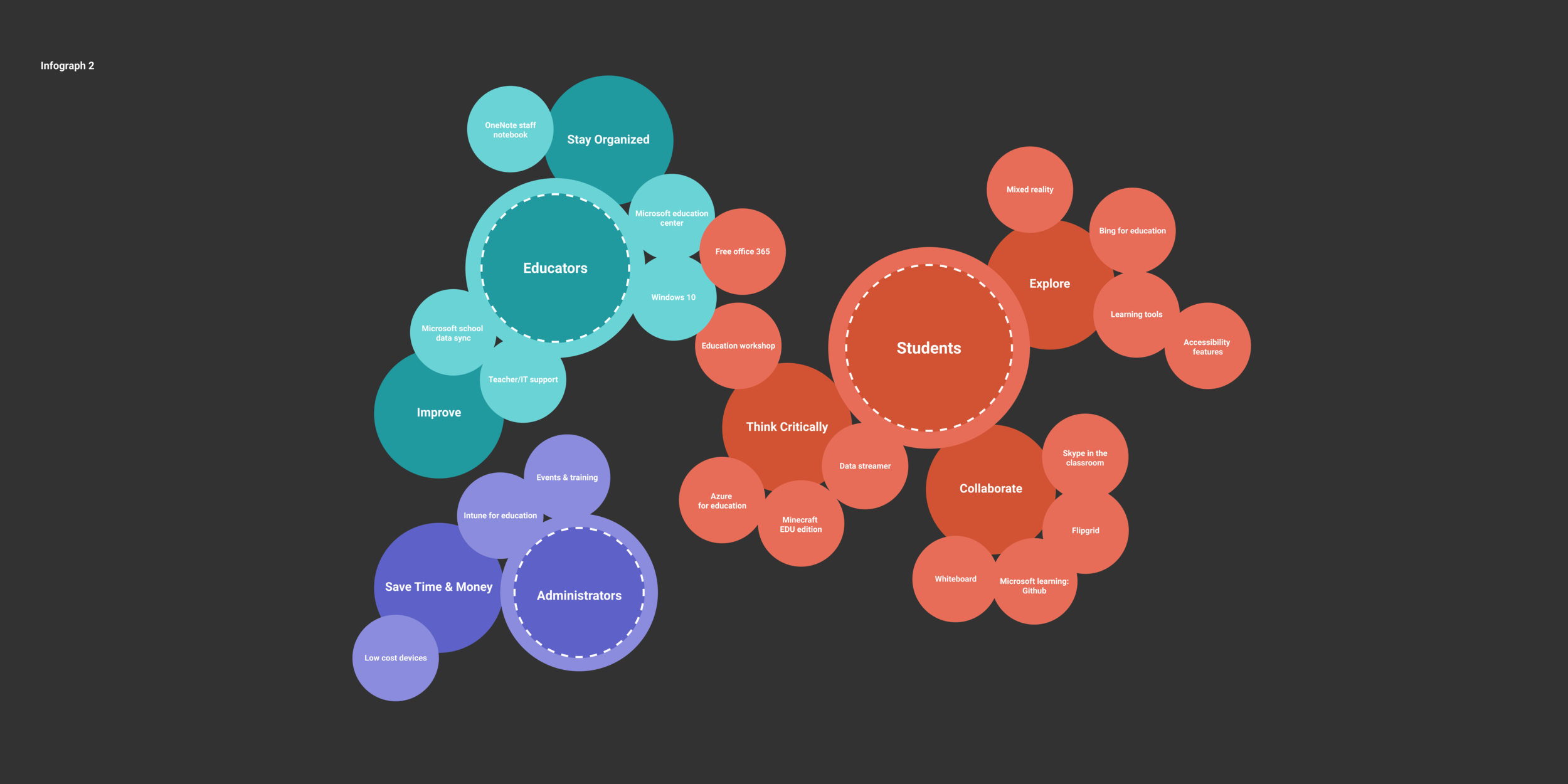
Negative space becomes more consistent, less of a distraction
Colors are tweaked to appear more vibrant.
Student’s bubble is scaled up, Administrator’s bubble is scaled down.
Dashed lines create emphasis on the users’ bubbles but feels off-brand.
Moving Forward
At this stage my teammates and I agree that Option 2 is the stronger of the two; it’s a more simplified and dynamic way to structure the data. It has potential for interesting motion design with its bubbles, but can also stand alone in a poster format. Moving forward I continue to iterate on how there can be even more hierarchy, a more emphasized relationship between the three users, and a more intentional way of formatting the text that expands to describes each product.
Phase 6: Figma comps v4
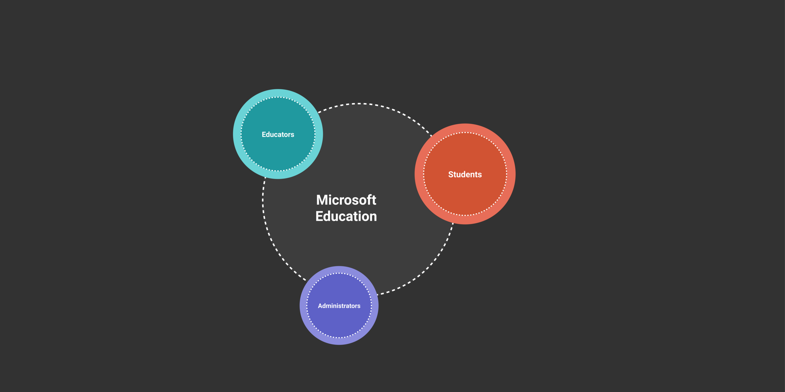
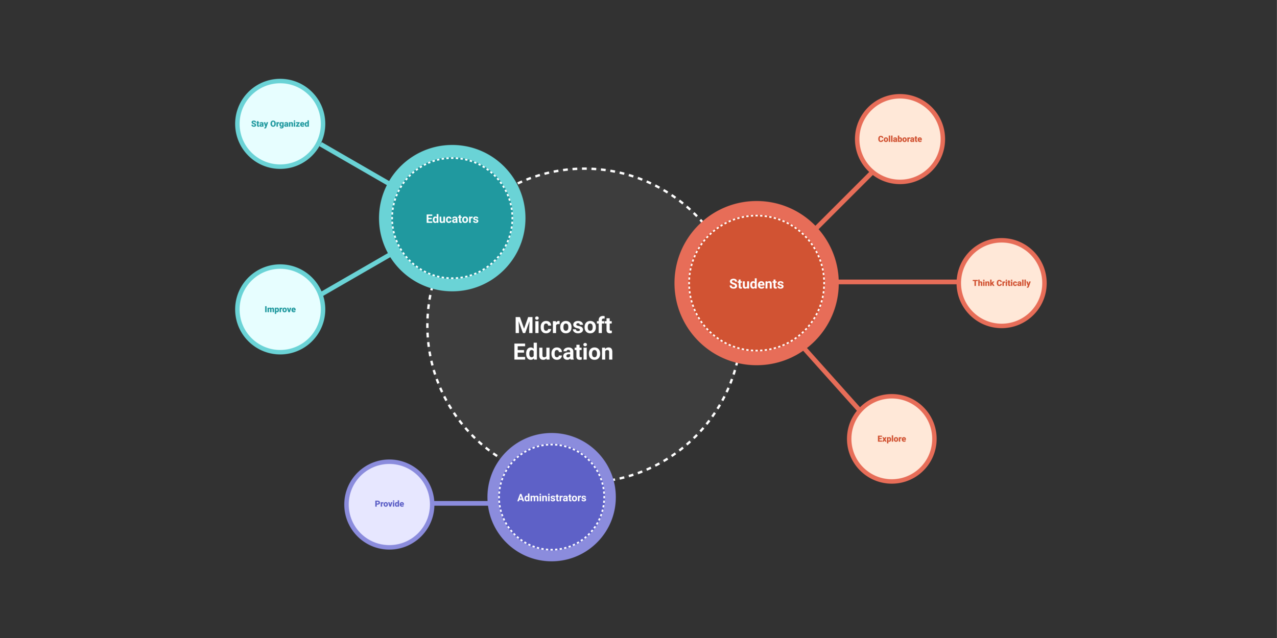
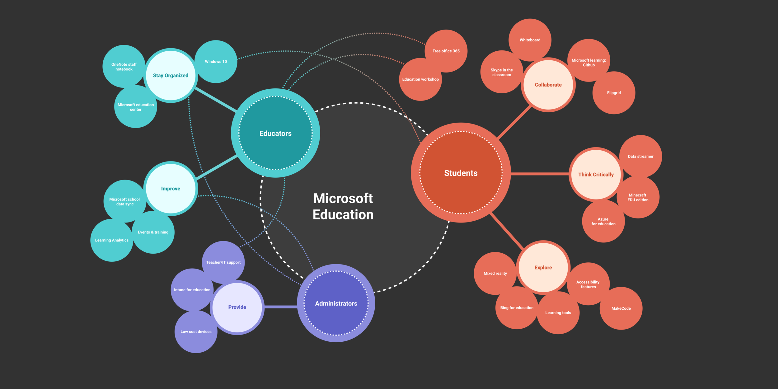
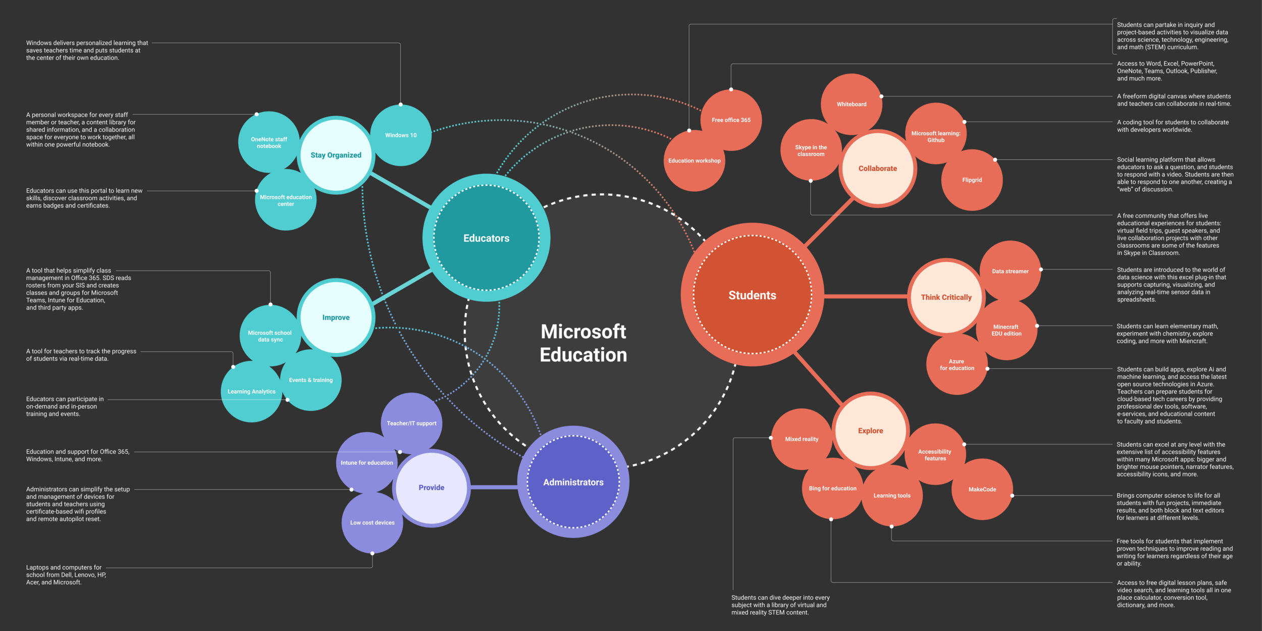
Feedback
At this point the EDU team approves my infographic concept. The following were elements that needed more exploration:
Color choice
Dotted lines that represent products that apply to more than one user: is there another way we can show this?
The title “Microsoft Education” is not fully realized
Interaction and opportunities for motion
Phase 7: Figma comps v5
A New Mood
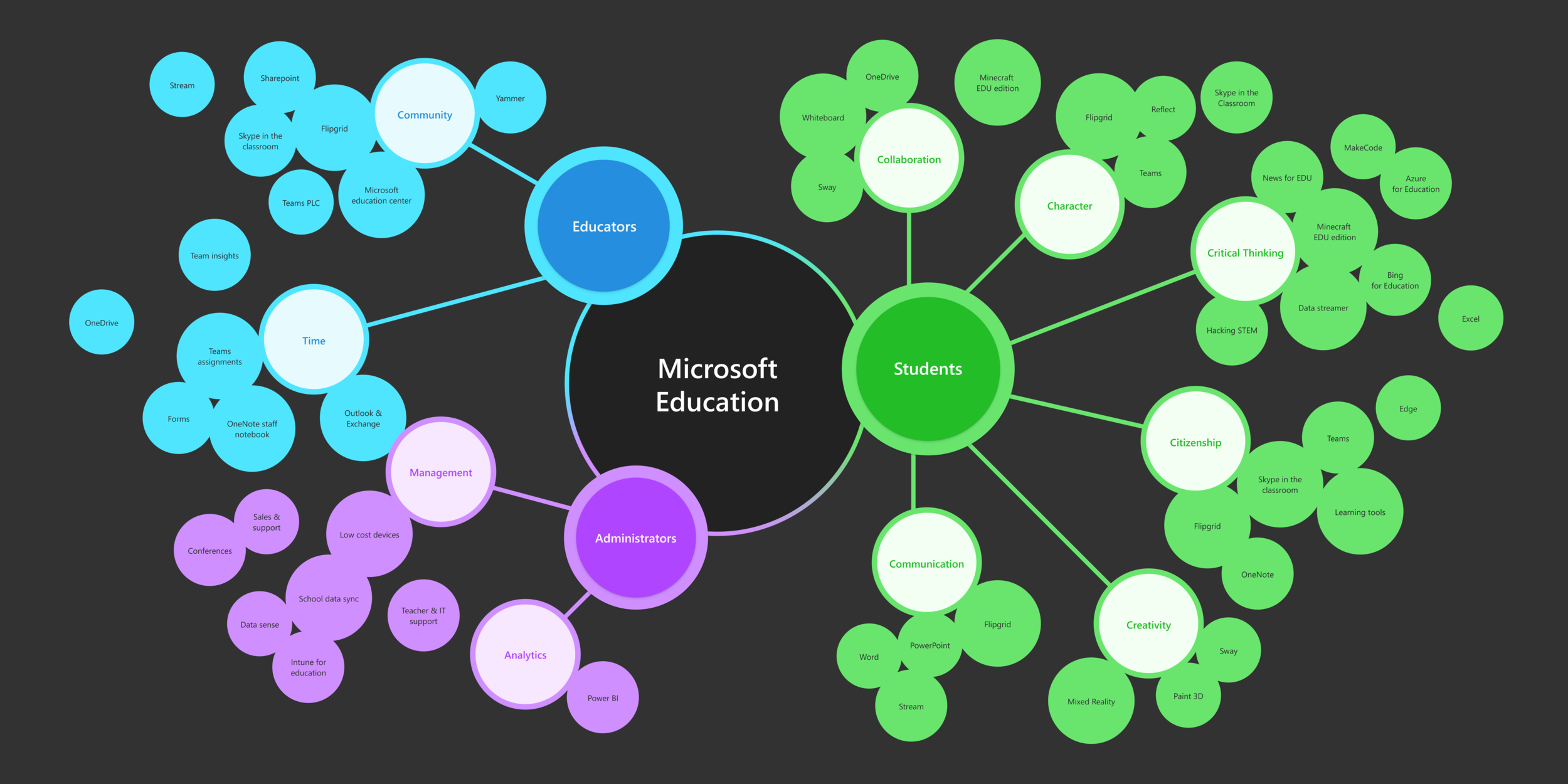
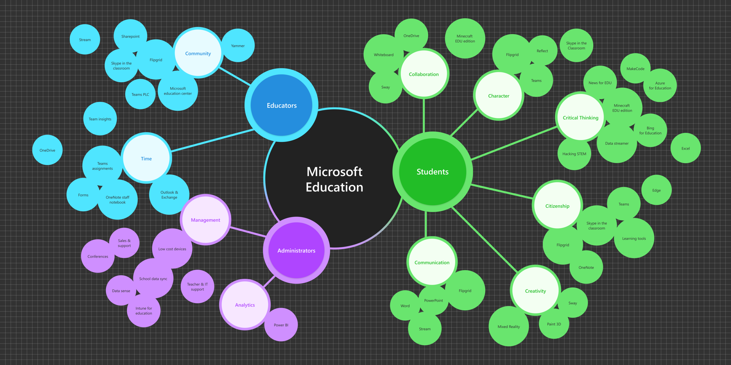
The final infographic concept features colors taken straight from the Fluent Design system website. The dotted lines are removed and instead, product bubbles are duplicated where they apply to more than one user. The title “Microsoft Education” is centered, more grounded, and more prominent with a new visual treatment.
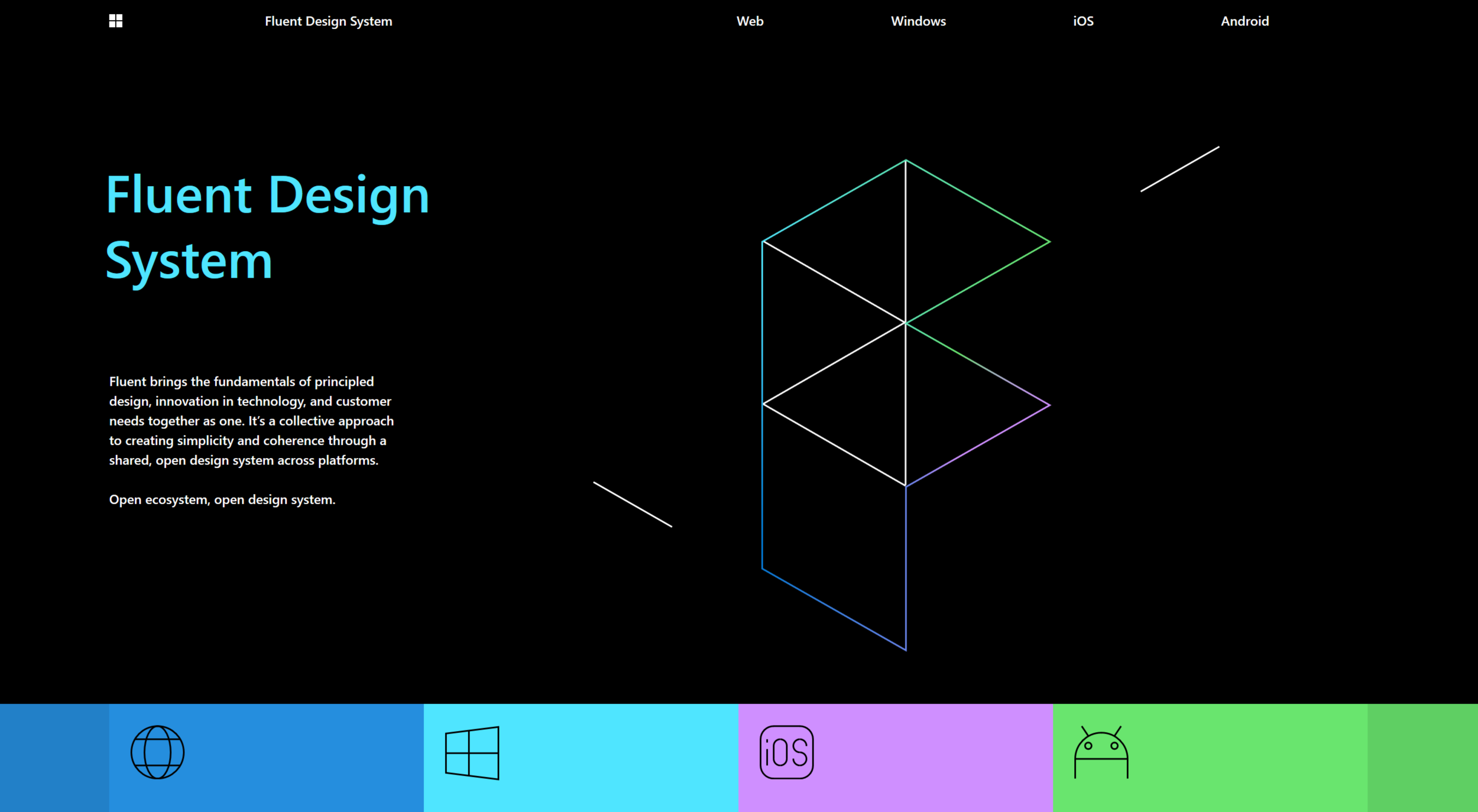
Fluent Design website (color reference)