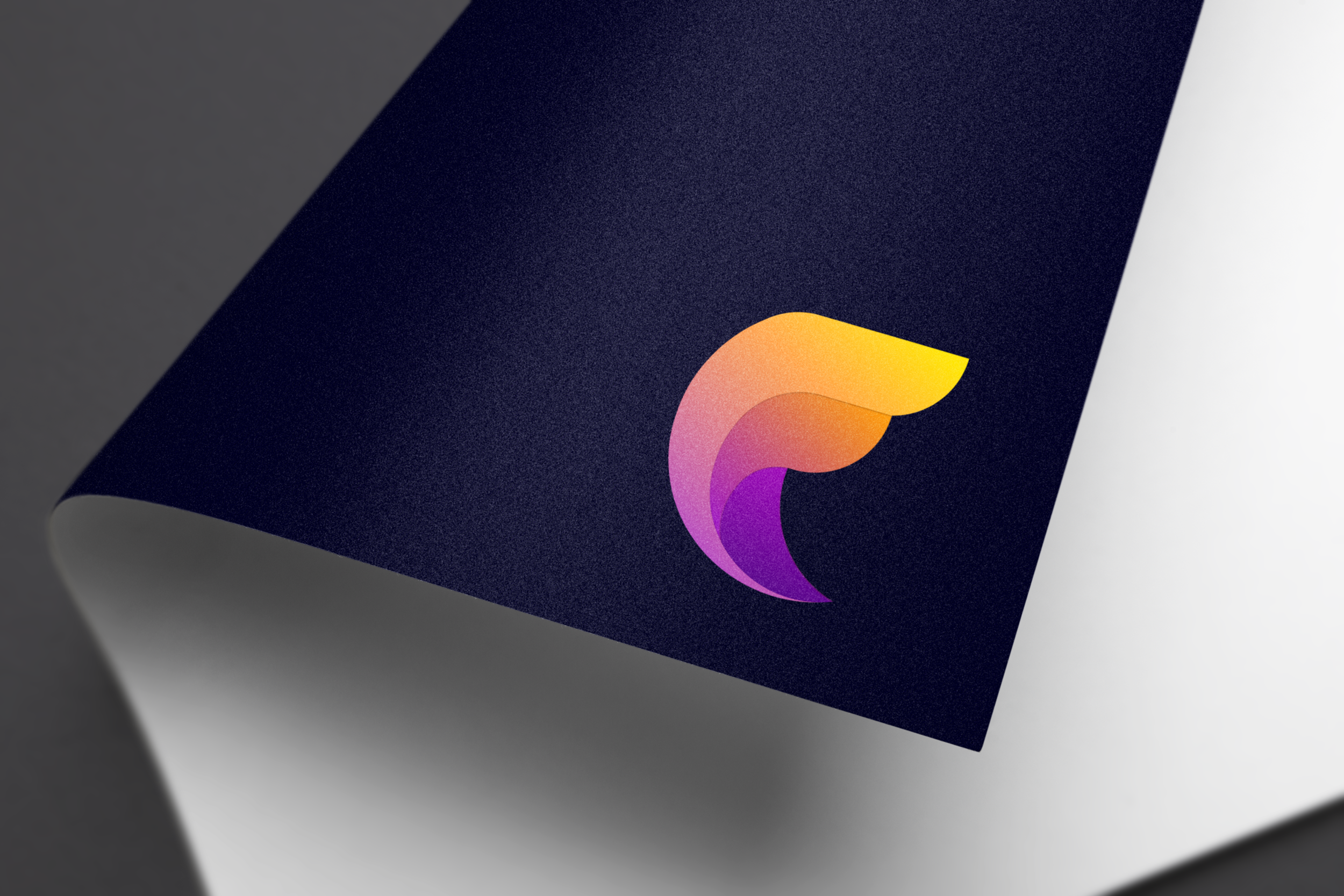
The Brief
Create a logo for an internal developer tool/service that will be used by Microsoft AI&R engineers.
Keywords provided
Developer ecosystem, micro-services, agility, security, compliance.
“Falcon is transformative, informative, secure, simple, and trustworthy”
Phase 1: Research
The Problem
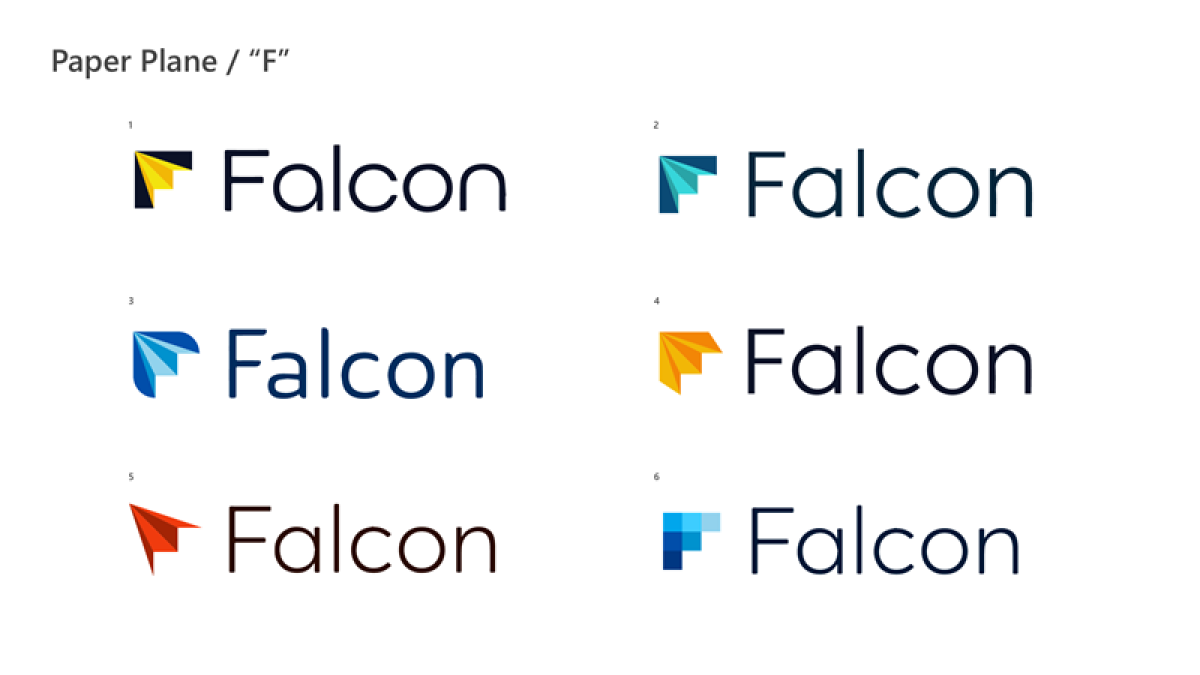
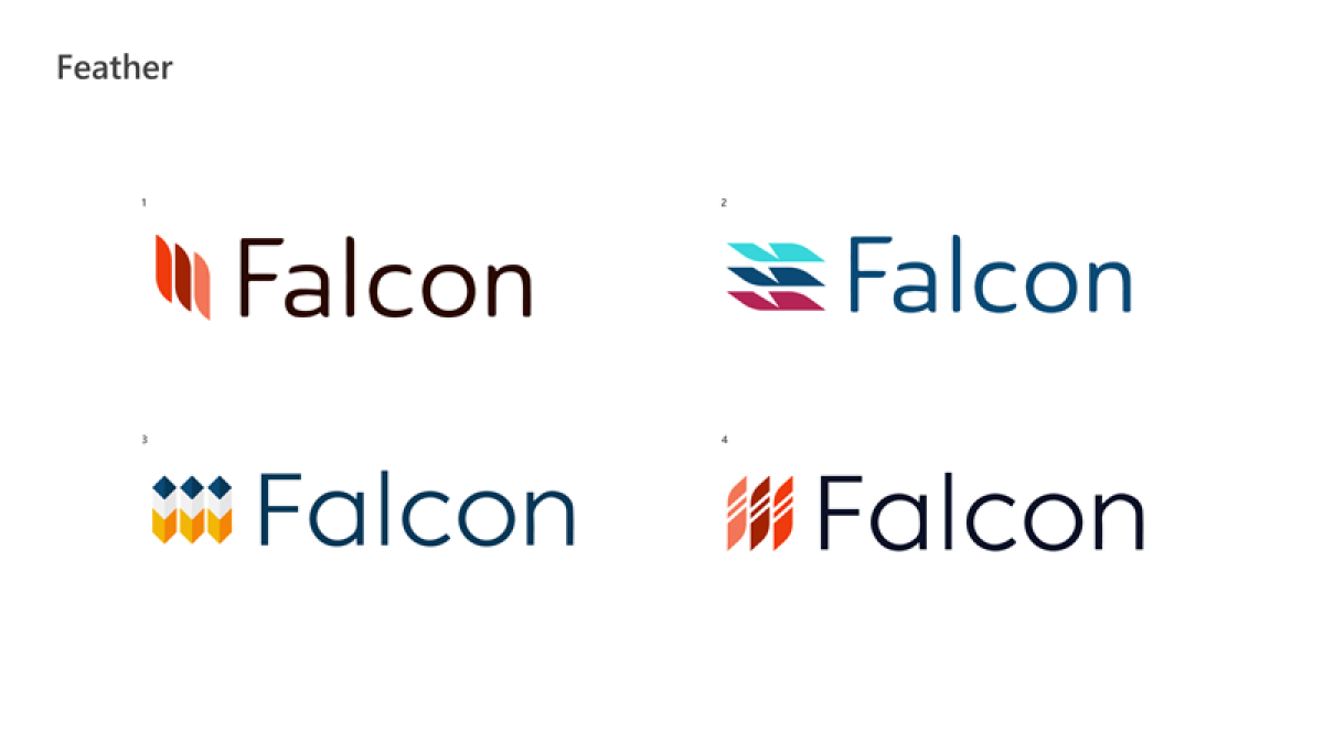
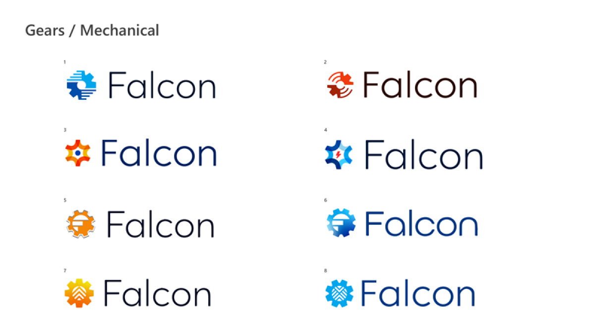
The Falcon team had a previous designer work on some logo marks. They told me these explorations were too literal; “there’s nothing special about the name being a bird—it was just a name.”
The Solution
Take the energy, agility, and vibrancy that the name Falcon symbolizes, without using literal representations of wings, beaks, or feathers.
Competitors
Researching competitors helps me understand the visual language that is appropriate for this service. Colors used by these other businesses are calm or muted, signifying trust and professionalism. All logos are sans serif, a nod to the digital and progressive nature of the service. How can Falcon stand out among its competitors?
Mood BOARD
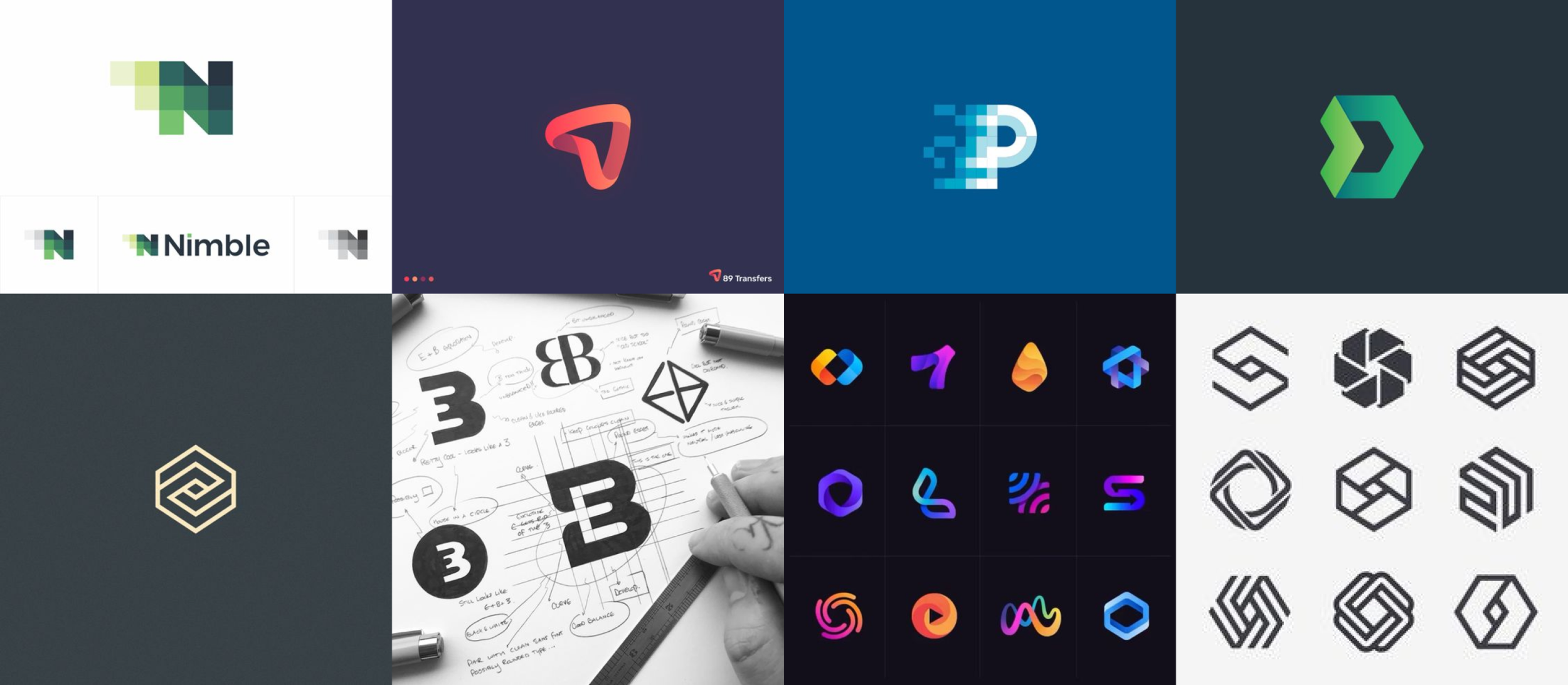
To avoid cheesy graphics, there is potential in using geometric/abstract shapes to signify some of Falcon’s keywords. Another option is creating an abstracted “F” as the mark.
Phase 2: IDEATION
Sketches
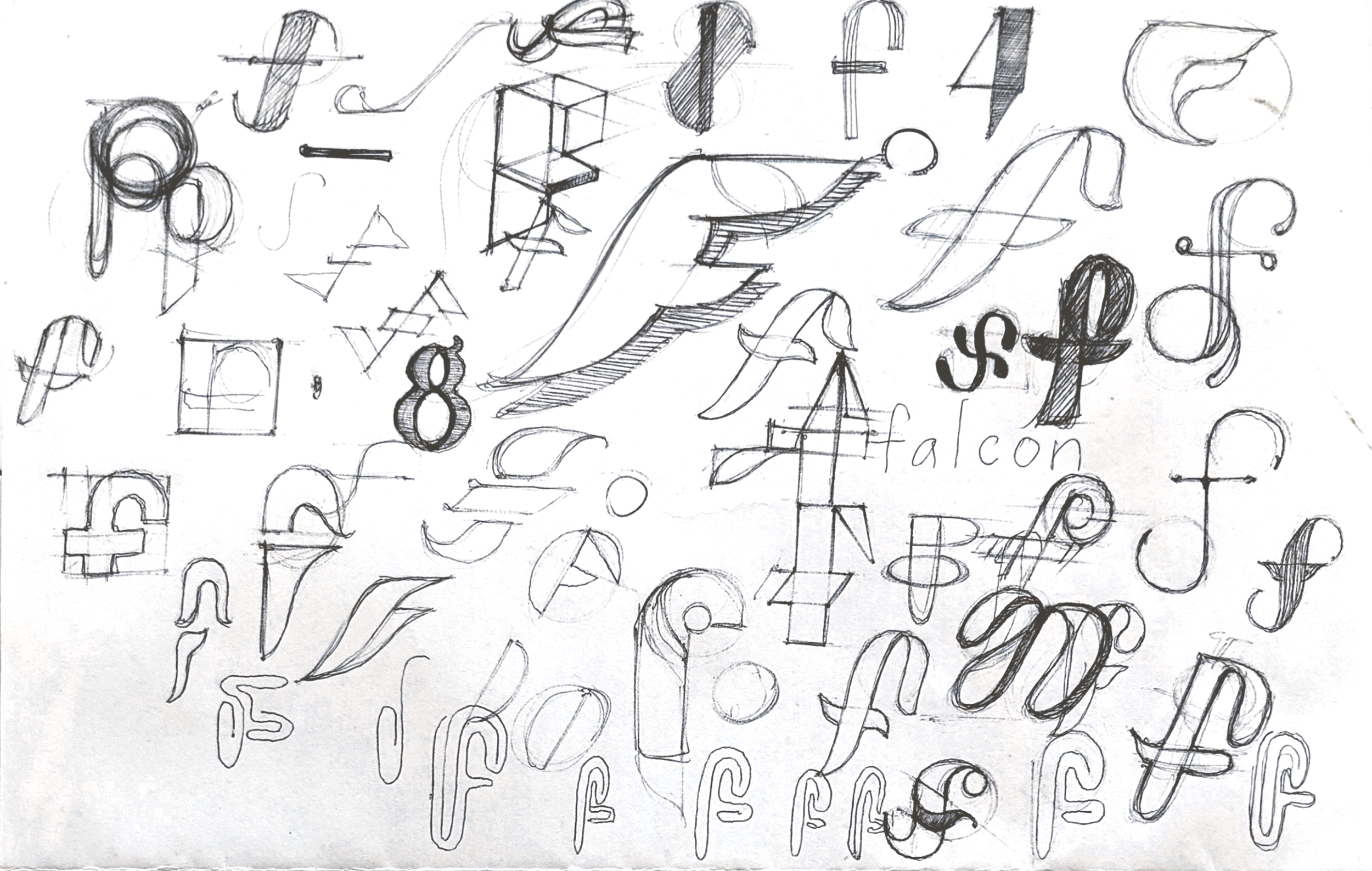
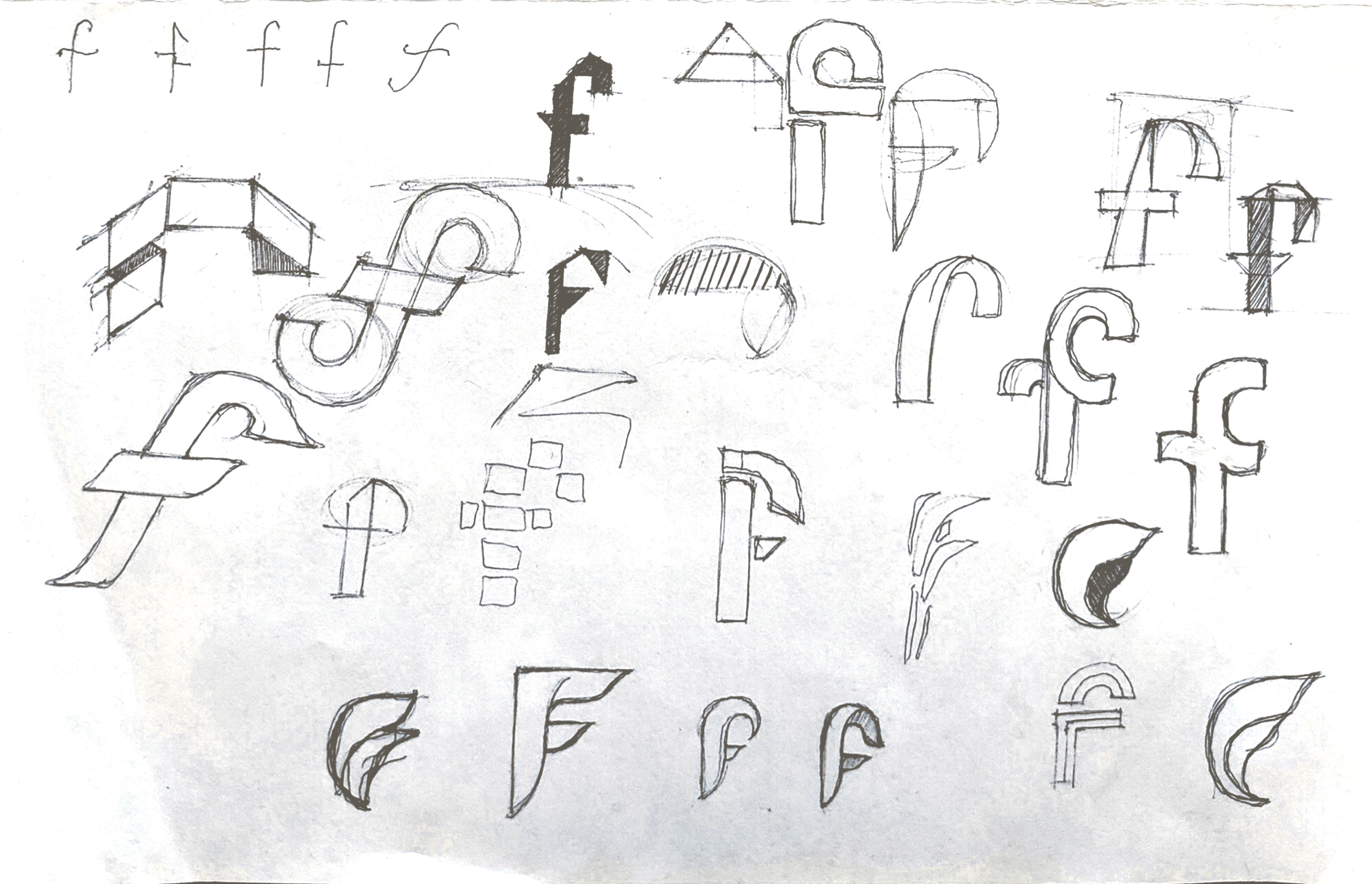
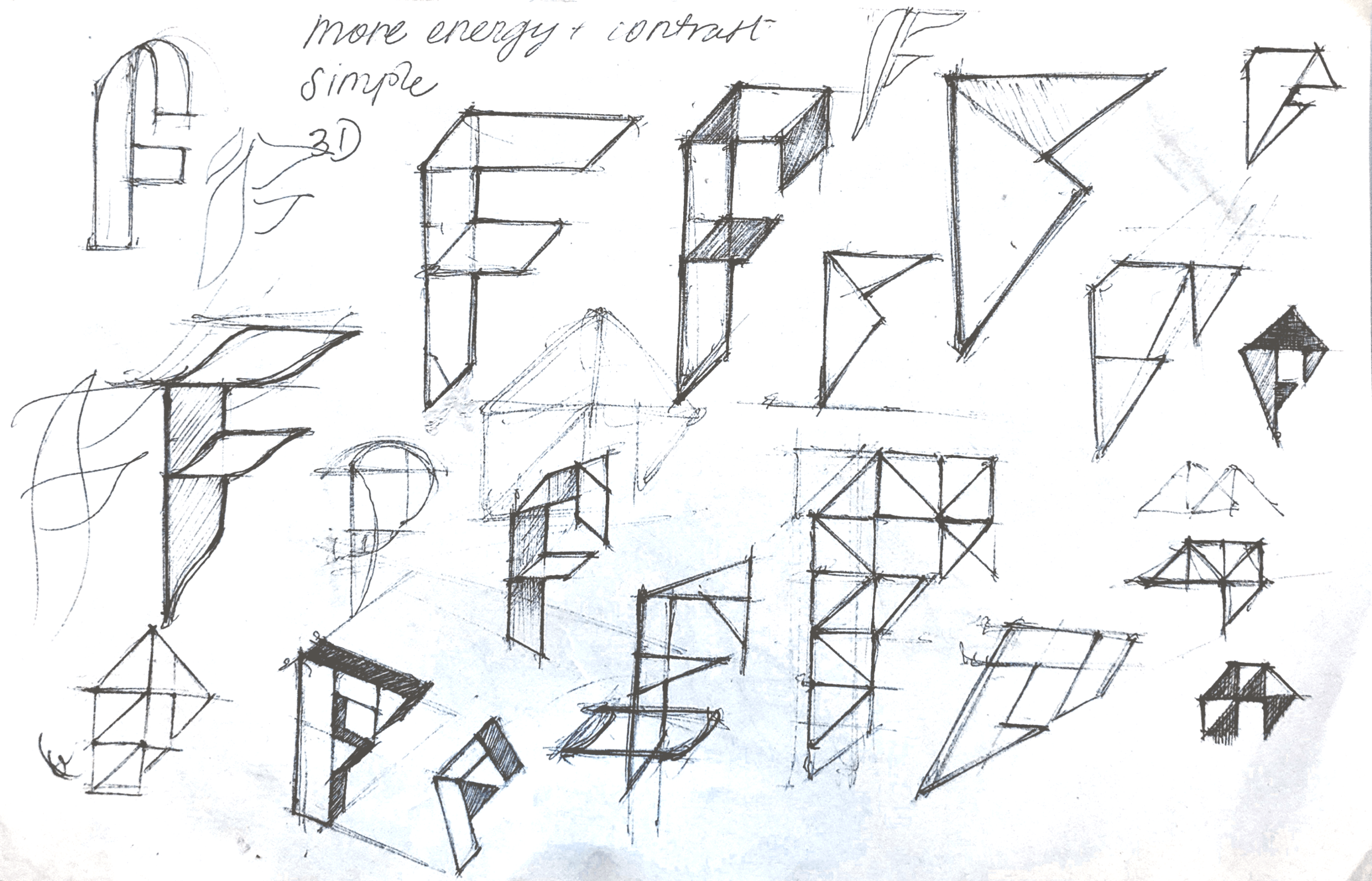
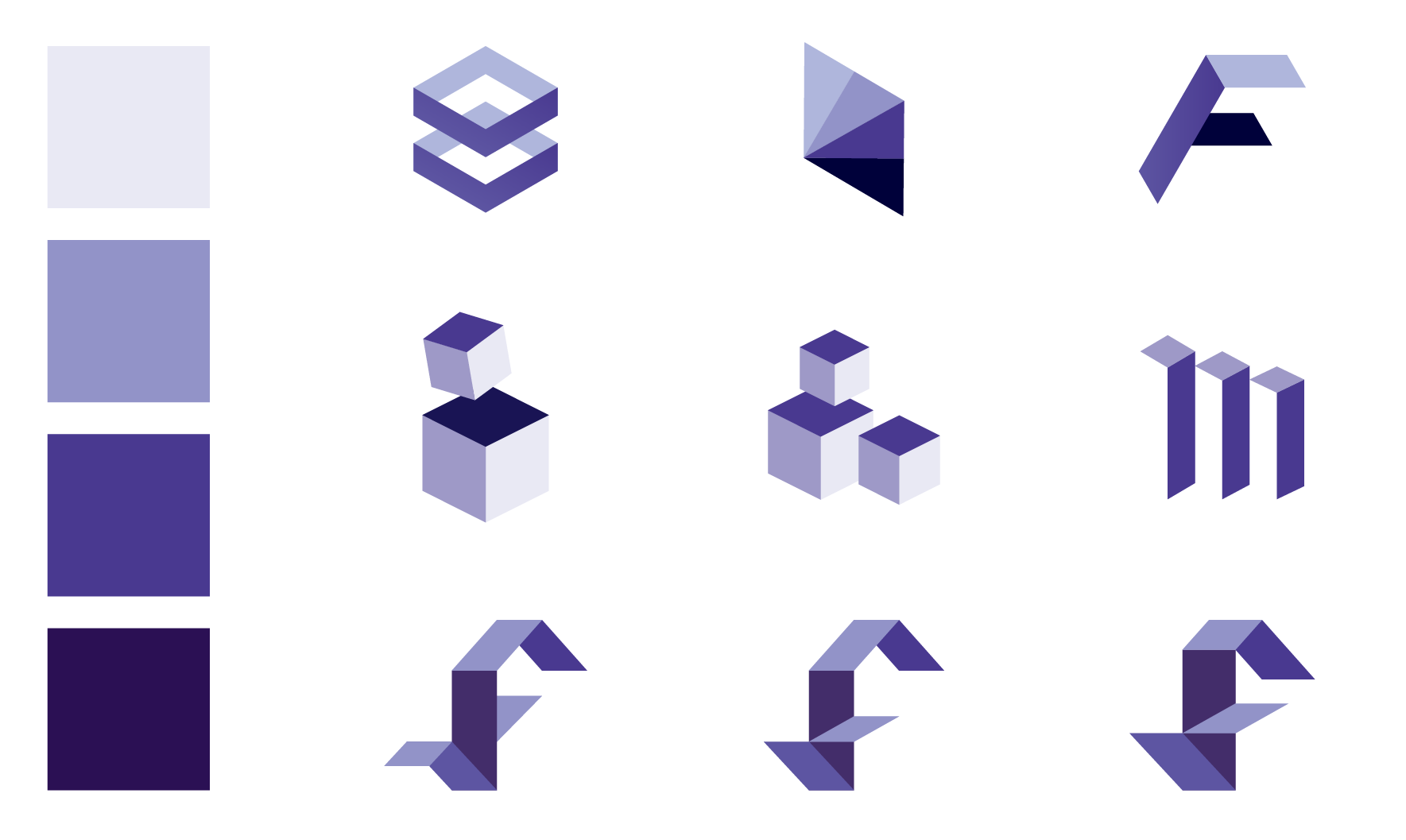
Shape exploration
Phase 3: logo concept v1
round 1
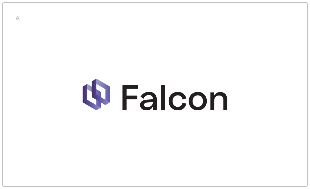
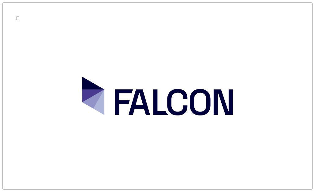
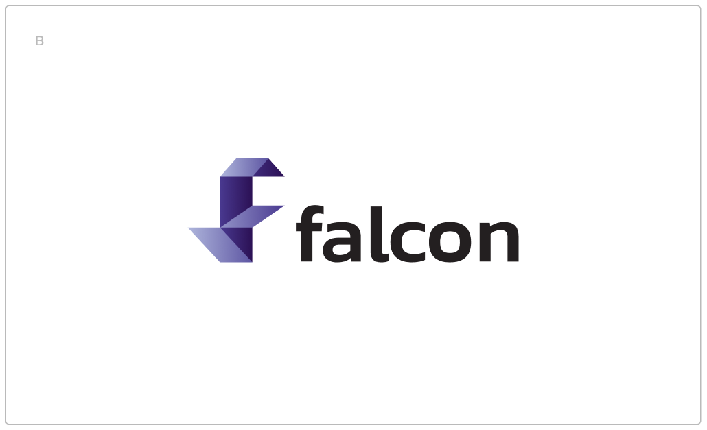
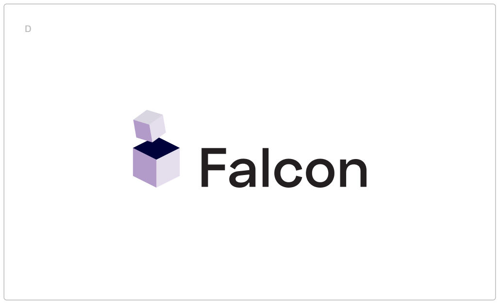
The first round of logos show a range of typography and icons. The concepts are kept simple in order to get feedback a early in the process as possible.
Feedback
Favorites are A and B.
Needs more energy/contrast to help deliver the message.
Option A could work if it was more energetic, nimble.
The client requests a round of iterations that combine the secure, logical, simple essence of a square form with the nimble, intuitive, elegant (features of Falcon) essence of the more organic form. Option B is starting to go in that direction, with the structured look of paper/origami combined with elegance of its folds.
Phase 4: logo concept v2
Round 2
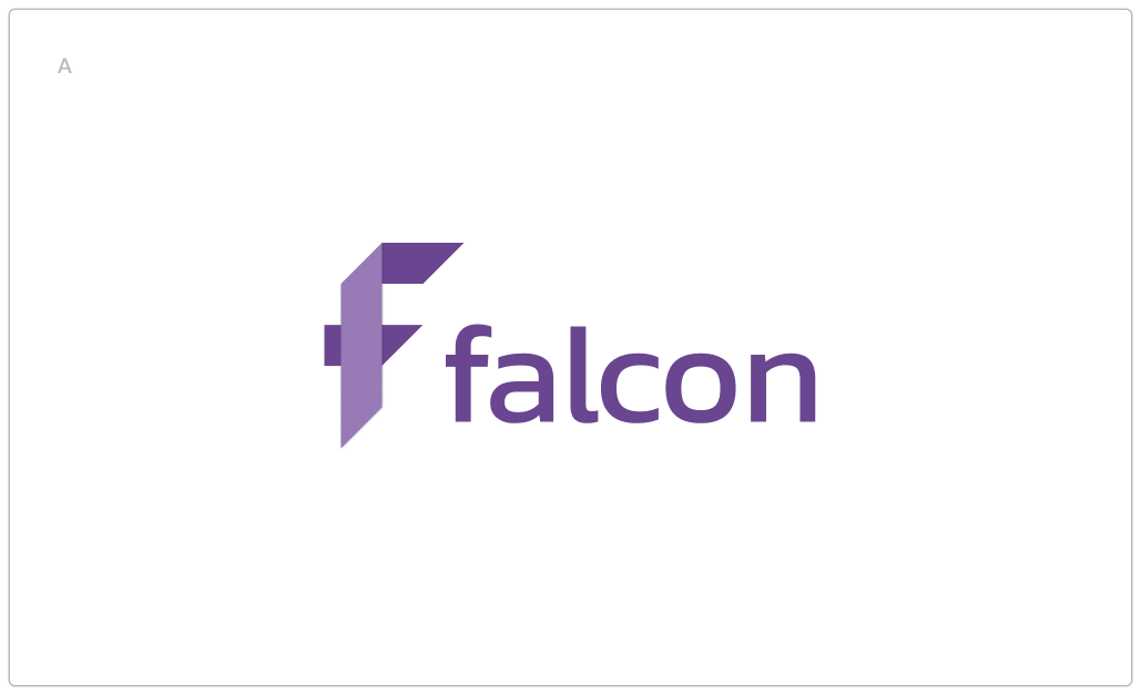
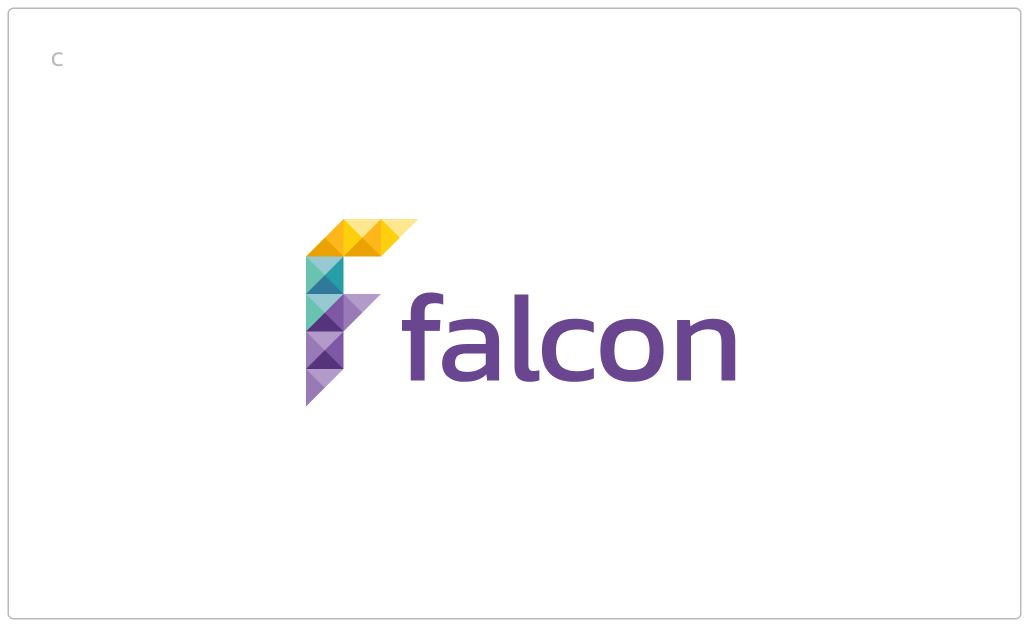
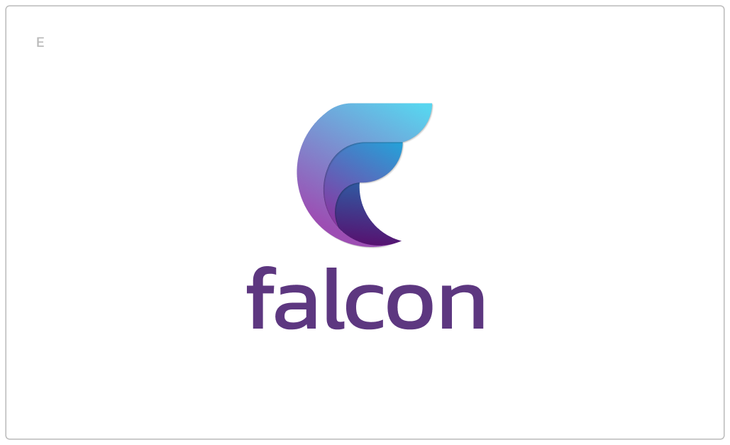
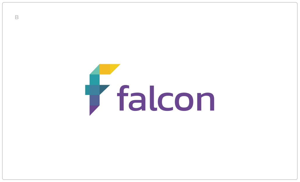
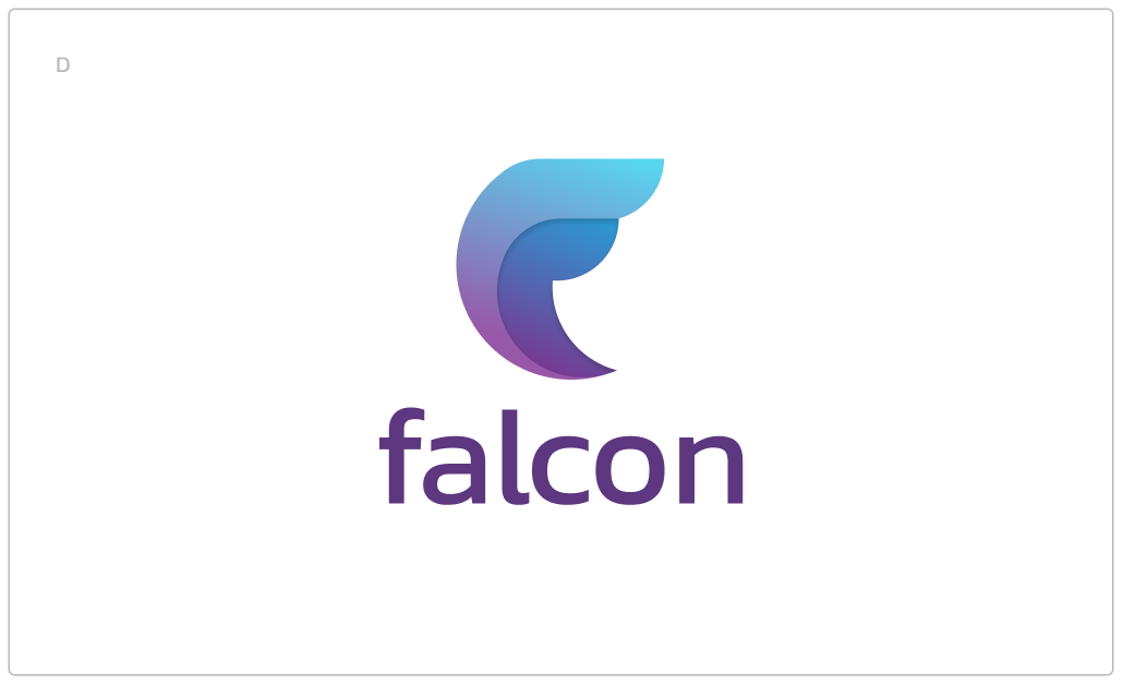
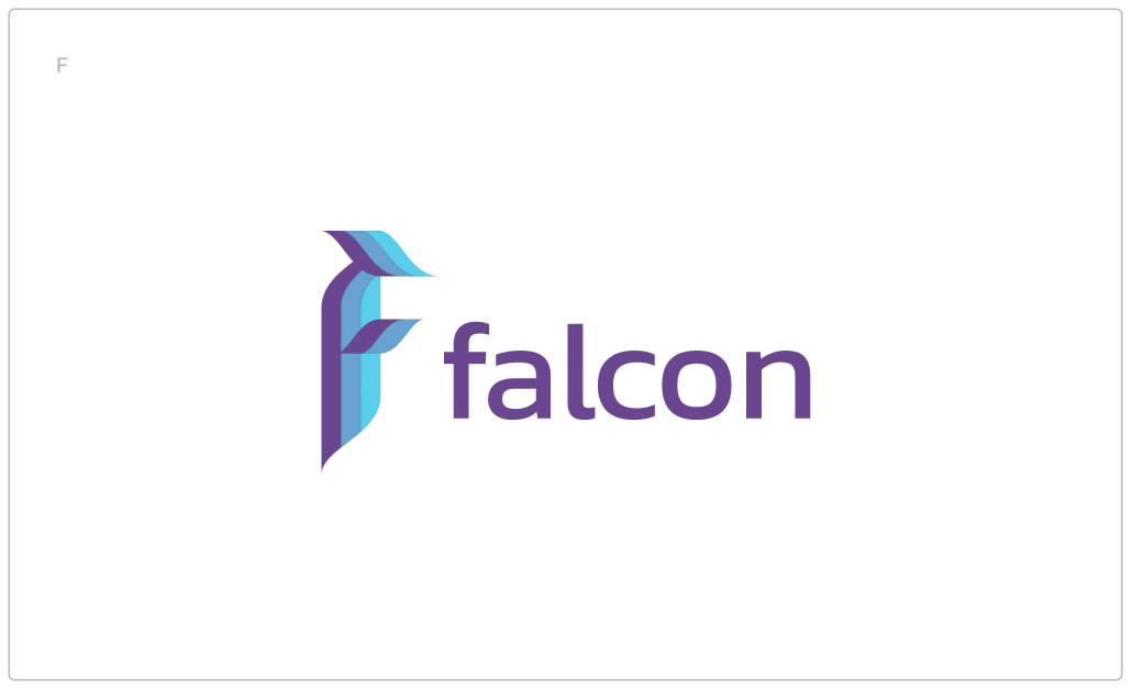
With the typeface chosen, the second round of logos focus on icon shape and color story. Each icon is created with keywords in mind from the previous critique: nimble, secure, simple. Purple and blue are the primary colors because of the trustworthy associations they hold, yellow is added for contrast. Gradients are applied to options D and E because they represent the calm and elegant brand that Falcon represents.
Feedback
Option A meets the origami shape that the client was after, but it’s an icon that feels too familiar/perhaps already exists.
Options B and C have surfaces that are too complex.
Option E is preferred over D; it has more dimension, has a bird-vibe without being literal, and also represents the F for Falcon without being obvious.
Option F is scrapped for next round.
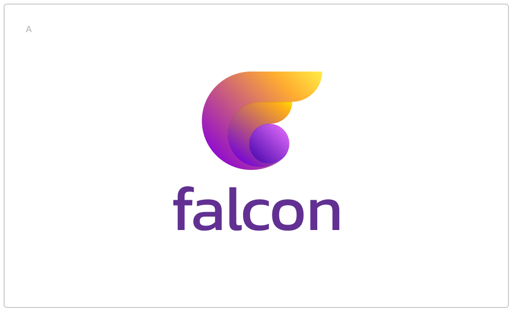
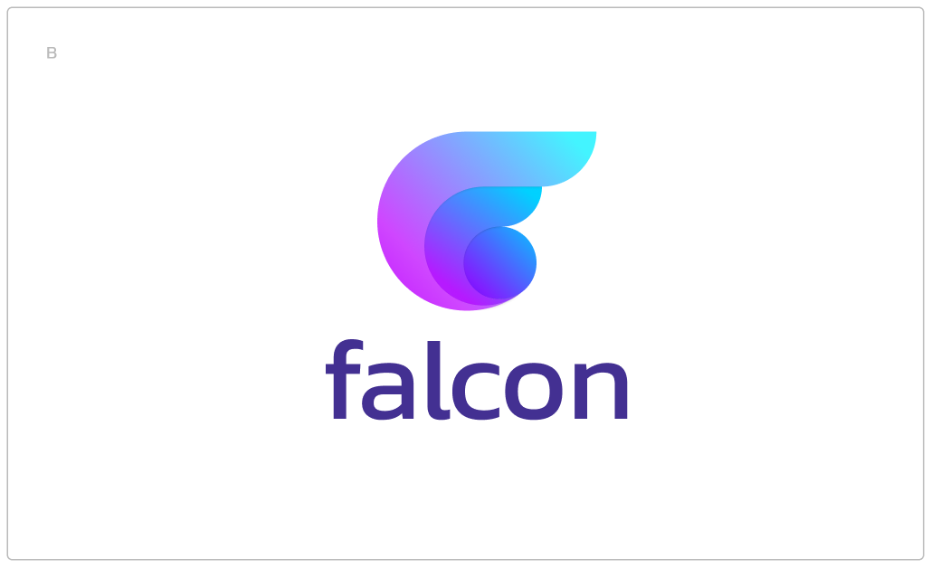
“I’d like to see if we could make variations on E with the more vibrant colors of logos B&C and if possible explore the soft & simple shape (Falcon) protecting something burgeoning (service), which is the picture I have when I see E?”
Phase 5: logo concept v3
Round 3
The goal of round 3 was to make a variation of Option E from the previous round and make it look like it’s “protecting” something. This is meant to represent a metaphor for Falcon holding its flourishing service. The colors were brightened and saturated per client’s request.
Phase 6: logo concept v4
Round 4
Colors are refined and applied to the two strongest concepts.