What is Ripl?
Ripl is a…
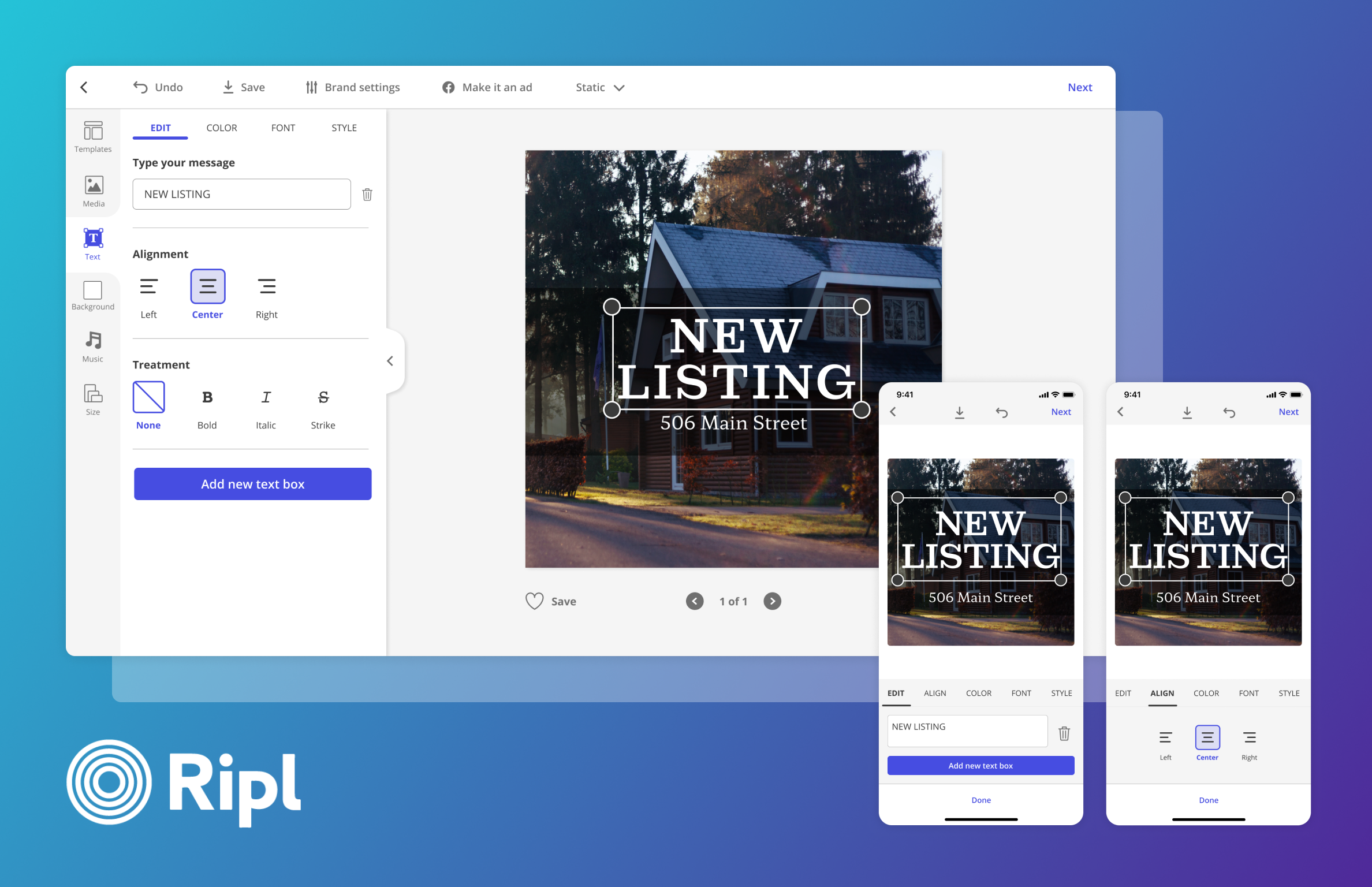
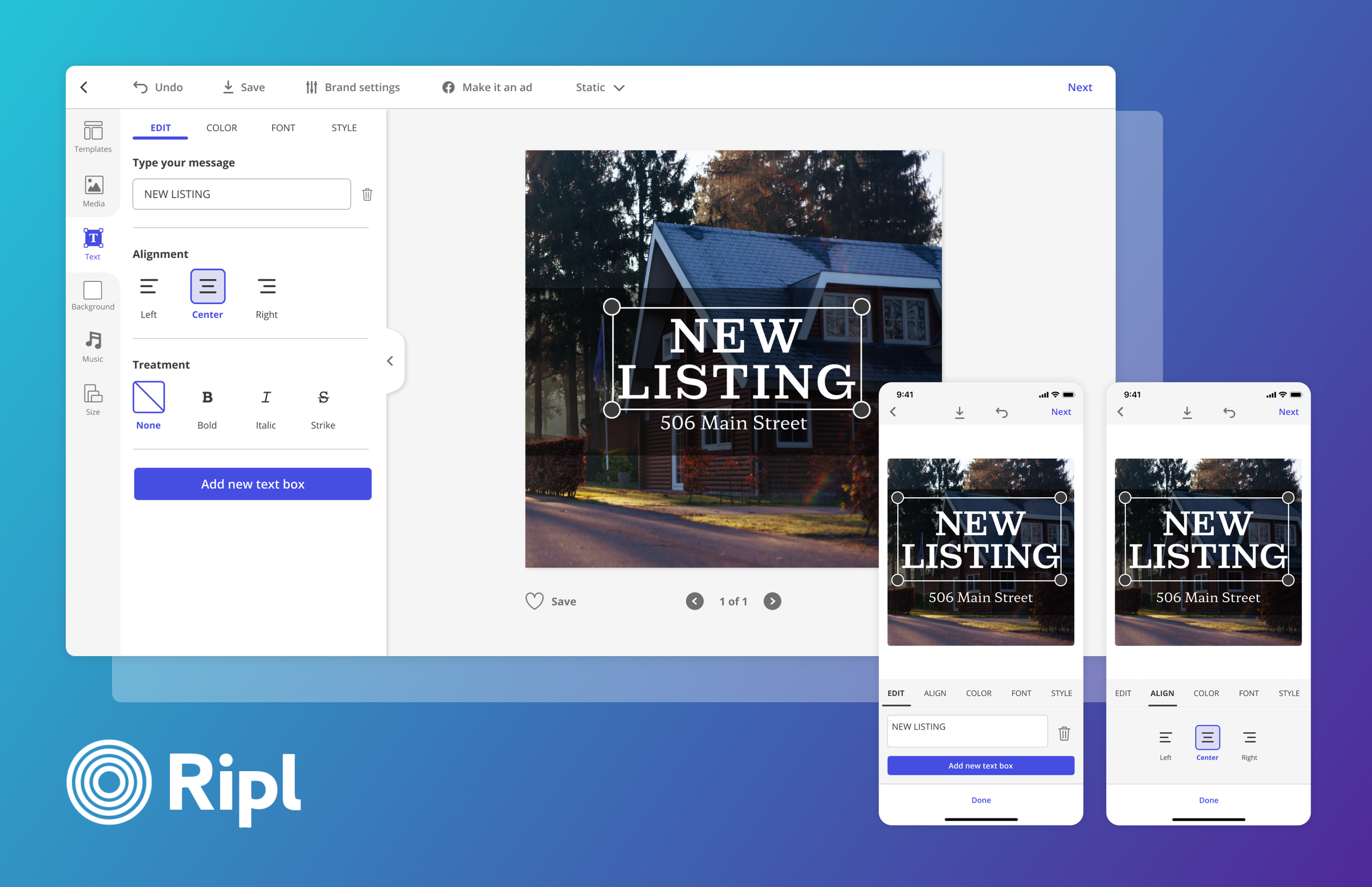
Social media content creation & scheduling tool for web app and mobile
Guide to social media creation & success
Facebook & Instagram Ad creator & submitter
Who is the Ripl Customer?
Small business owners
Businesses with 1-5 employees on average
Majority of 45+ year olds
The Brief
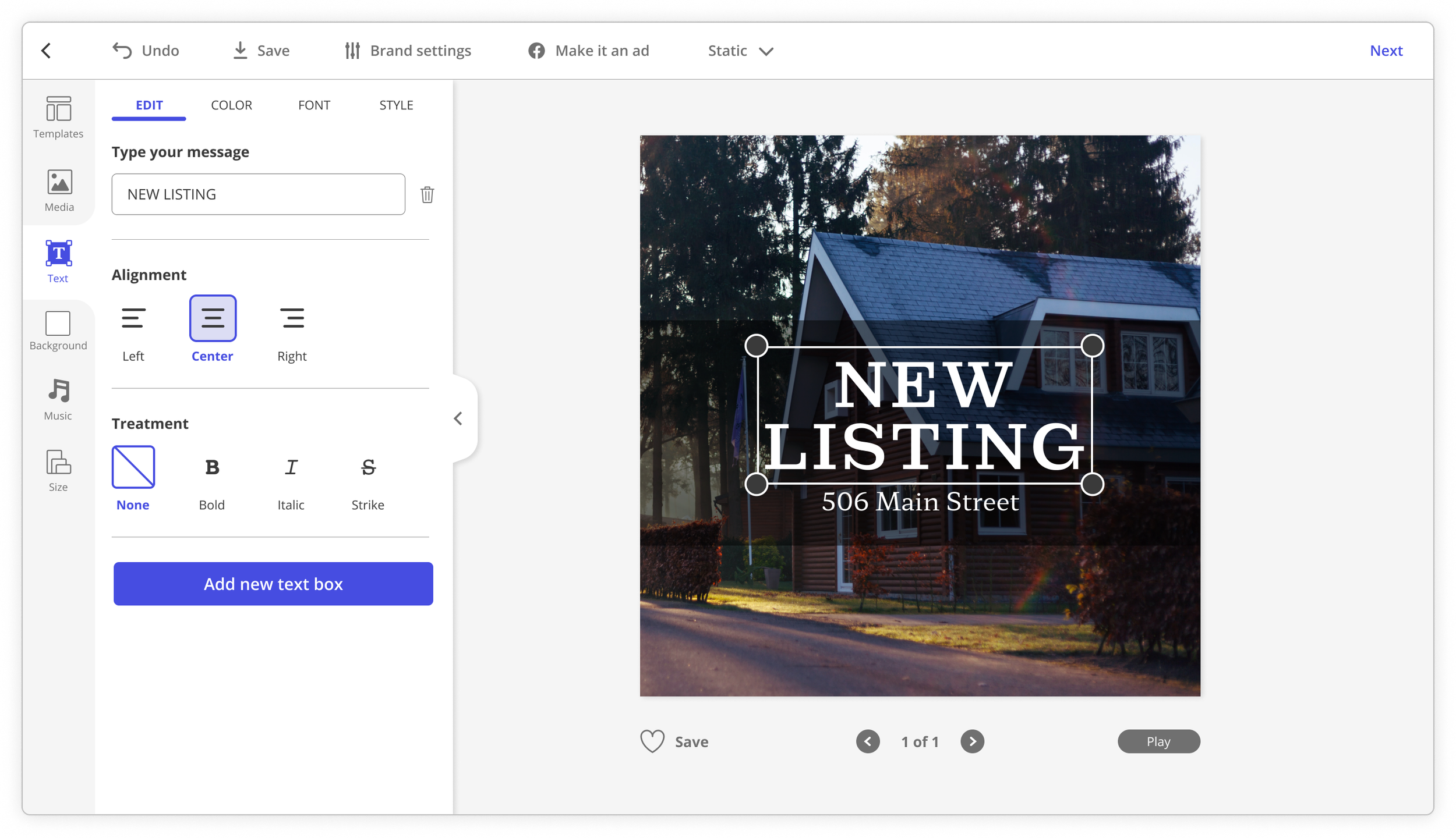
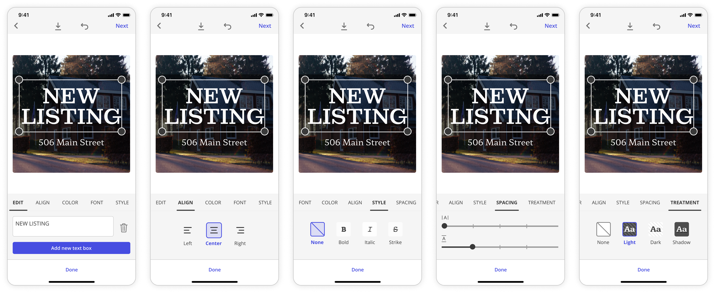
Design a new experience within the Customize page where users can edit text in context, overriding the previous experience where text colors, fonts, and styles are globally linked.
WHY?
Ripl users continue to request this as a feature through our Customer Support channel
Contextually editing text is a common experience across competitors and Ripl needs to keep up
GOALS
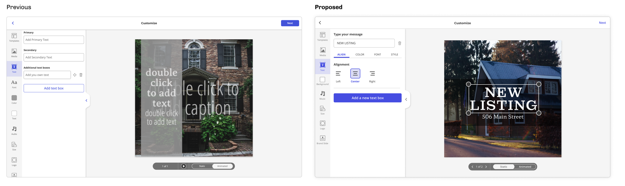
Give users more control over how they style their text
Maintain some of the guardrails we currently have so that their content stays cohesive and legible. Our users are not designers.
Zooming out
Overall, how does the Ripl Customize experience stack up against the competitors below? Which patterns could we leverage? What is the future of Customize for Ripl?

Reviewing Competitor Screens and Interactions
What controls do they provide? How do they nest controls within each other? How many controls are there?
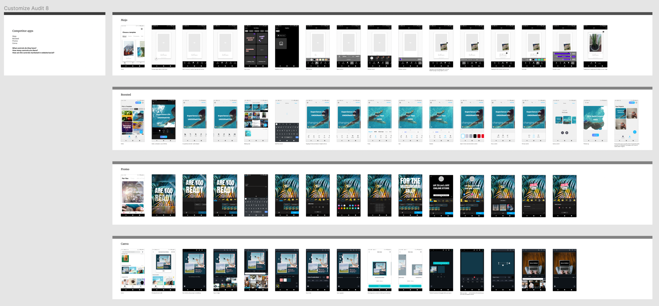
Top Takeaways
All competitors give users more control and more editing freedom than Ripl.
Ripl’s strength is the constraints it gives users. This eliminates decision fatigue.
Some competitors nest multiple controls within each other.
Nesting can make navigation difficult. Users may get lost or feel disoriented - keep it minimal.
Overall, competitor apps are more complex.
Ripl’s customers are older, small business owners. They value how easy and quickly they can create content with little editing. At the same time, we need to cater to folks who DO want more freedom.
Current Experience
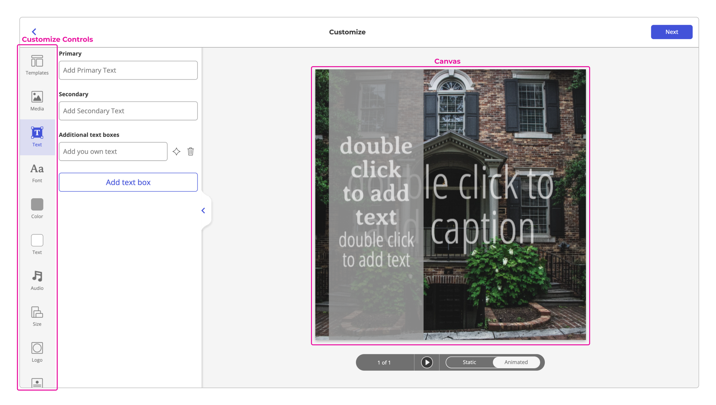
The existing text editing control has a Primary and Secondary text field which are both linked to text on the canvas. These two fields are also linked to colors and fonts within the overall template that are heavily restricted and unintuitive to use.
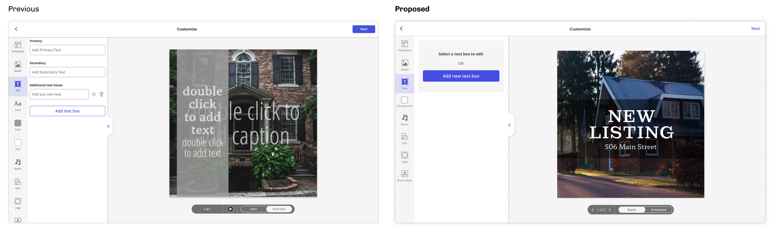
Text Control Redesign: Current & Proposed Comparisons
(1) Teaching users new Patterns
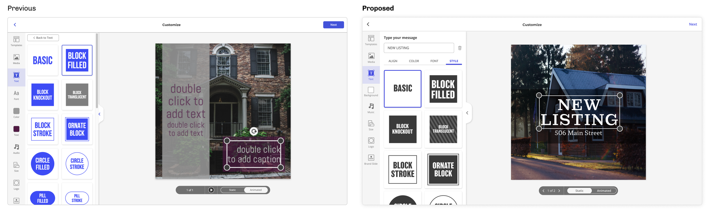
(2) Giving users more control over styling
(3) Smarter Color Suggestions
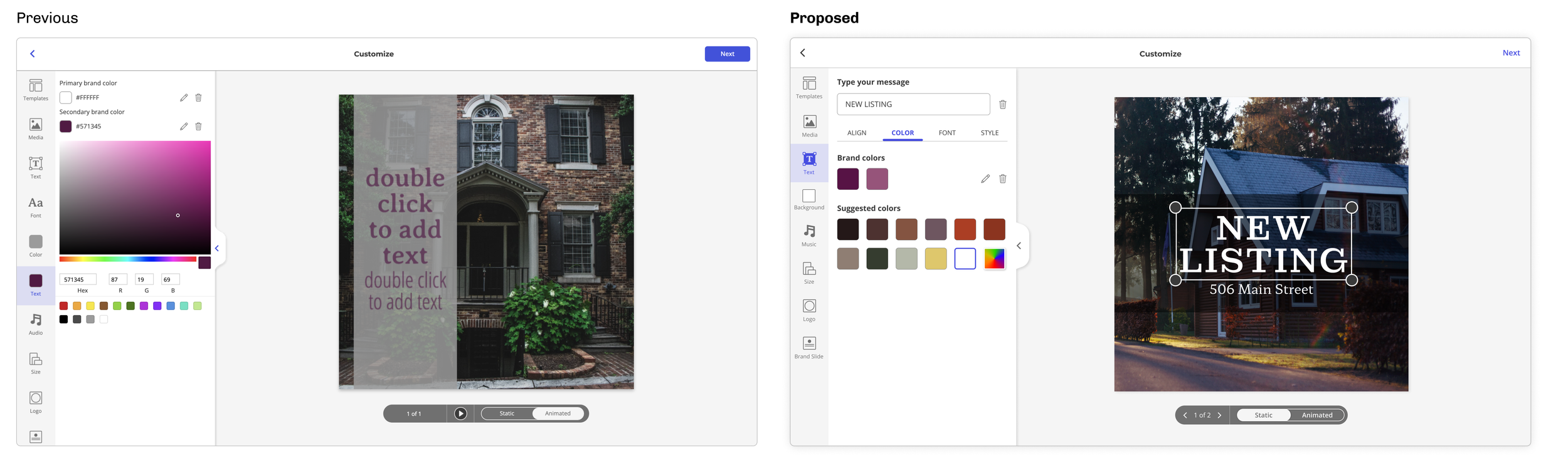
(4) Clear Labels and Intentions behind Font suggestions
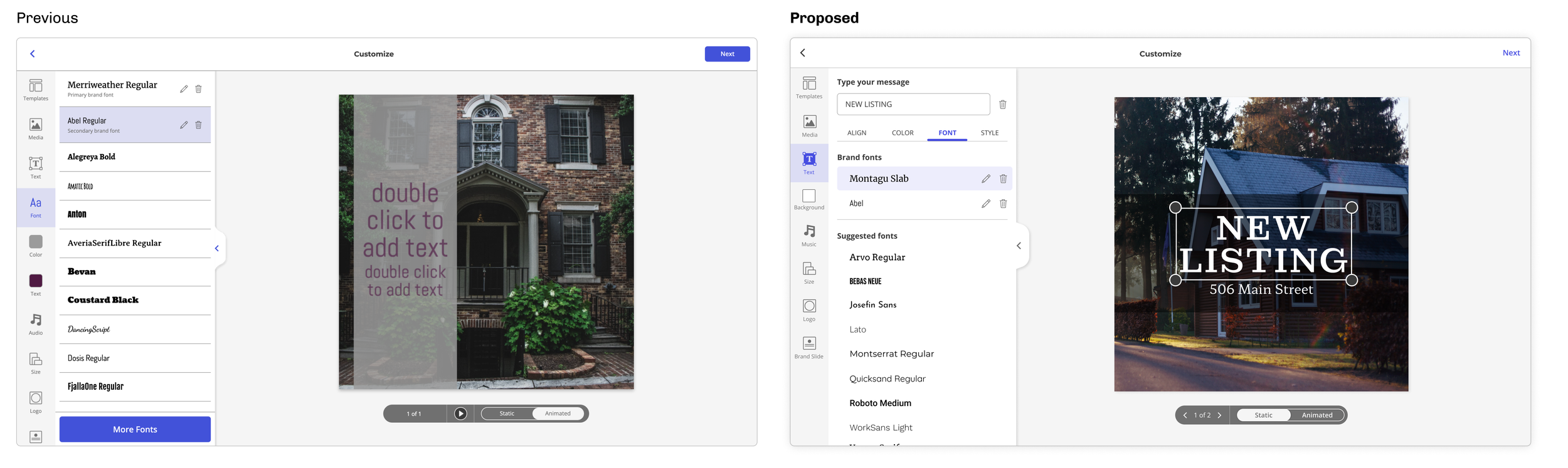
(5) Intentional Use of Colors in the UI
Future Thinking
How can we utilize extra room in the UI to add more capabilities for users? To stay modern and competitive with other content creation tools?