The Brief
Research, design, prototype, and test a reboot of an existing app. Answer the question: “What should The New York Times look like 5 years from now?”
The Timeline
5 weeks
The Goal
Re-imagine the way people check the news
The Team
Marina Semez / Graphic and user-experience designer
Madison Ruppel / Graphic and user-experience designer
Individual Role
User Research / User Experience / Conceptualization / Usability Testing / User Flow & Scenarios / Sketch Prototyping / Brand & Identity / Pitch Deck
THE CURRENT EXPERIENCE
User Flow - Paid Subscriber
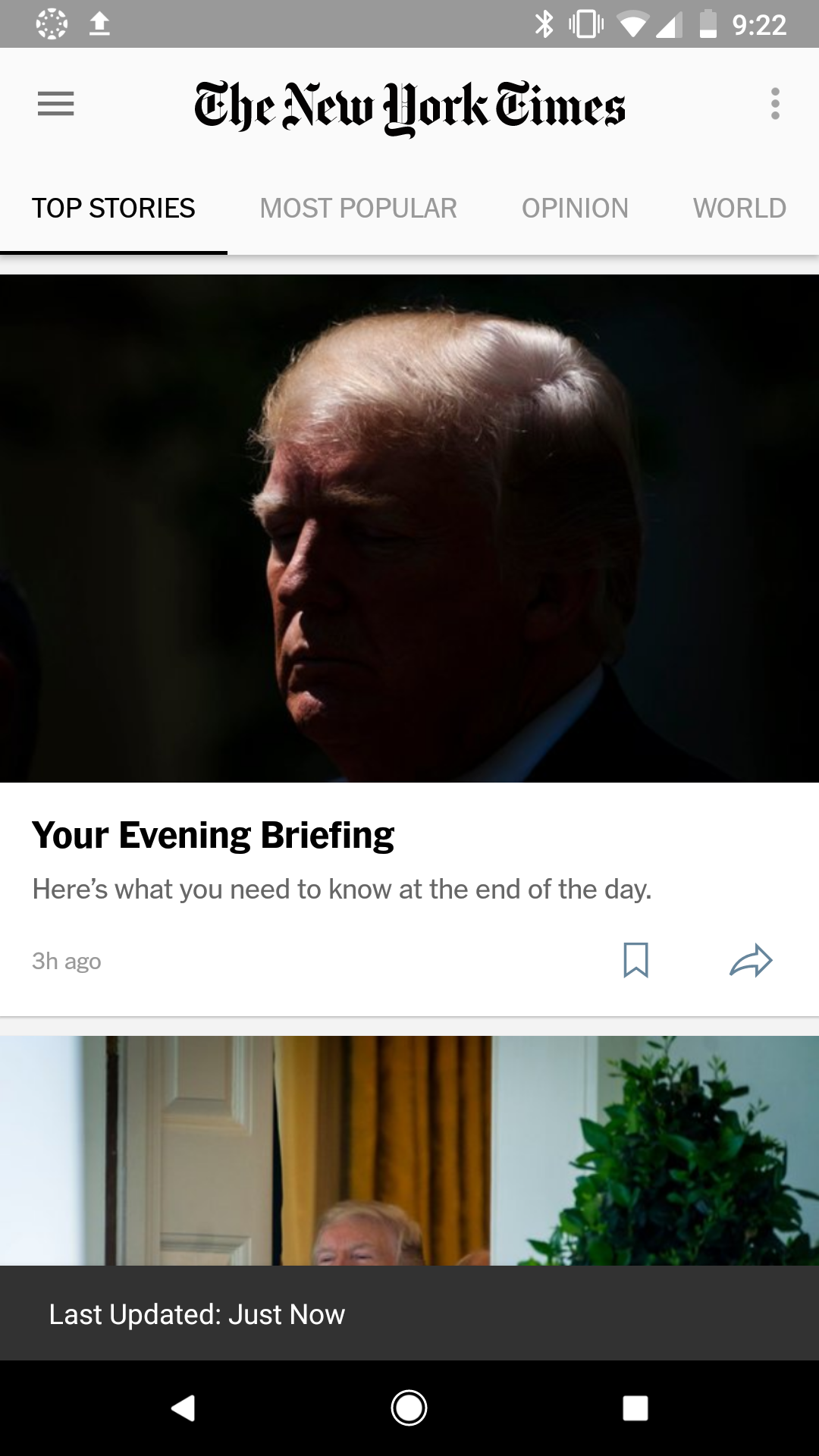
Nice to see daily brief
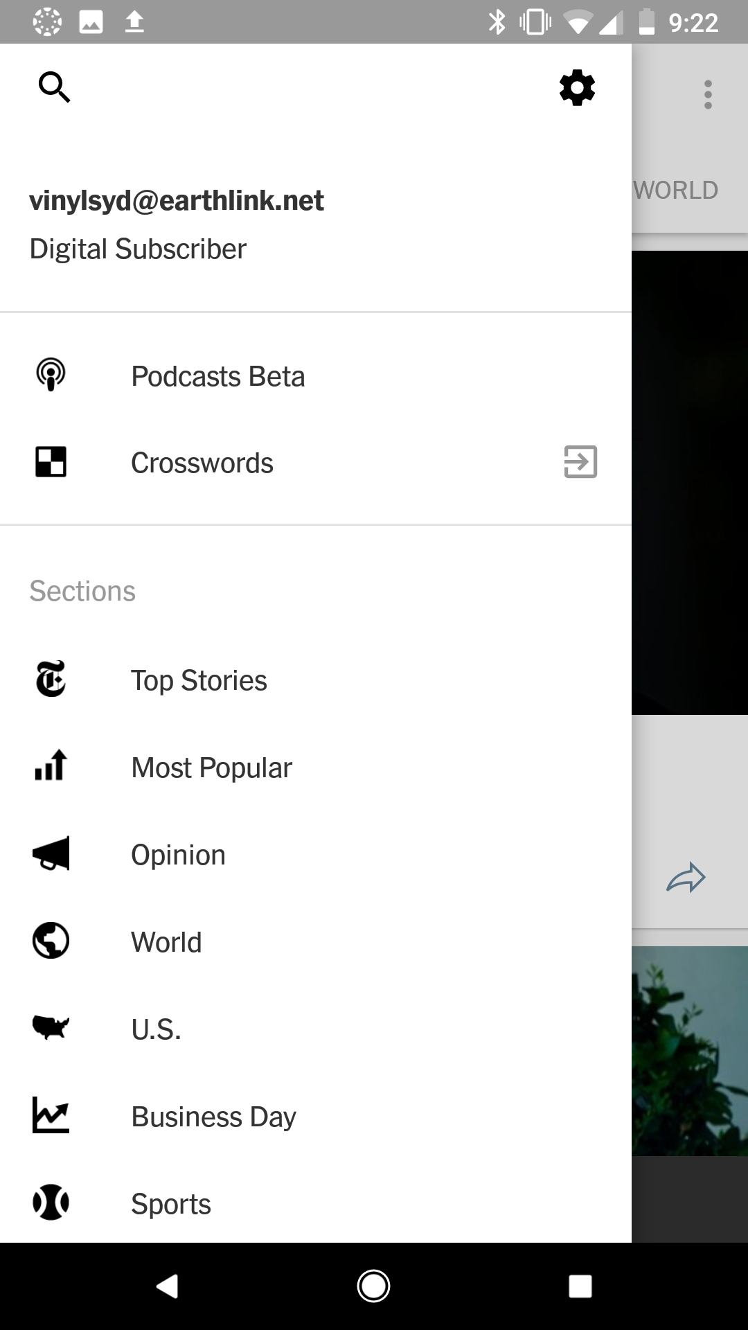
Menu has over 30 topics
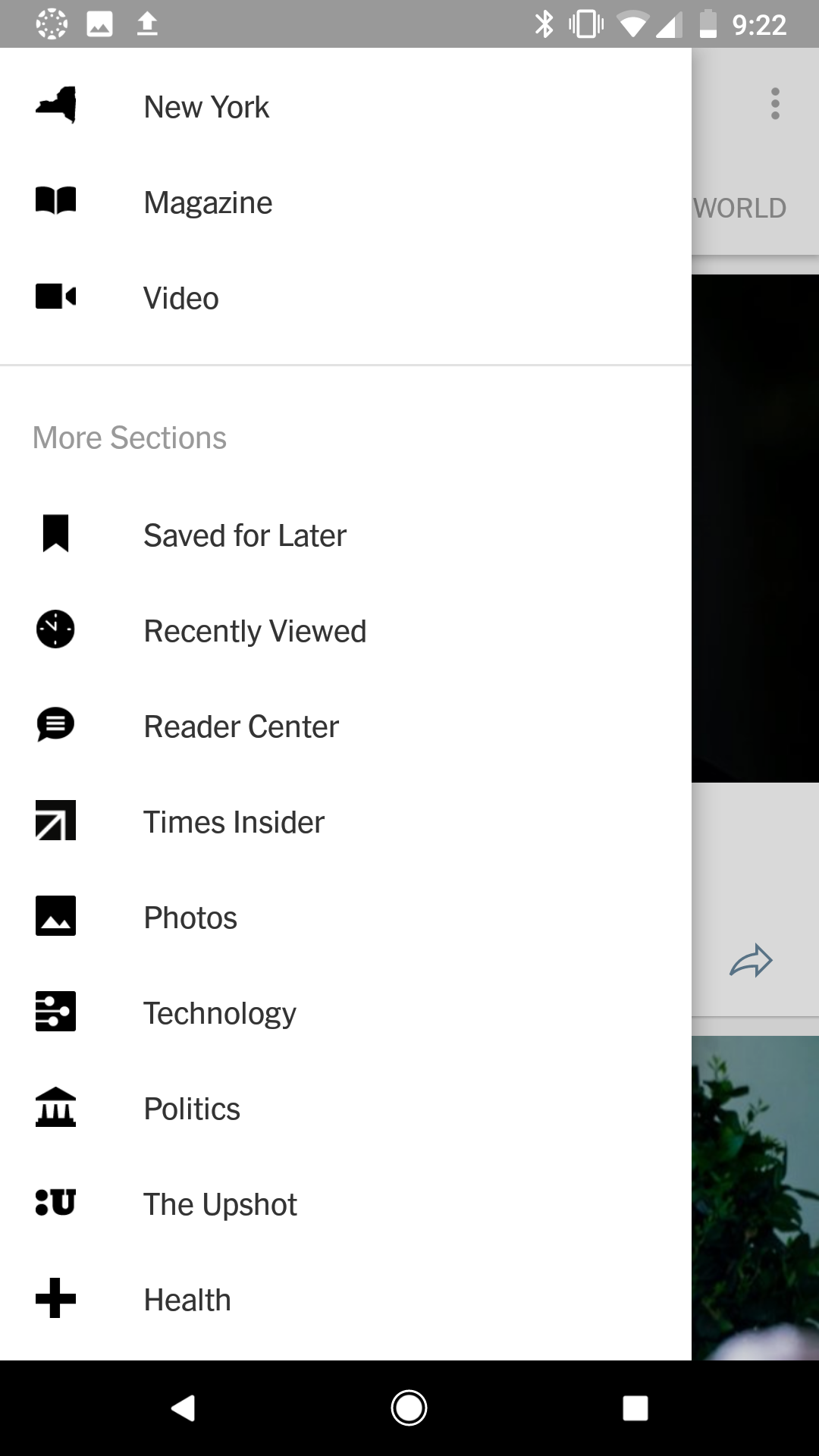
The organization of "sections" vs. "more sections" is unclear. Why are they separated?
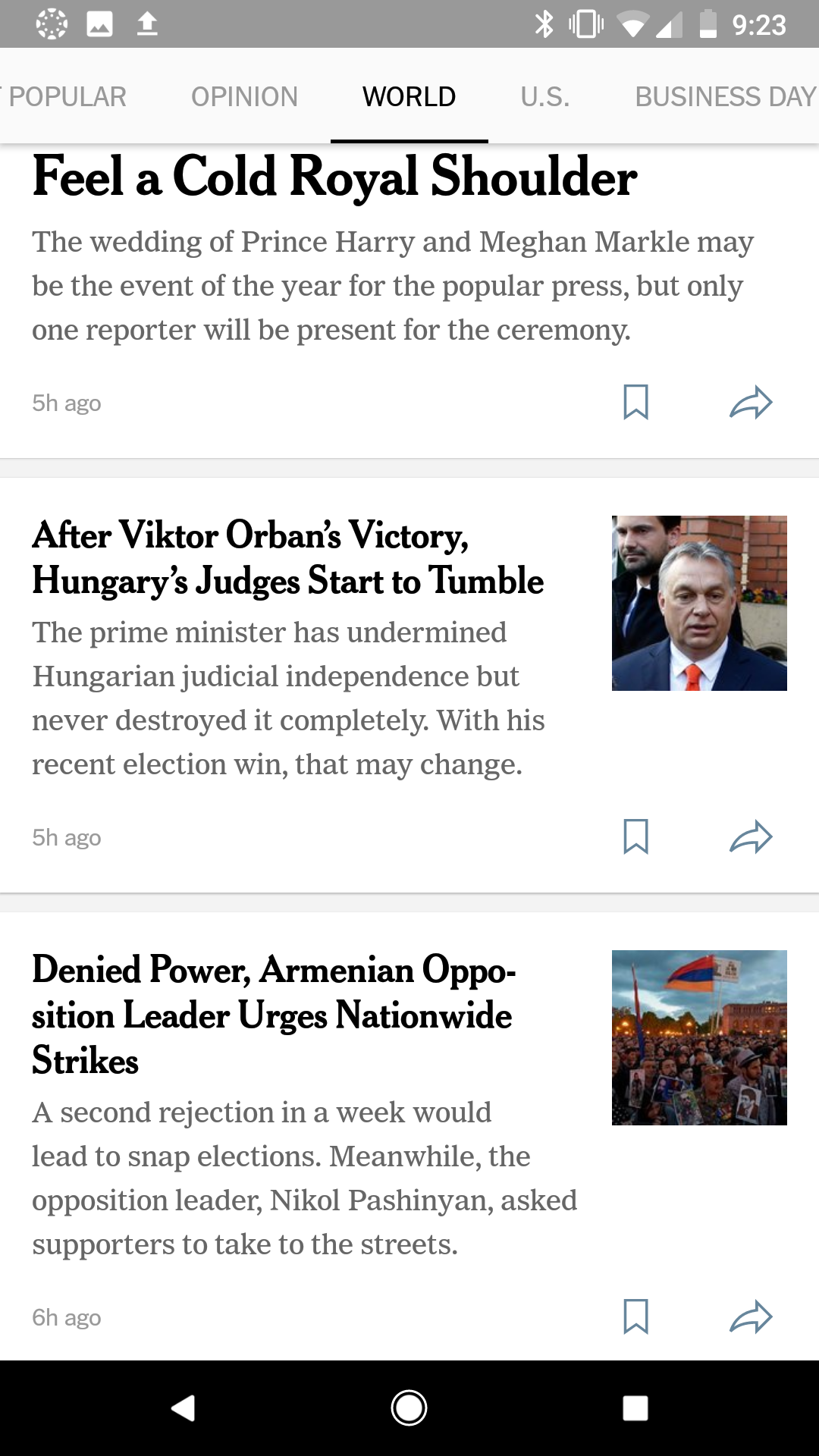
Hierarchy in the text is nice
User Flow - Non-subscriber
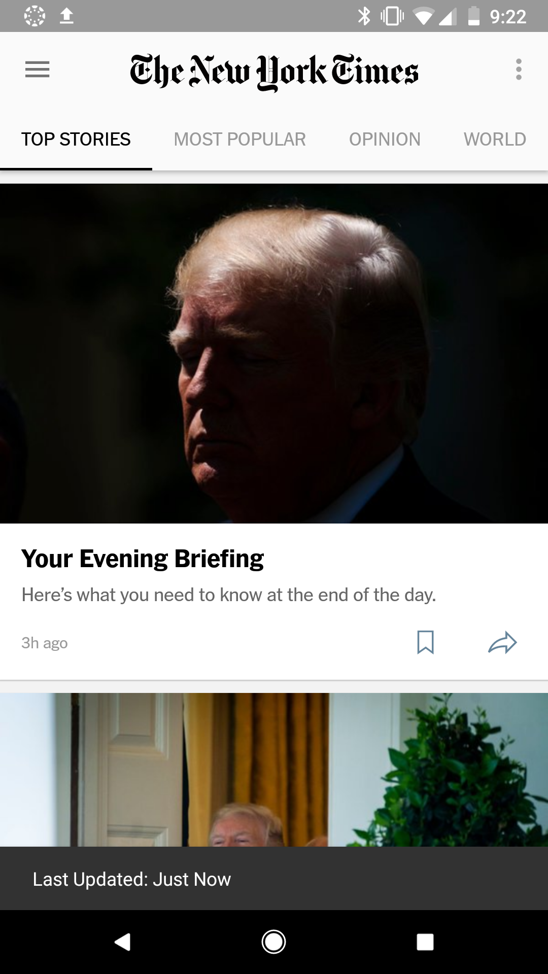
Same homepage as subscriber
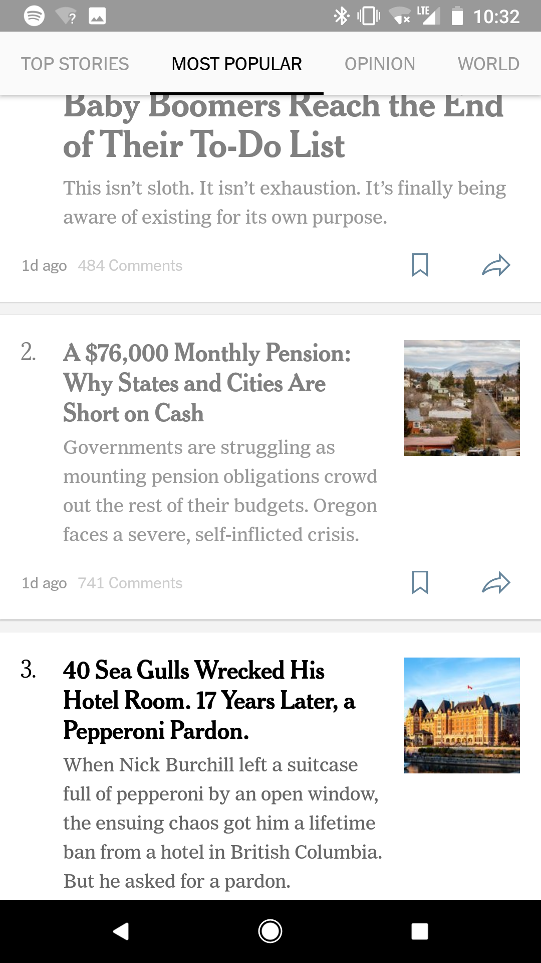
Read articles turn grey
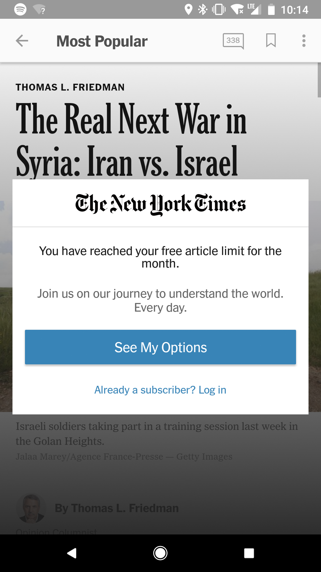
Notification after 10th article
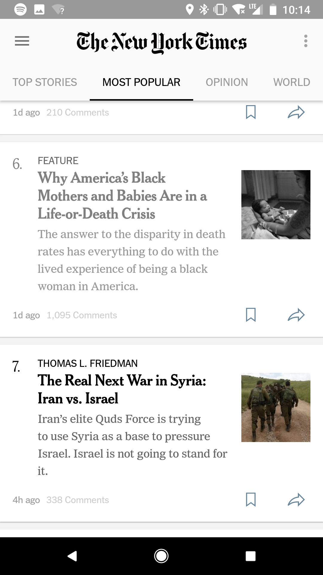
Able to navigate back to homepage for browsing, but no reading
Who Uses the NYT App?
“Millennials are now the single largest demographic segment of audience on the New York Times (all traffic), and that is incredible.”
-Meredith Kopit Levien, the New York Times's chief revenue officer.
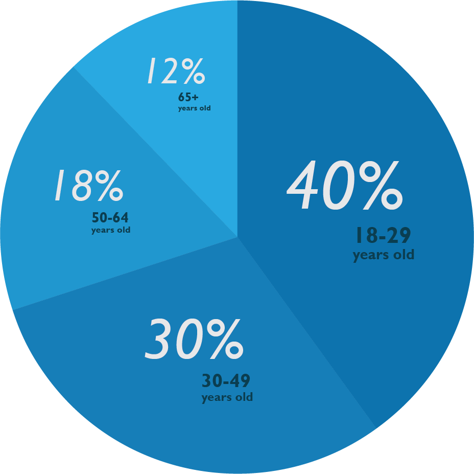
This youthful interest – which accounts for “between 35-40% of the total audience” – has been “particularly striking” around the election of the new president, she says. The challenge now for the Times is to convert more of these young readers into paying customers.
User Journey
A first-time user was given the app and asked to walk through various tasks: browsing the articles and menu items, searching for a certain story, saving that, and reading it through. This step helped us identify where there was hesitation or frustration in the experience. The diagram below shows pain points labeled with orange and red circles.
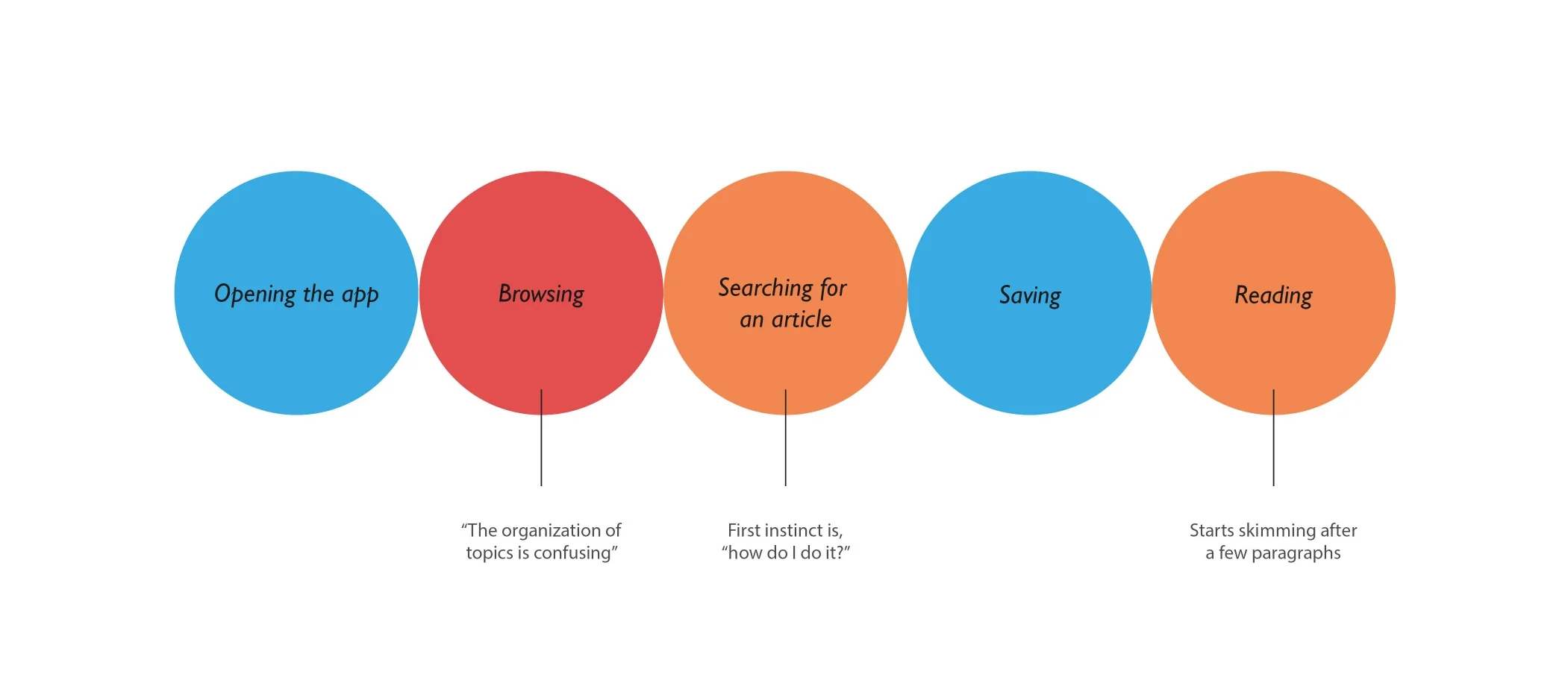
We notice from user's interaction with the app that there is not a lot of excitement or exploration happening. The initial steps in opening the app and scrolling through the home feed go smoothly, but once they open the menu options that’s where the slow-down begins. With 34 different news topics, it becomes time-consuming for them to choose a single one. There are no options for customizing a list of preferred topics.
At this stage, we assume creating a customization option could enhance the user-experience.
RESEARCH
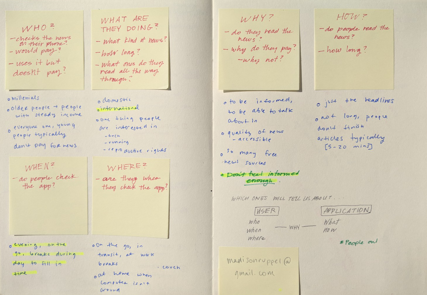
Competitor Analysis
Knowing that The New York Times is optimized for paid subscribers, we wanted to understand what keeps people paying for their news. A comparison matrix and a competitive analysis were created to better understand what makes NYT great, and where it could be improved.
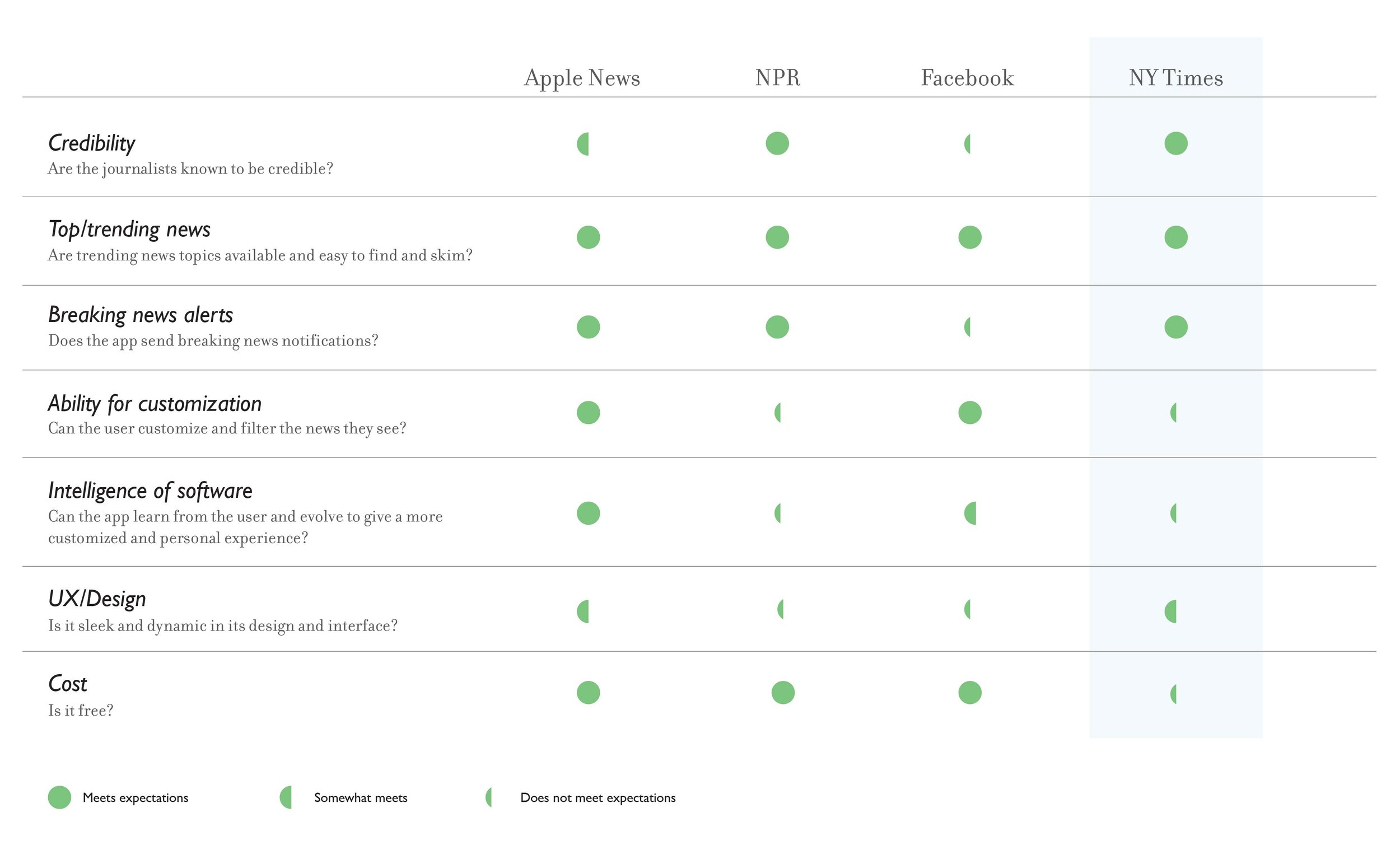
When we compare The Times to other mainstream news sources, its credibility is what makes it so successful. The most significant feature the app lacks is the ability for customization or the feeling of it being unique to the user.
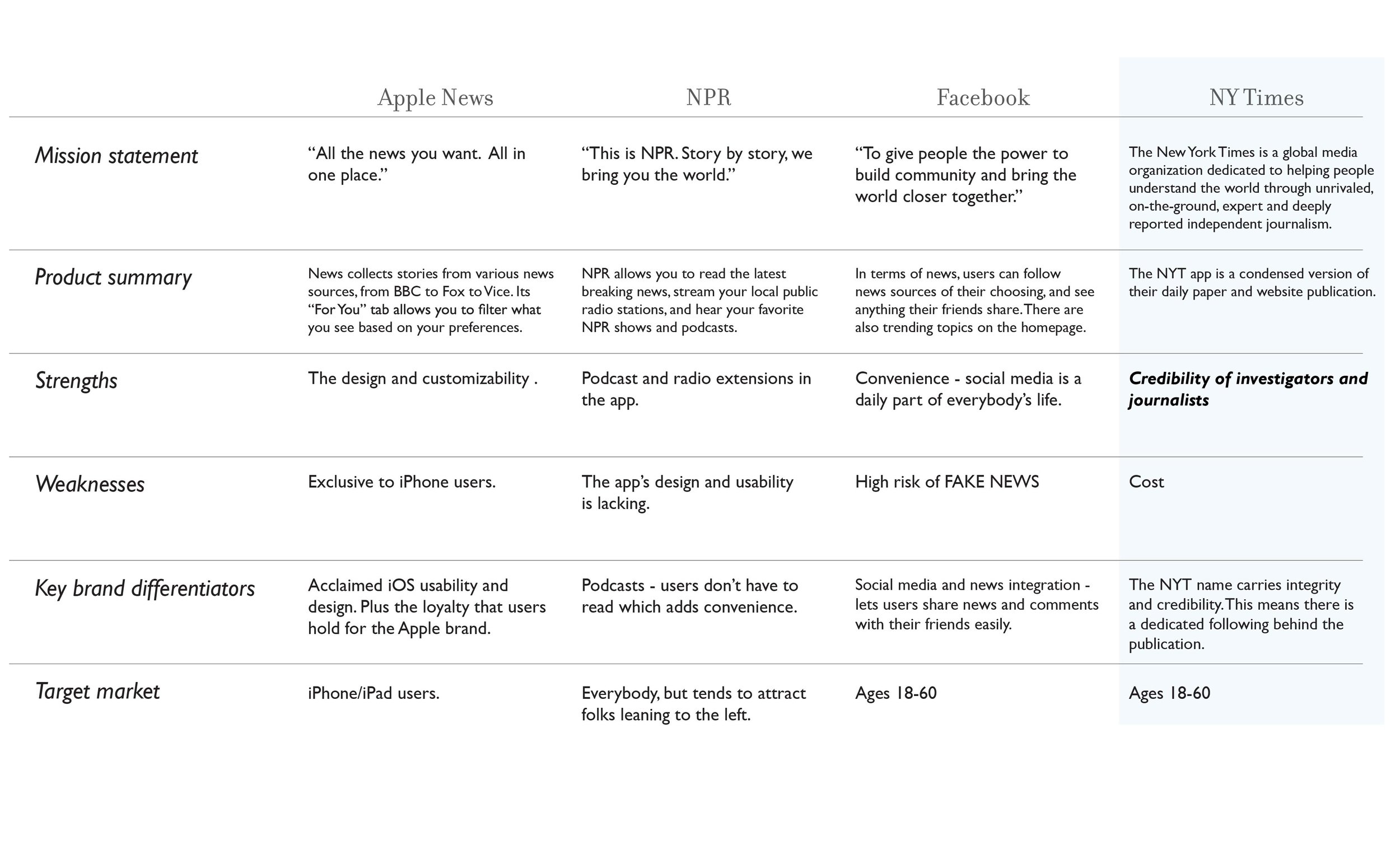
The competitive analysis confirms the integrity NYT holds for being in-depth, reliable journalism. How can we highlight this credibility while providing a more advanced experience for the cost?
User Interviews
To further understand our audience we conducted 6 user interviews with members of our target demographic. These questions were broad on purpose, as we are learning about the user's daily life and routine.
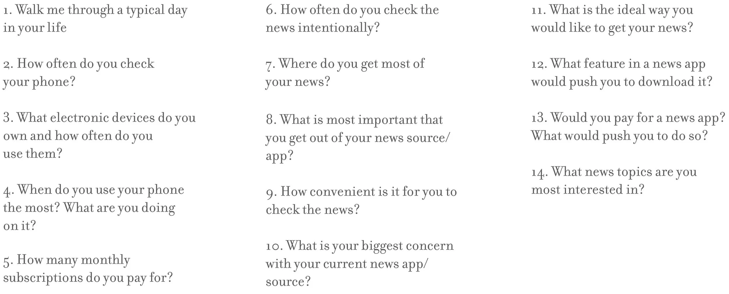
Interview Takeaways
News sources are easily accessible, but it can be difficult to make time for.
“I work online, I socialize online, I don’t have time to read a whole article on my phone.”
Many of our users frequently read full articles on their laptops or in print.
“I prefer to read a newspaper over articles on apps.”
Our audience is weary of fake news, and they don’t want to worry about credibility.
“If I am reading an article written by a real journalist, I don’t want to be worried that it’s fake.”
Survey
Our team created a survey in which 65 people participated in: "How do you want to get your news?" This would illicit more concrete data that we could use to narrow our scope. Out of 10 questions, the following statistics were most insightful:
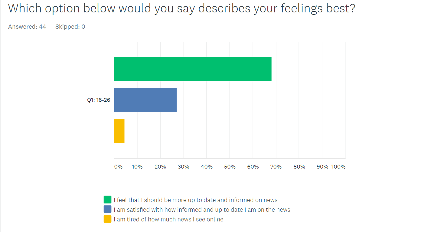
68% of our audience feel they should be more up to date and informed on the news.
How can we encourage people to explore and interact with the news?
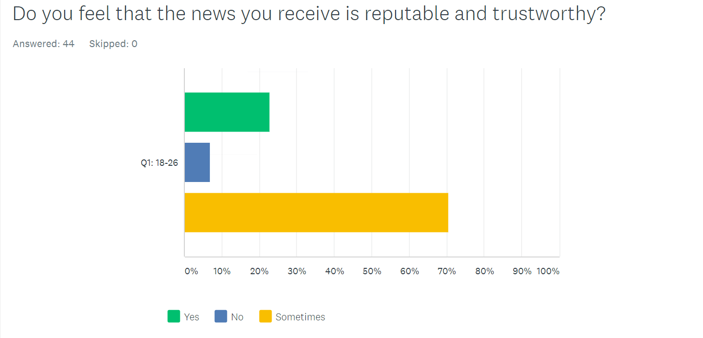
They felt their news was reputable only 23% of the time.
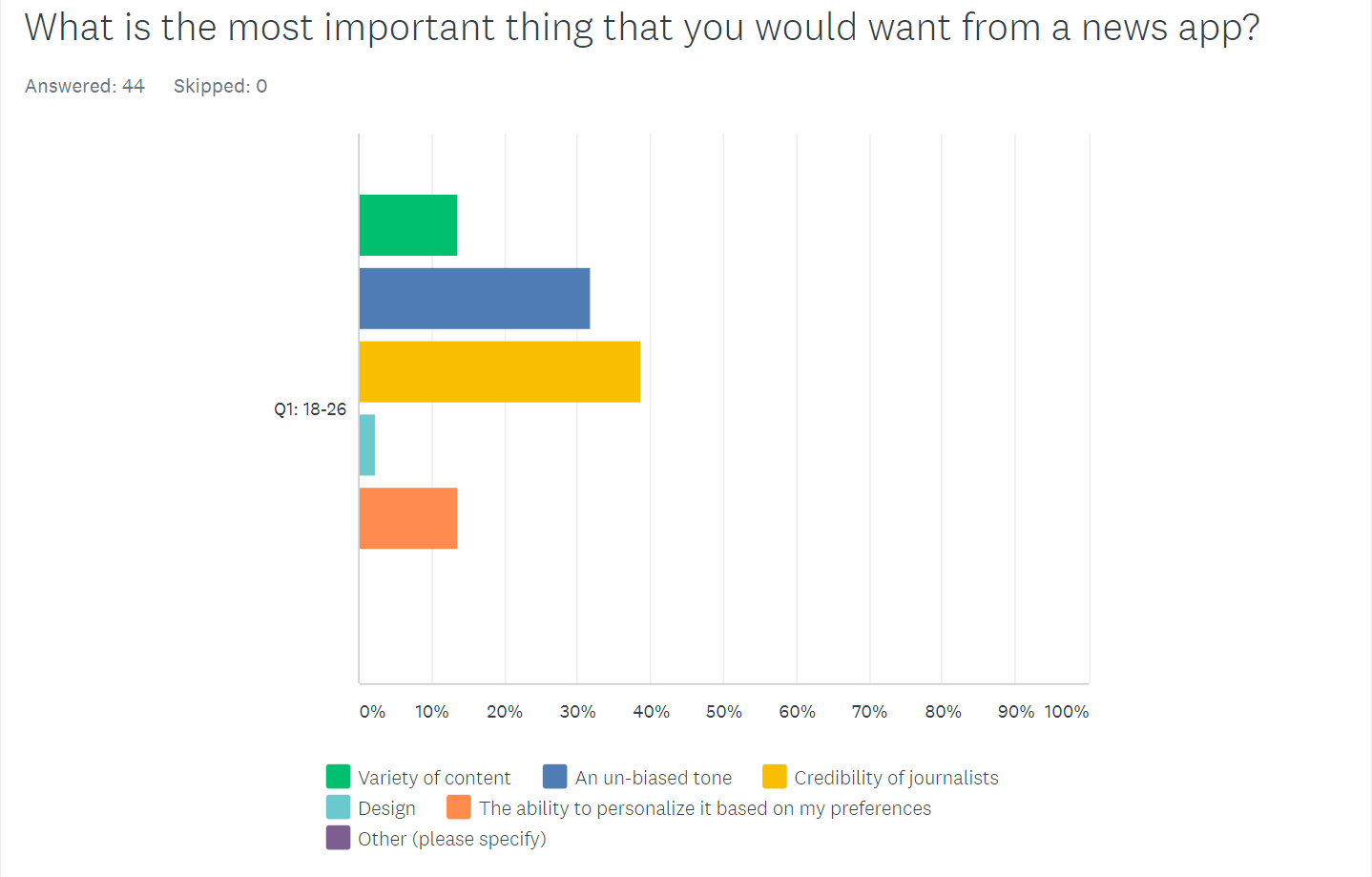
70% say that the credibility of journalists and an un-biased tone are the most important things they want from their news app.
How can we lead people to this reputable news source?
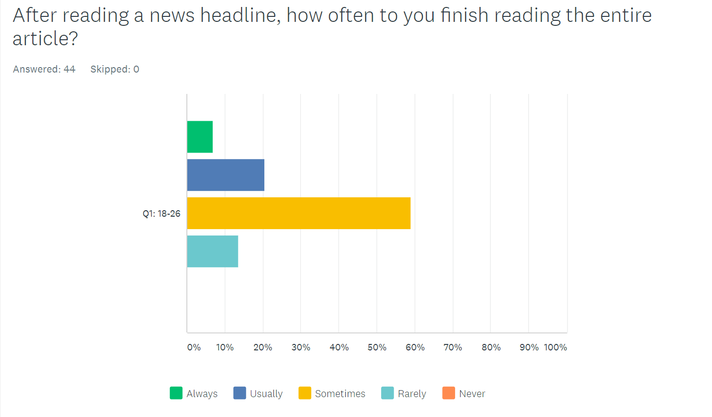
Only 6% always finish reading the entire article they click on.
How can we be more brief while keeping the integrity of the brand?
NEW Product Statement
The New York Times is a high-quality news source, dedicated to bringing news to people who want to stay up to date in this age of fast-moving information. With so many articles and sources to sift through online, The Times is condensing top stories into an accessible selection; whether you have a 30 minute commute, or a 30 minute lunch, the NYT Brief will ensure that you are informed.
User Testing
I created a low-fidelity prototype that I tested on 5 different individuals, which I recorded for later reference. This concept was based on what a free New York Times app could look like. Our audience already feels overwelmed with information on a daily basis, so why not choose the news for them? NYT also has a fantastic VR app,
which we want to promote through our app by showcasing VR stories in with the written ones.
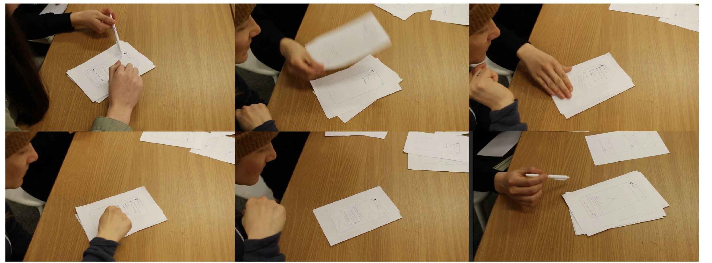
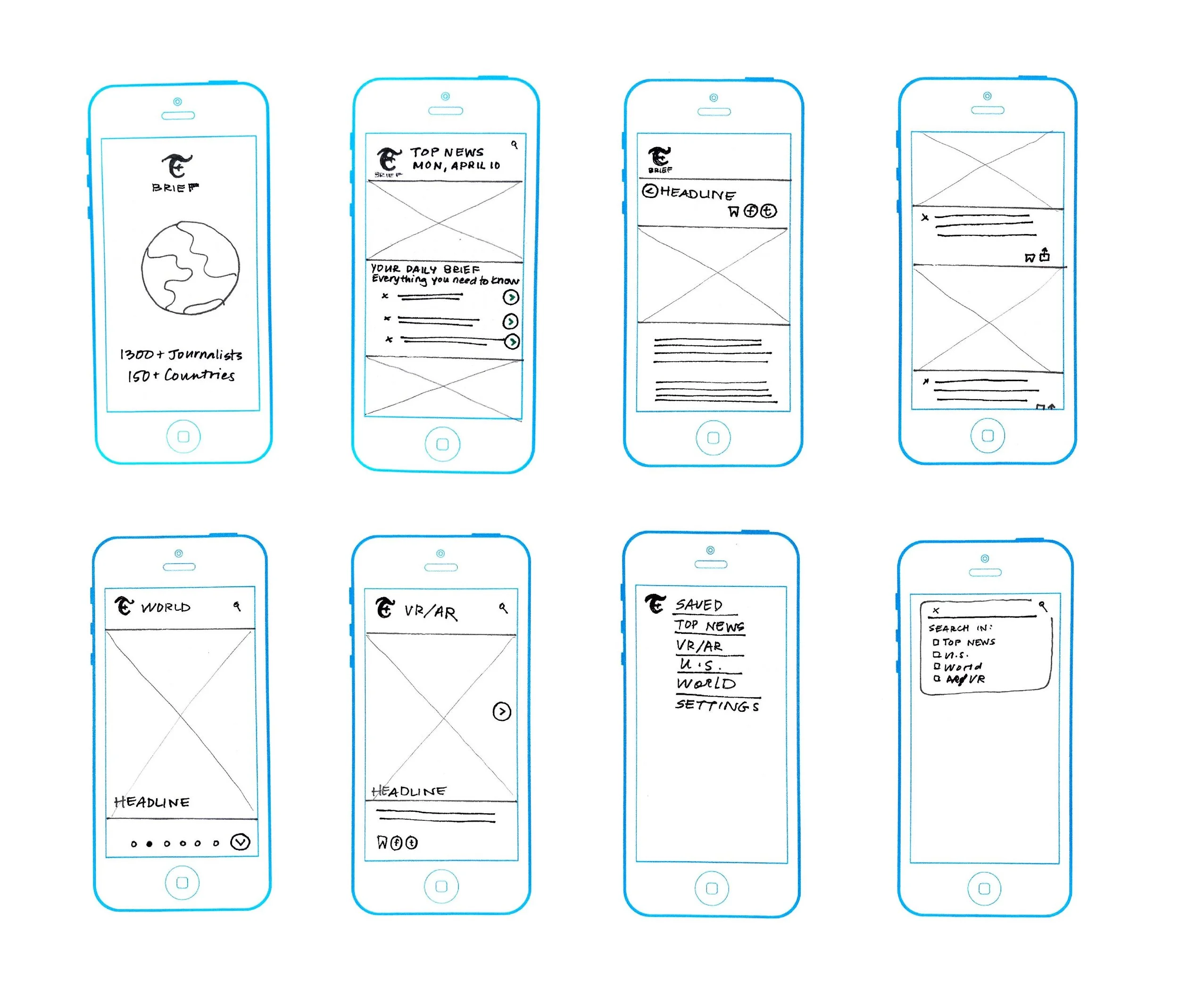
We wanted to see how far we could push the simplification of the app. Users responded well to the condensed articles and variety in usability (swipe up/swipe left/etc), but were uncomfortable with how VR/AR fits into the rest of the topics (Top Stories, U.S., World). VR is a fascinating way to get your news, and we didn't want to get rid of the feature because users were interested. The challenge is to seamlessly blend different medias in with traditional news.
THE NEW APP
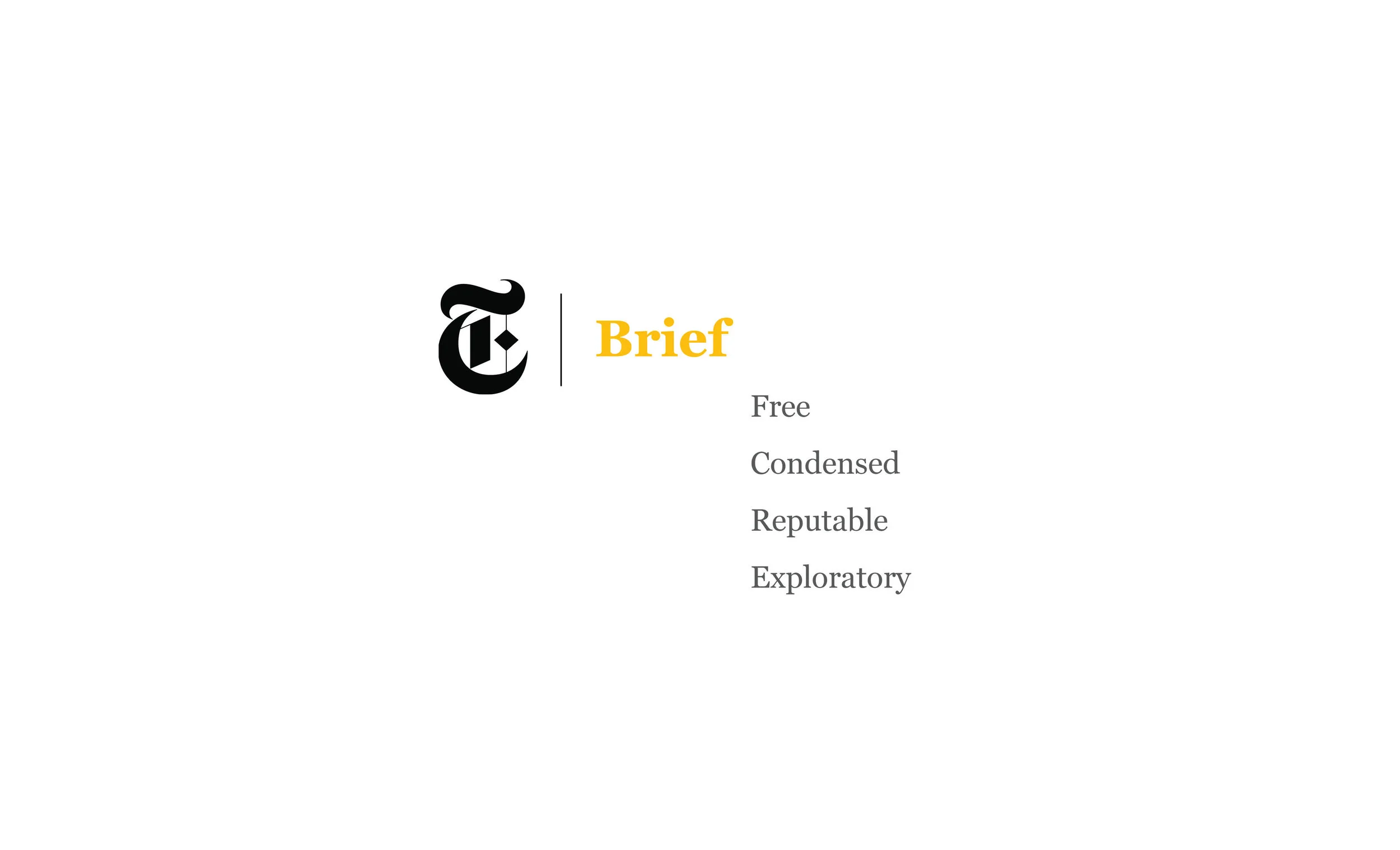
Free
50% of our surveyors read the NYT. We want to close that gap by offering a free app, with limited information. At the same time it is convenient and simple to subscribe to the full experience.
Condensed
In this political climate, it can be overwhelming to have to read through multiple articles a day. Providing our audience with a breadth of news topics, along with some tid-bits of knowledge will increase their confidence and help them feel more informed.
Reputable
It shouldn’t take much effort for our audience to find reputable, reliable news sources. Our team of journalists and investigators are world-renowned. It’s time to make our stories more accessible.
Exploratory
Checking the news doesn’t have to be bland. We want to highlight the NYT investigative spirit by providing alternate ways to check the news.
Home Page
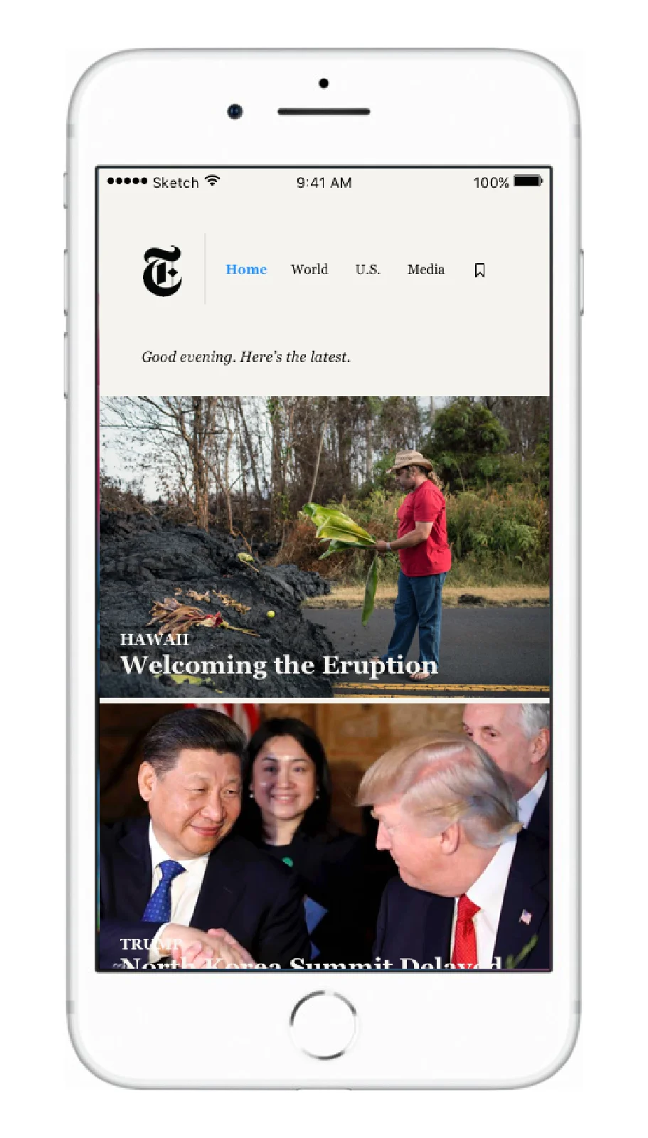
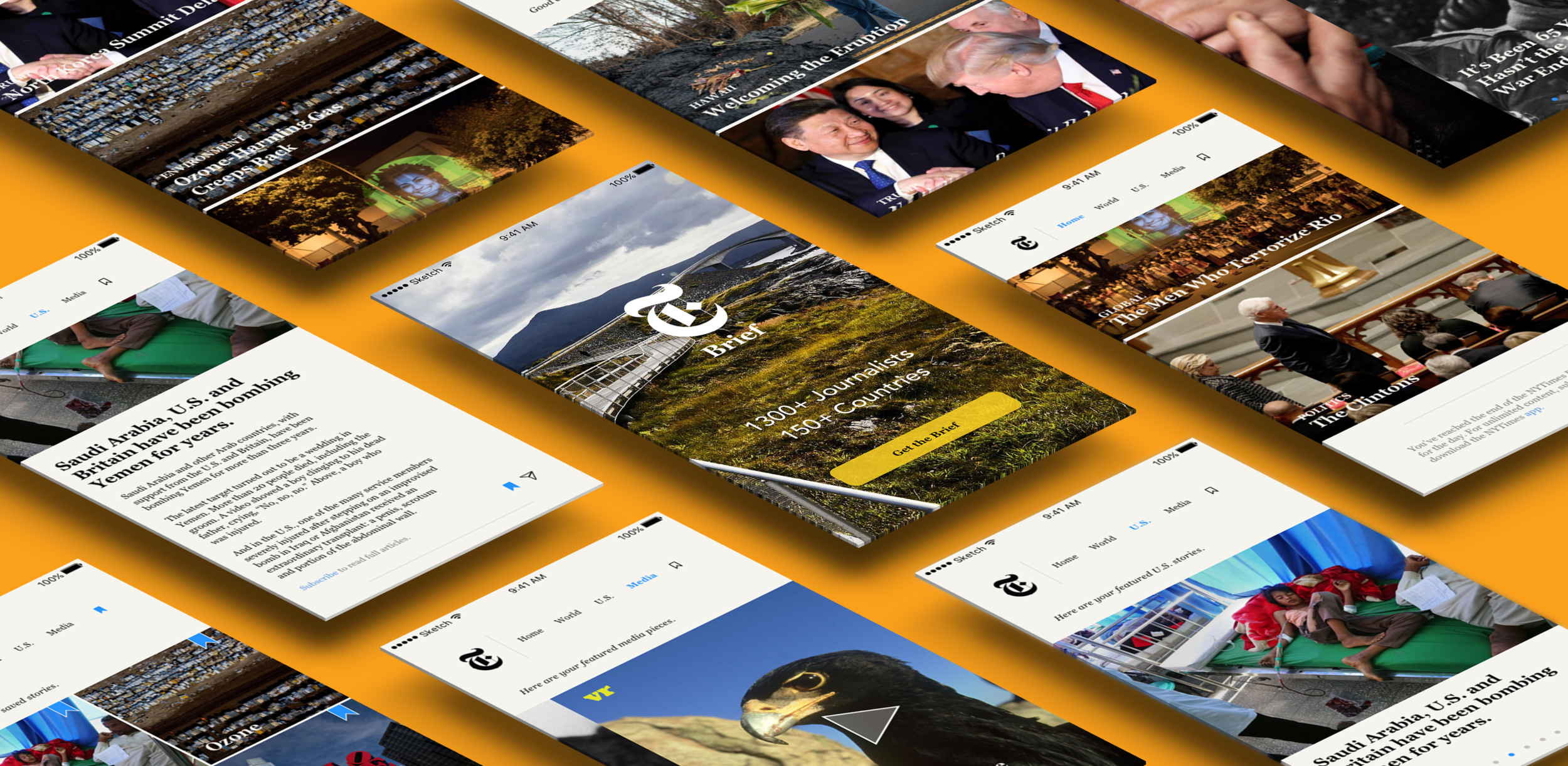
Home features 10 different articles per day based on breaking news and what is most popular.
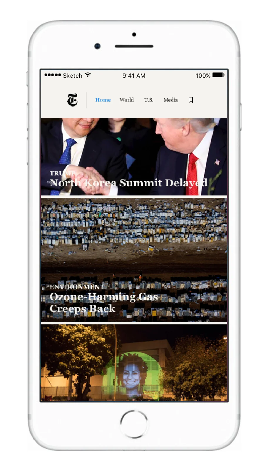
Our target audience is comfortable using minimal UI's: prototype testing proved that users preferred seeing mostly photos, and having the option to learn more.
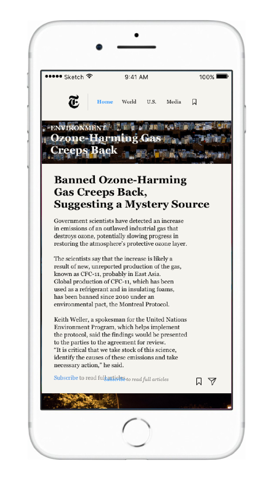
Clicking on the image reveals 3-4 paragraphs from the original article that provide you with a summary of the story.
U.S./World
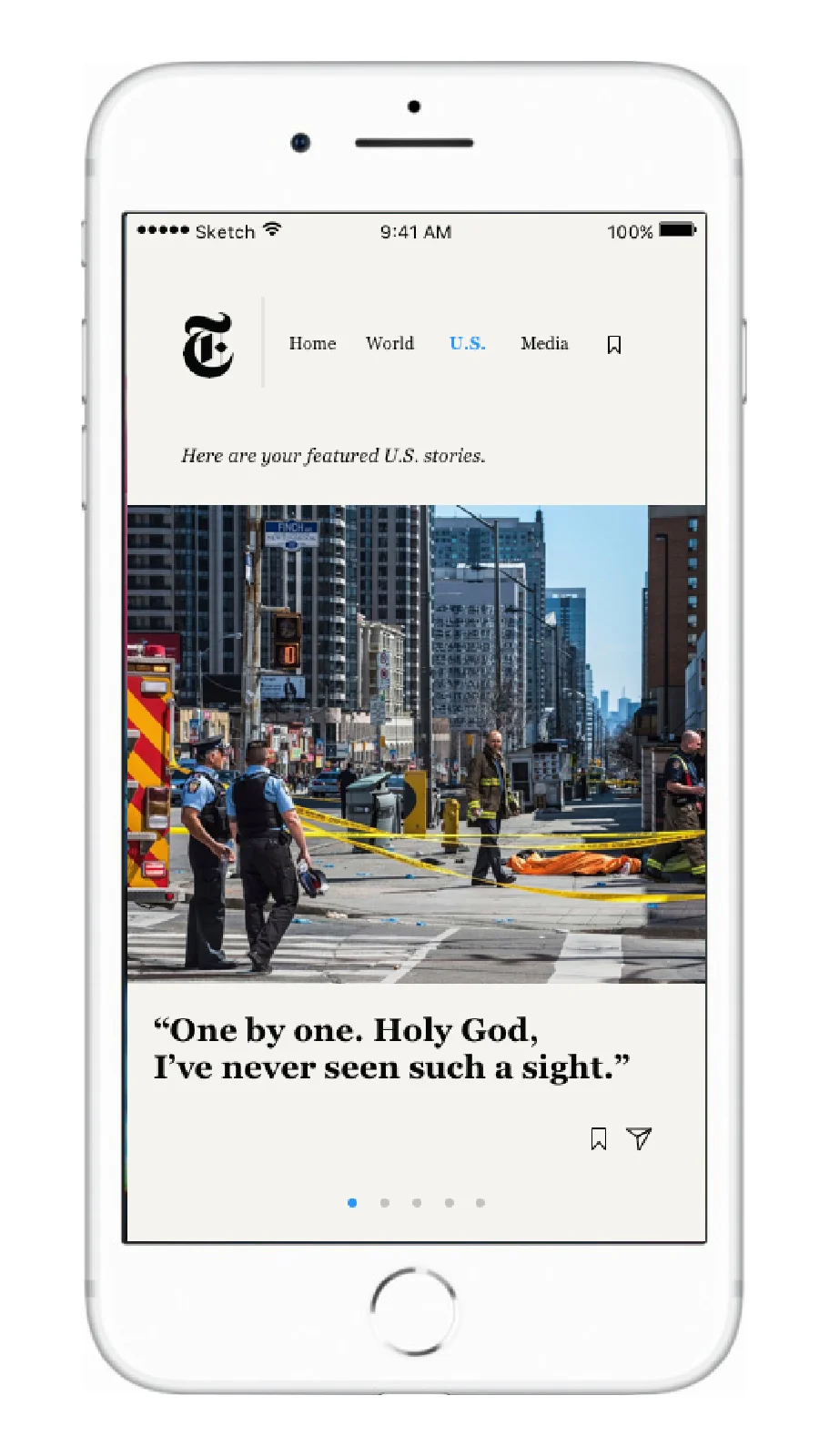
U.S. and World have the same usability features in order to provide the user with some consistency.
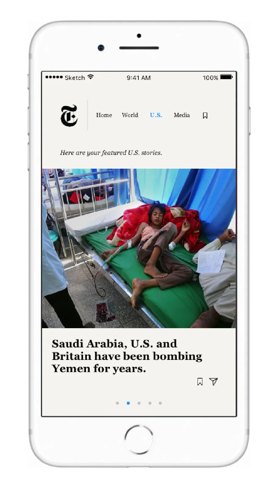
Large images scale these pages to draw in the reader.
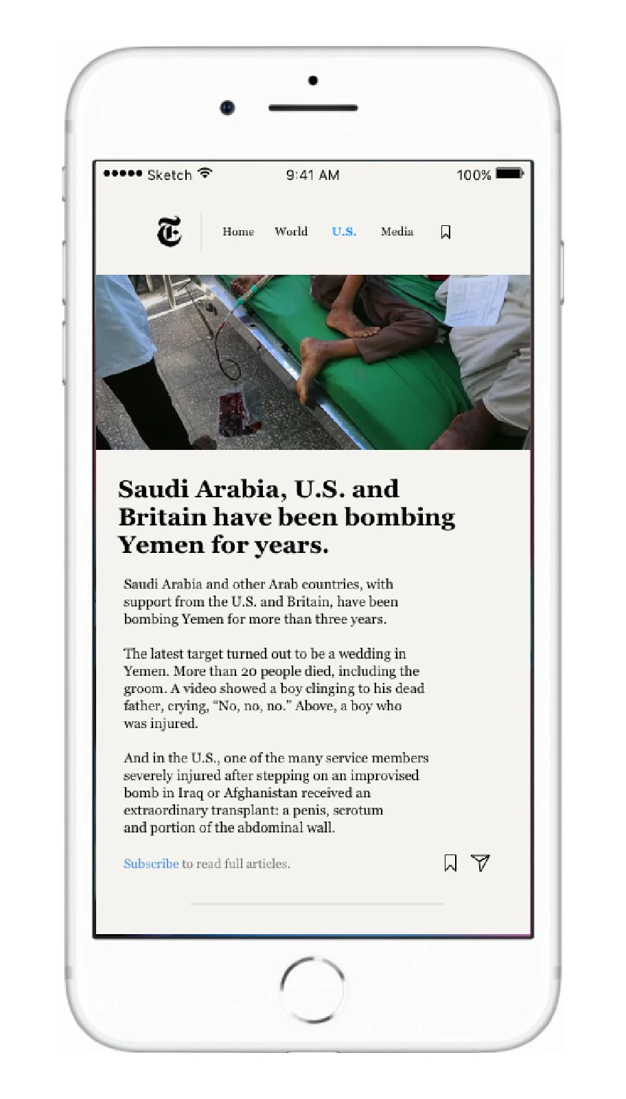
Users see the familiar 3-4 paragraphs which they can read through, and have the option to subscribe if they want to continue.
MEDIA
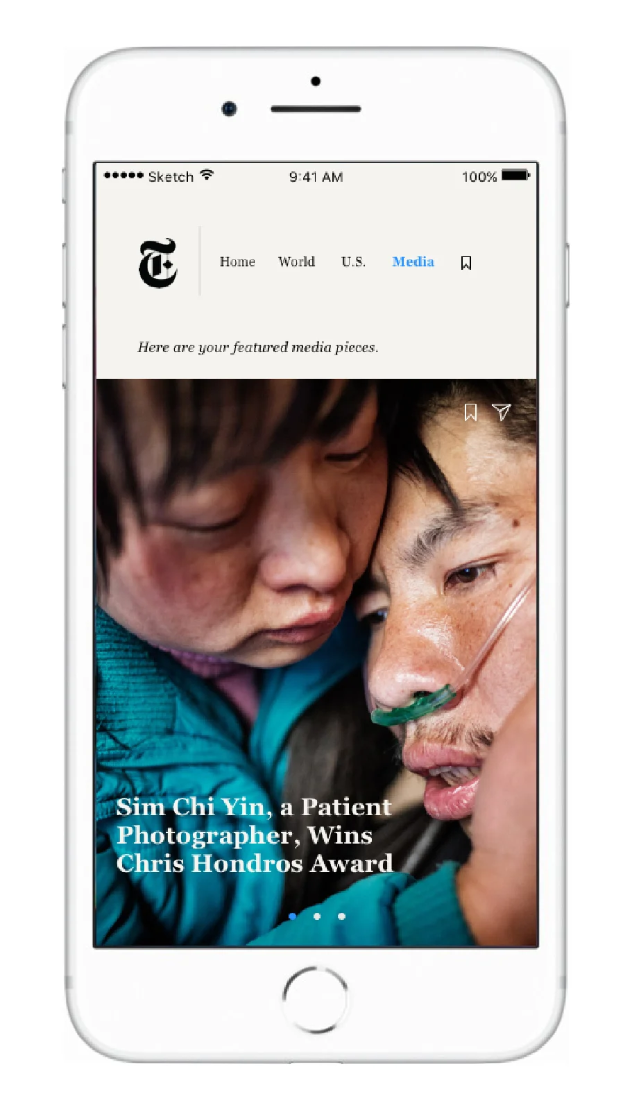
VR/AR was replaced with a streamlined Media tab.
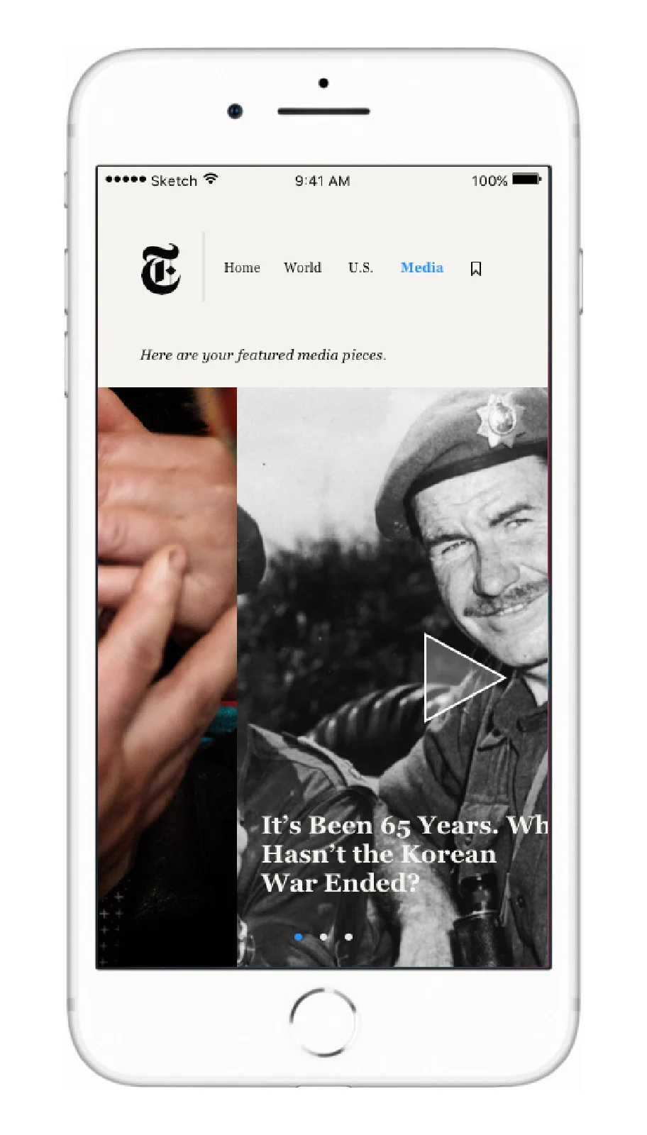
This features a daily photojournalism story, a video story, and a VR story. This successfully incorporates the variety of ways that NYT provides the news.
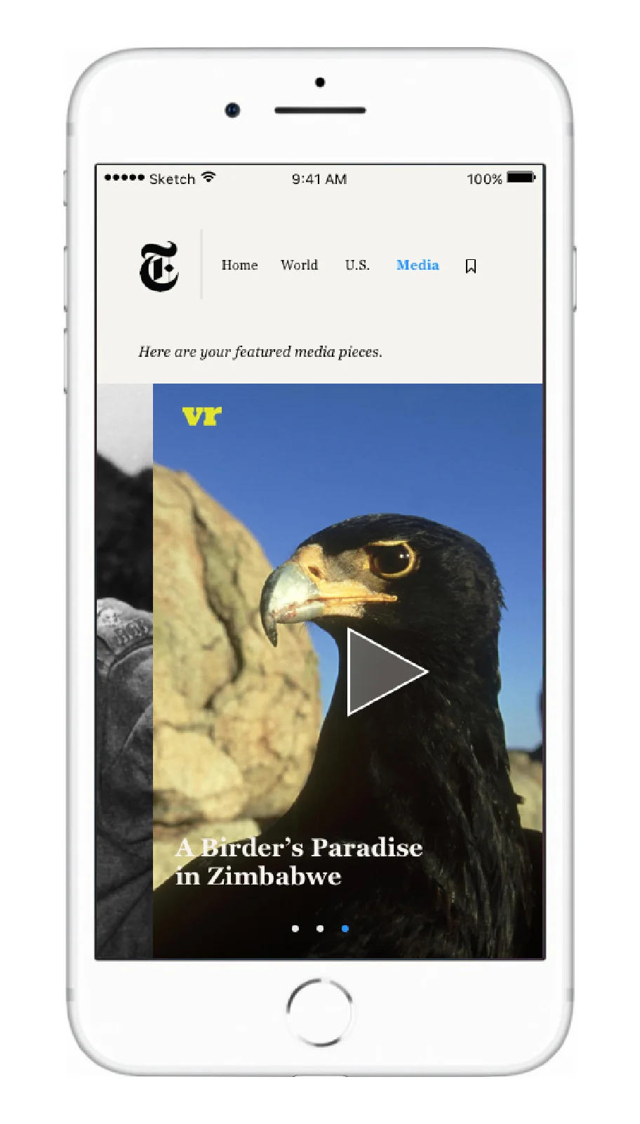
Users are always able to save any of these stories for later.
Saved
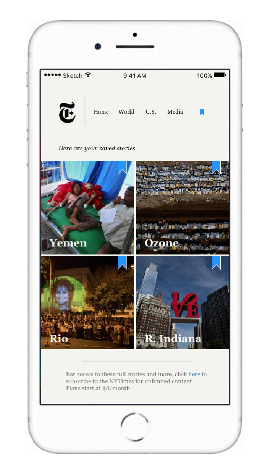
Articles in Home are refreshed daily, but users have the options to save certain ones for longer. Saved articles are stored under the bookmark icon, and can be unsaved by clicking the blue icon on top of the image.