The Brief
Design an interactive data visualization experience that exists in a specific environment. Collect and organize a set of complex data that can be transformed into an interactive experience. Present it in a way that will allow users to find unexpected patterns within the data.
The Timeline
6 weeks
The Team
Marina Semez / UX & UI Designer
Scott Maynard / UX & Media Designer
Individual Role
Market Research / Competitor Analysis / Usability Testing / Goal Assessment / User Flow & Scenarios / User Interviewing / Paper Prototyping / Sketch Prototyping / Moodboard / Iconography / Illustration / Brand & Identity / Pitch Deck / User Experience / User-Interface Design
"How can we provide data to the world that makes a positive difference in the community?"
https://abcnews.go.com/Health/food-insecurity-affects-50-million-americans/story?id=13206053
The Problem
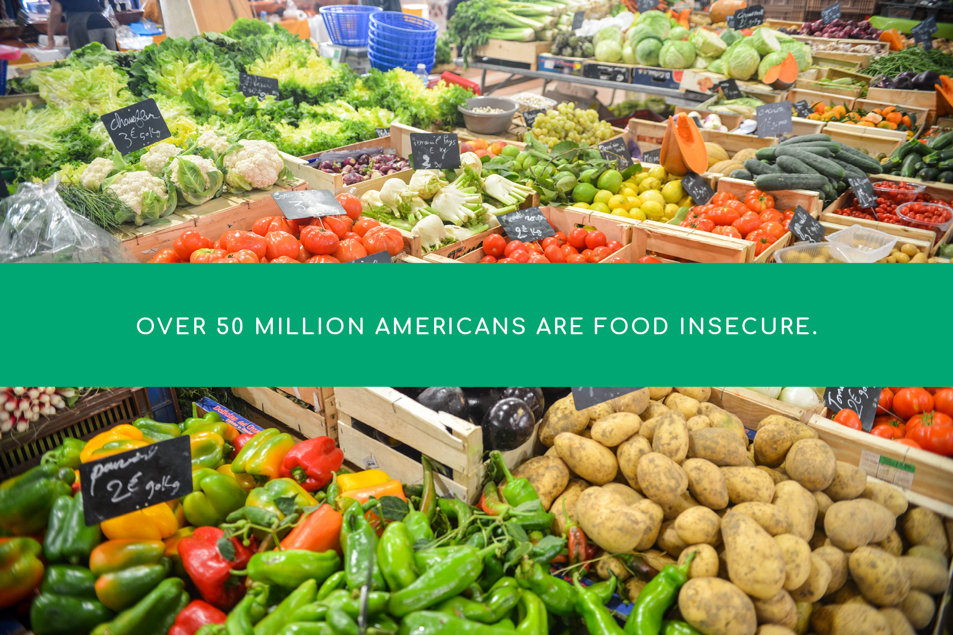
Our team found many alarming statistics relating to food insecurity in the U.S. The problem is that while many families can't afford their next meal, grocery stores all over the country continue to throw away perfectly good food every day.
The Solution
Implement a food service system inside of grocery chains that would allow people access to food that cannot be sold.
Phase 1 : Research
Competitor Analysis
We started by looking into the different solutions currently in place. Who is helping solve food insecurity locally, in Bellingham?
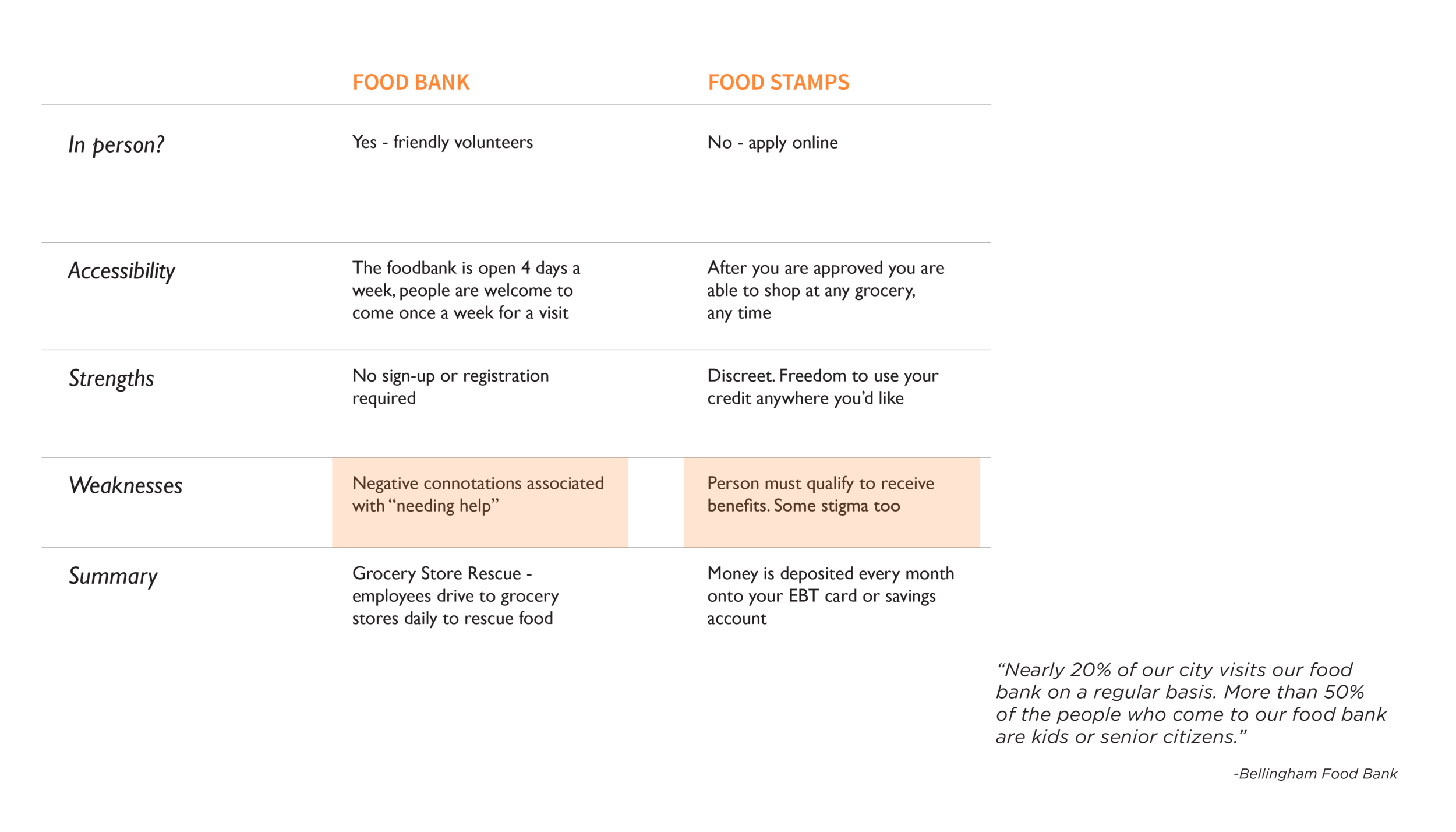
The local Food Bank is a great option, but it's only open three days a week. This means that anyone who works during the day or has no means of transportation cannot access this community benefit. There are also restrictions with Food Stamps; if you qualify, the items you are allowed to purchase with your EBT card are limited.
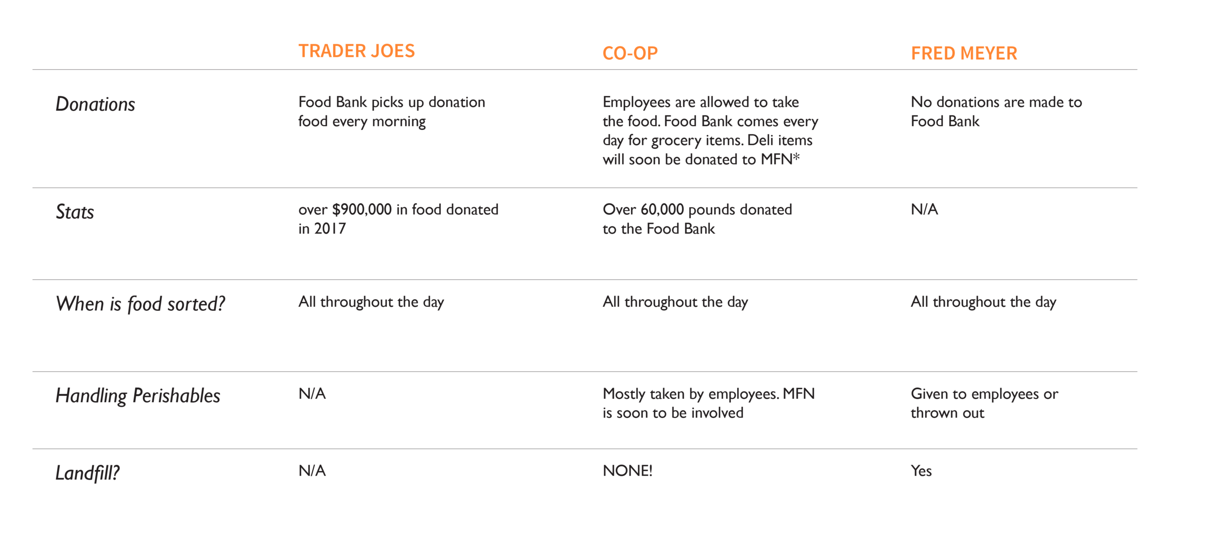
I had the opportunity to speak to the Director of Sustainability at the local Co-Op, who informed us of their zero-waste policy. Anything that is not donated to the food bank is re-distributed the same day through Miracle Food Network. When you compare Fred Meyer, and their food waste practices, there is little attention given to properly disposing/composting/recycling food that cannot be sold.
What Cannot Be Sold?
Besides food that has gone bad or fell onto the floor, many of the grocery items getting thrown away are perfectly safe to consume. We were able to put these items into four distinct categories, and I designed the icons for each one using Illustrator.

SURPLUS / Too much of one item.

OPENED / While the shipment boxes are unloaded, some items may be accidentally cut open.

MISSHAPEN / Just because something isn't perfect doesn't mean it won't taste great!

DAMAGED / Items that are discolored or bruised.
The User
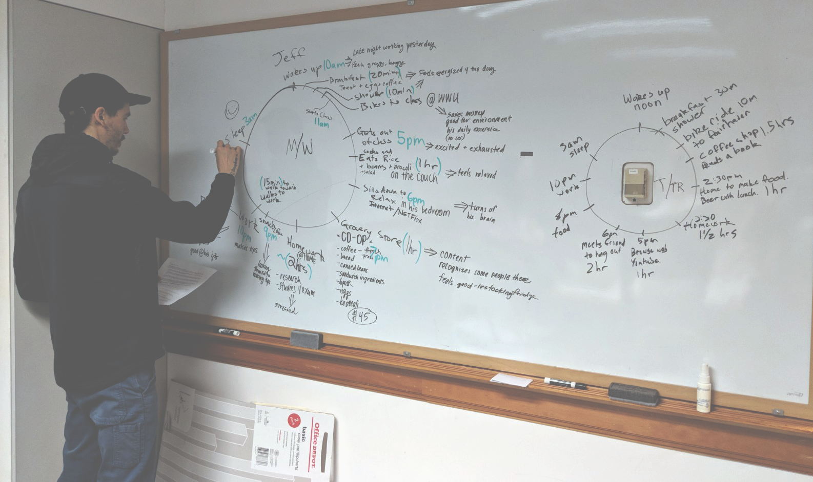
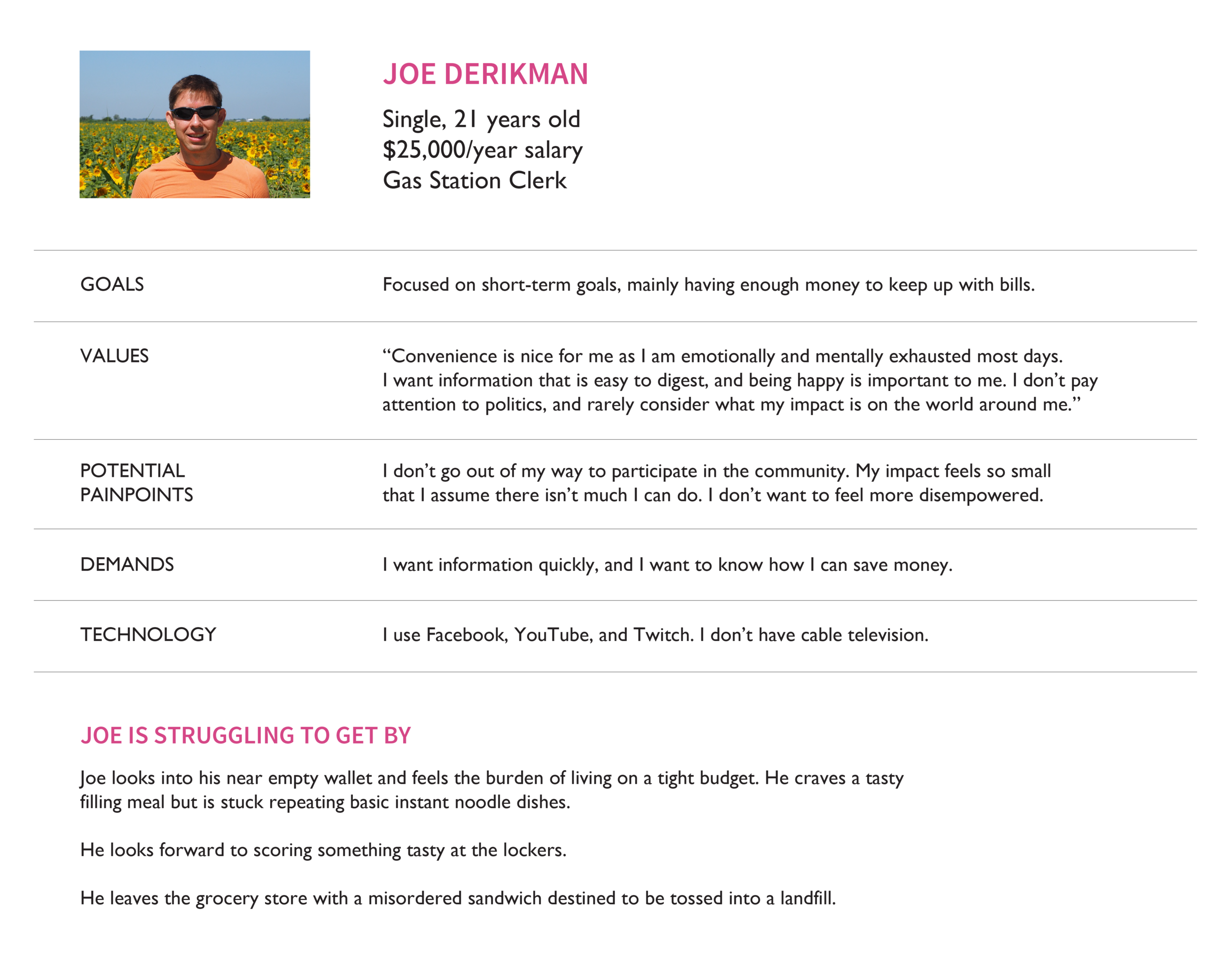
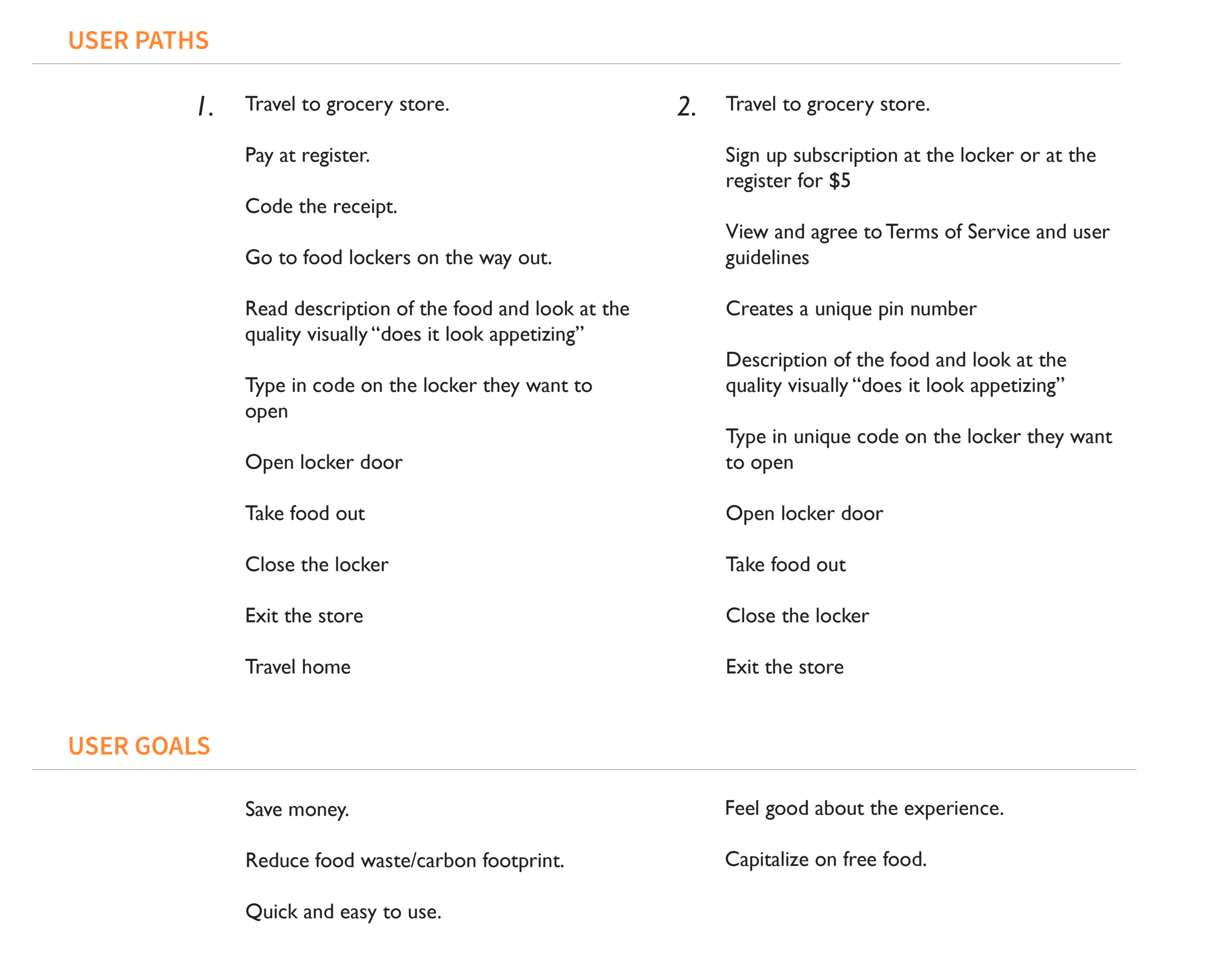
Understanding our user was essential in the design process. In order to do so our team made an in-depth user persona of who would likely use a product that offers discounted food items. This included analyzing user goals and potential user flows. We also mapped out what the average day of this person would be, shown in the photo above.
The Target Audience
Those living with food insecurity.
Low income individuals.
Earth conscious people.
Families.
Everyone.
Survey
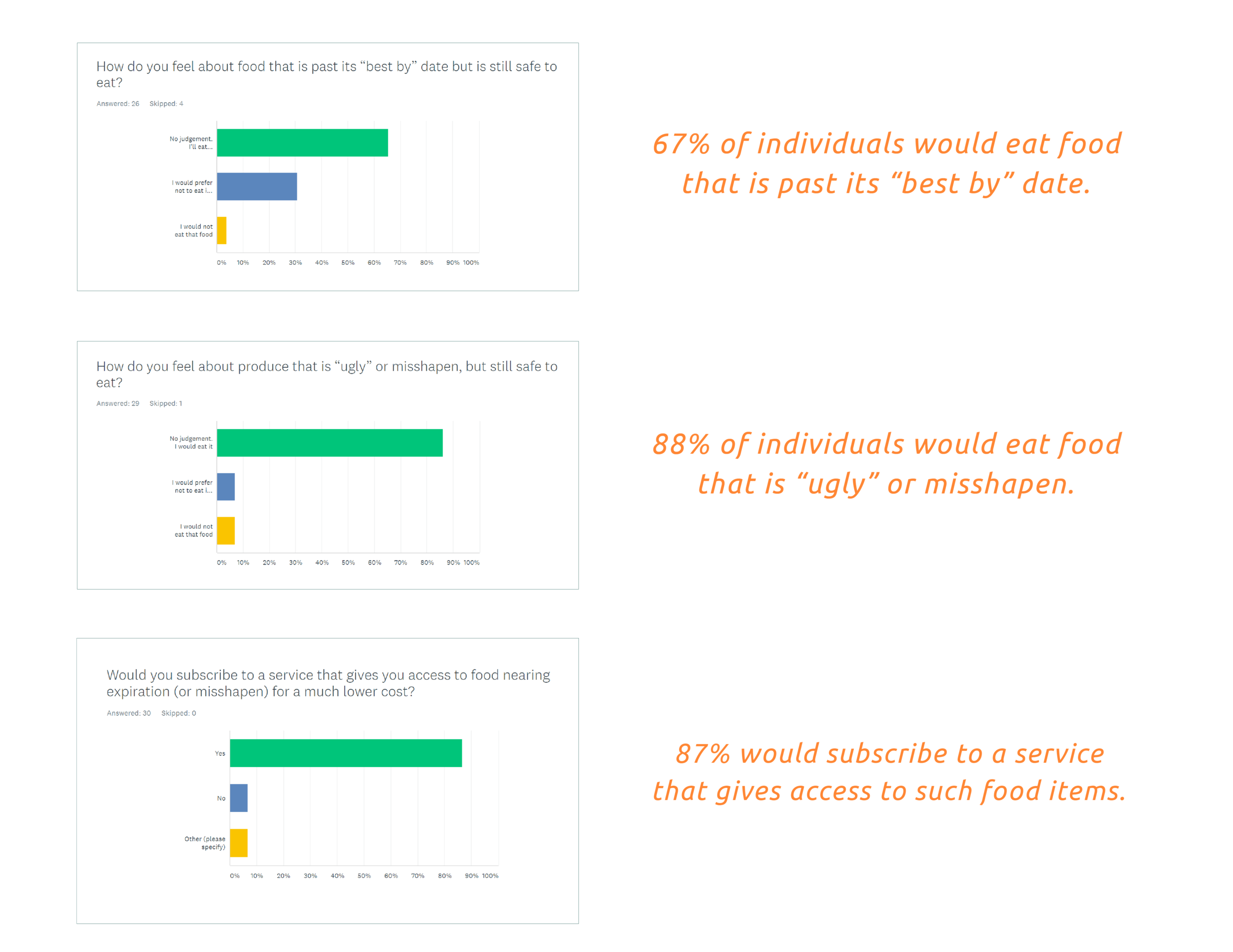
We designed a survey using Survey Monkey in which 30 individuals participated. The goal of the survey was to answer the question “How do people feel about imperfect food?” The following results were most significant for us.
Phase 2: Defining the Scope
Goal Assessment
Before sketching our ideas, we outline the Who/What/Where’s of our concept in order to narrow down our scope and prioritize our goals.
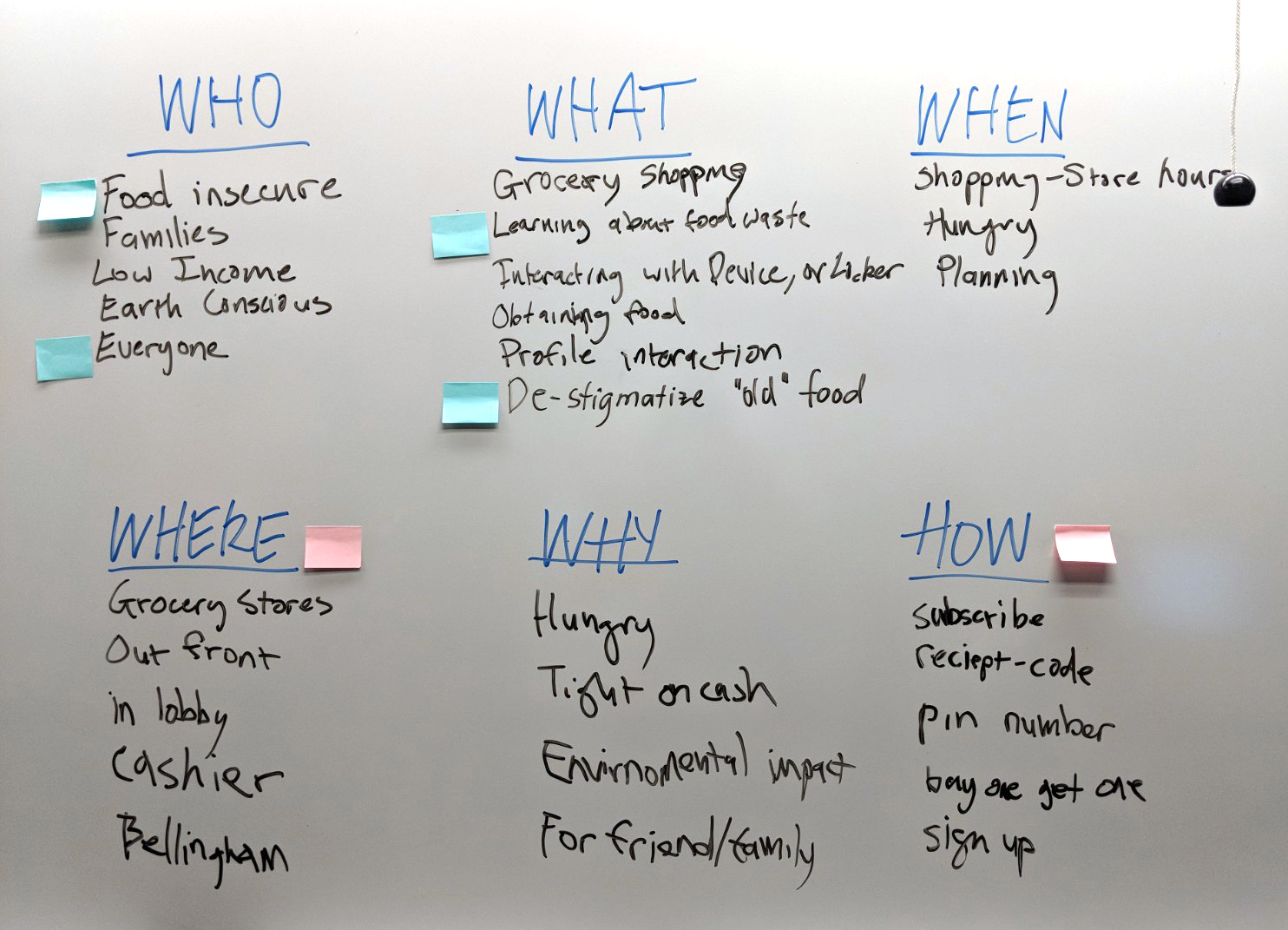
We prioritize the following aspects of our design:
WHO
Our audience does not want to feel like they are getting low-grade food.
WHERE
It is important that this service is located in a grocery store, it should conveniently fit into the shopping experience.
WHAT
The goal of the product is to educate its users of food waste and de-stigmatize "old" food.
HOW
This service will be new and unique, it should clearly and subtly tell the user what it is and how to interact with it.
Data
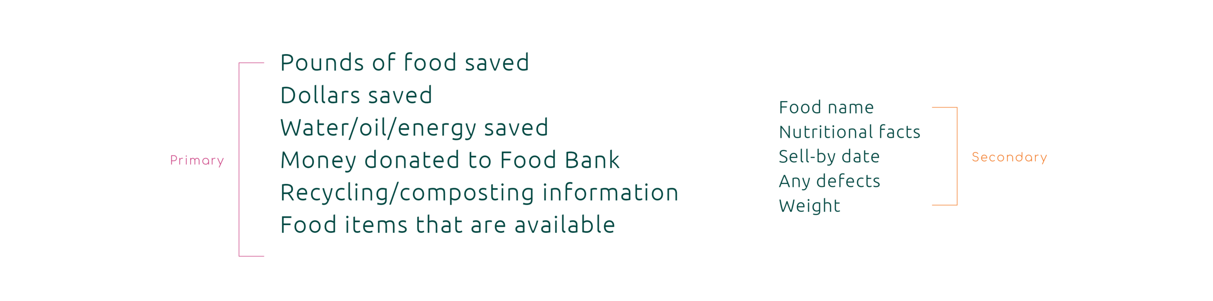
With our goal of educating the community in mind, we brainstorm a list of potential data points to use within our interface.
Product Goals
Make access to unsellable food more convenient.
End the cycle of food insecurity.
Remove the stigma behind food that is imperfect.
Educate people on the food waste problem.
Phase 3: Prototyping + Testing
Prototype 1: FoodLocker
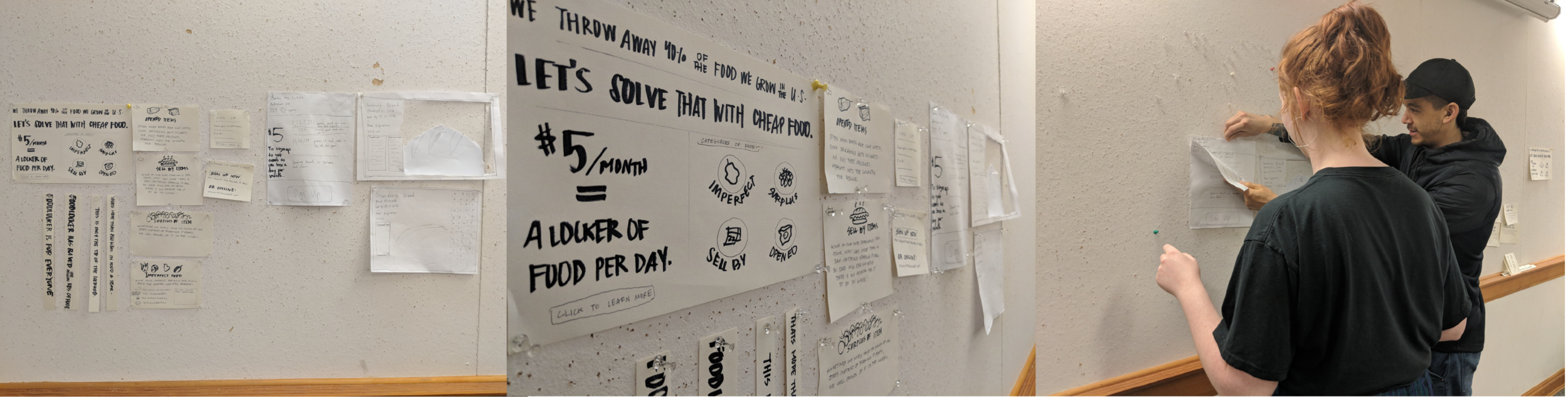
The service itself was exciting and interesting for people to use. Things that needed improvement:
It felt like there was a disconnect between the various screens that users had to interact with.
It was difficult to users to know where they should be focusing their attention.
The name "FoodLocker" came with the connotation that each person gets their own "locker." Also it sounds too much like Foot Locker.
The service needs to be more intuitive.
Prototype 2: TakeAway
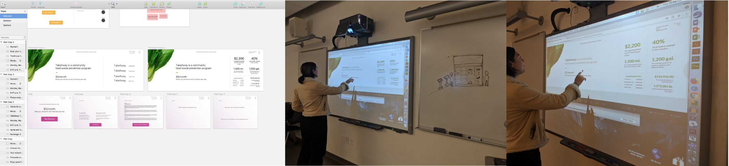
With a new name, we made a digital prototype using Sketch which users could test on a big screen via inVision. Our testers felt more comfortable in their understanding of the concept, but there was still room for improvement:
Needs some introduction to the icons on the big screen.
Adding more icons could streamline the learning process for how to use this service.
Some users were intimidated by the interaction with the food box itself, they wanted the steps to be broken down further.
Streamline the information on the big screen.
Phase 4: Moodboard + ICONOGRAPHY
Moodboard
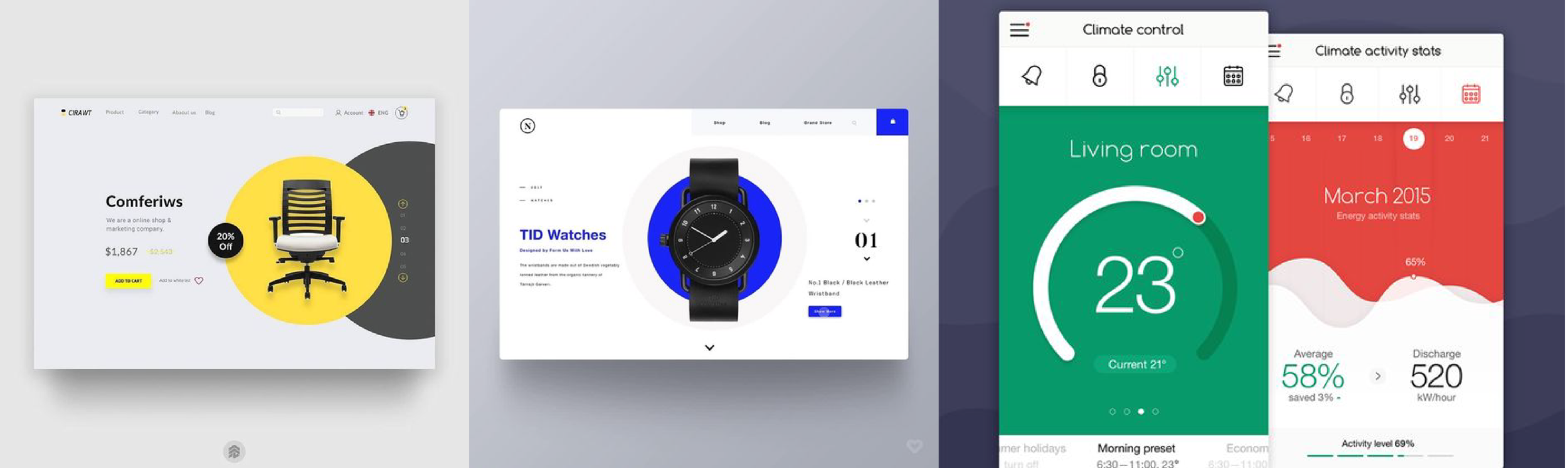
Users appreciated a clean, modern look to compliment its surroundings inside the grocery store. We compiled a moodboard that would lead us to designing an interface that was bright and inviting, but not too colorful that it would come off childish.
Iconography / Illustration
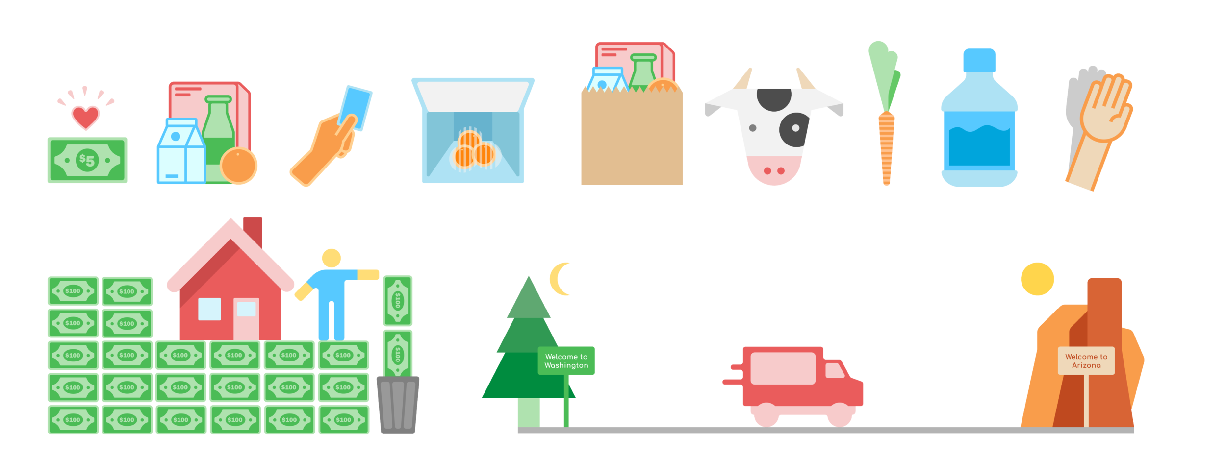
Using Adobe Illustrator I created a set of icons to use for our final UI. I drew colors from the original four icons that we created to represent the different categories of food.

Phase 5: The Final Product
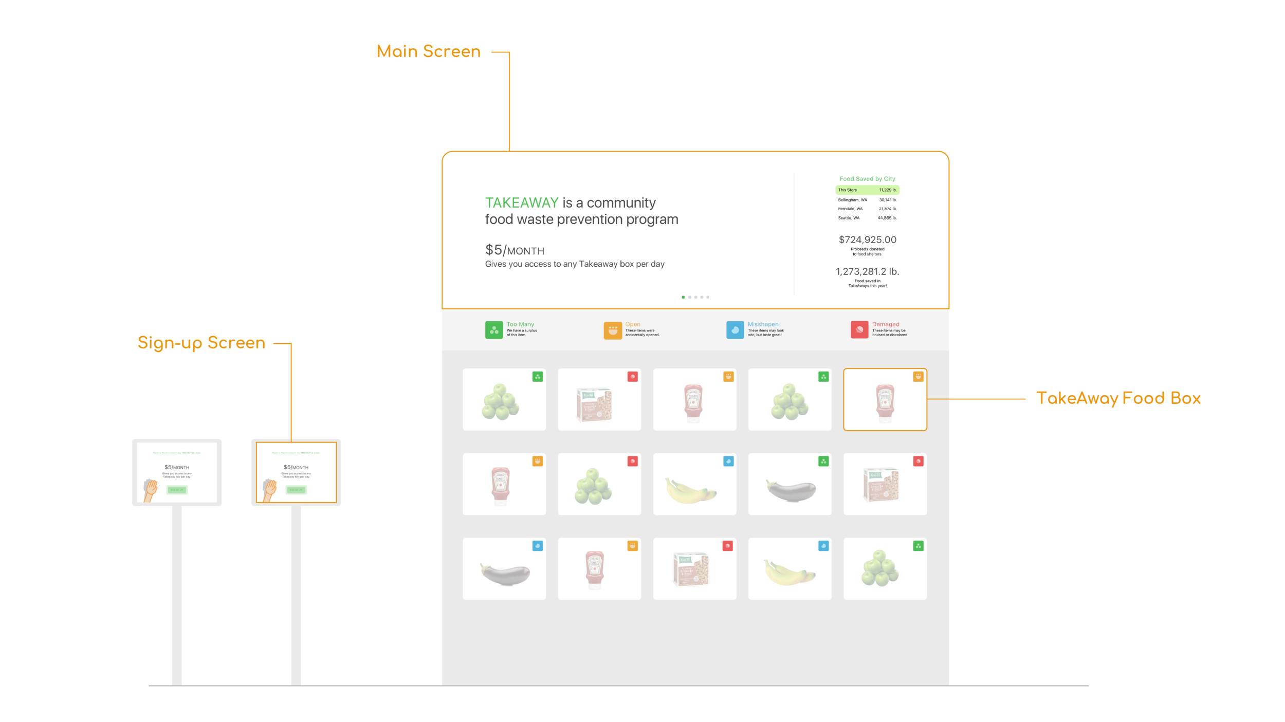
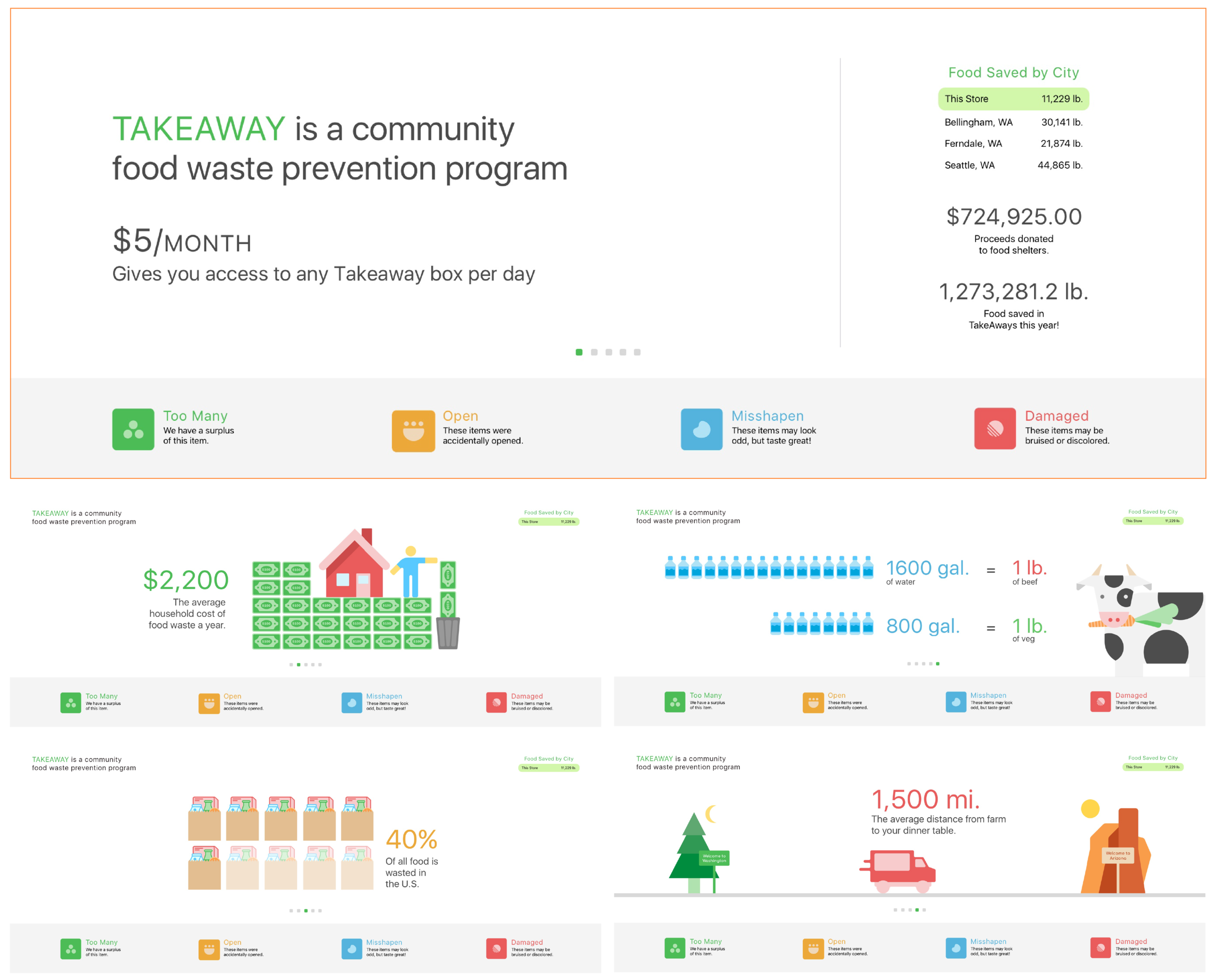
Main Screen
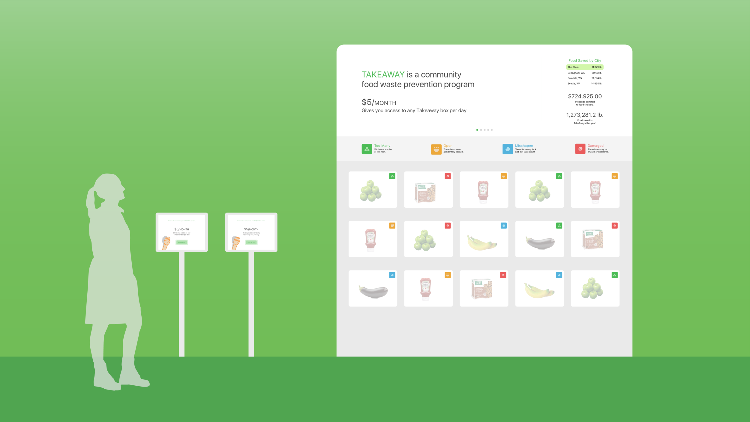
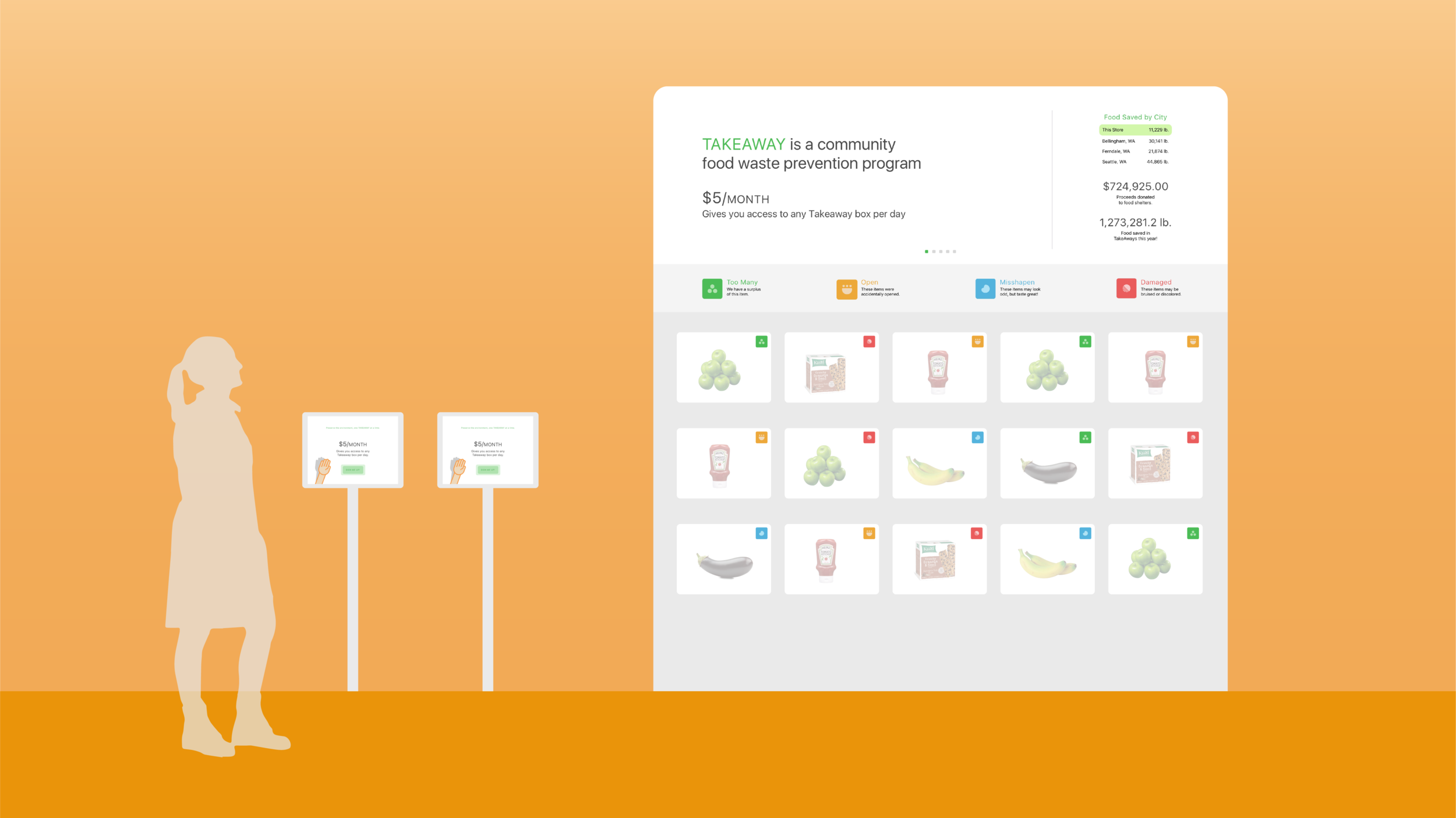
The purpose of our main screen is to draw customers in from a distance. As soon as TakeAway
catches their eye, they can see exactly what it is and what it will cost them. Our data sets are
displayed in a way that is interesting and easy to understand. The graphics support our statistics and make users feel good about the difference they’re making.
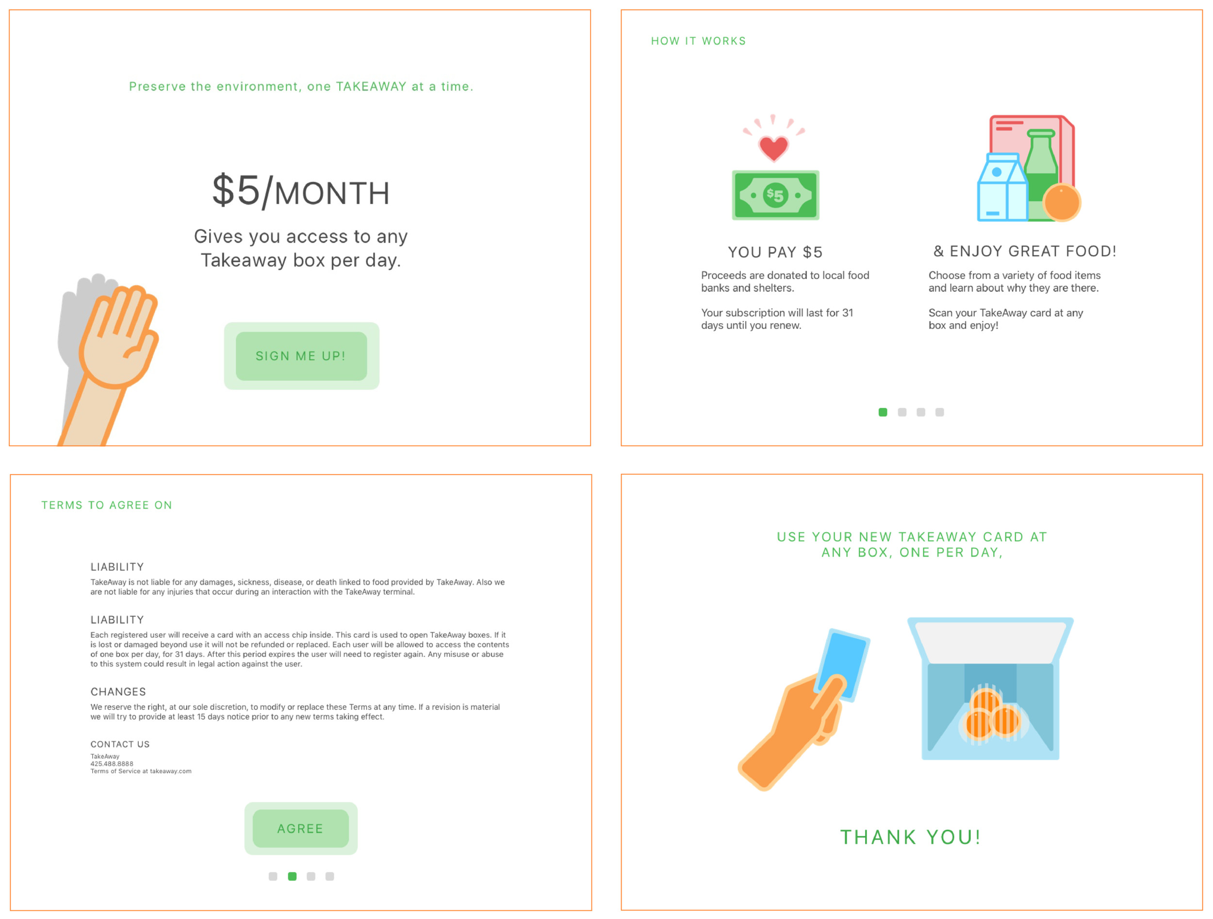
Sign-up Screen
The set-up process should be quick and simple. We designed the onboarding screens to be minimal in content, with graphics doing most of the work. The focus of this flow is to introduce people to how simple it can be to make a difference in their community by using TakeAway. We made sure to condense the Terms of Use to something people would not be intimidated by, while leaving them the option to view a full version.
Food Box
We wanted to keep the aesthetic consistent as we translated our design to the food boxes. The
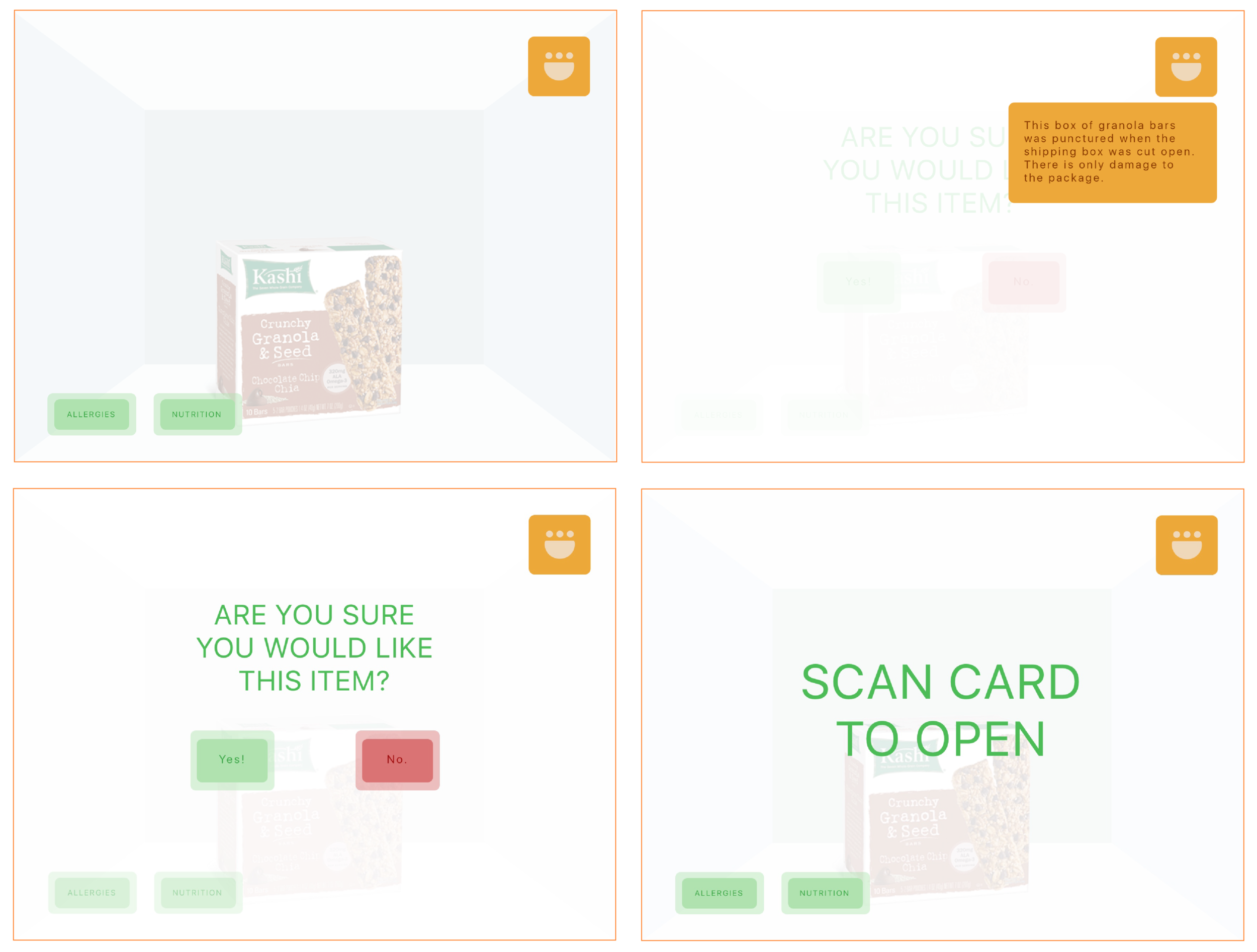
display is simplified to help make this new interaction a smooth experience. Users have a handful of options: buy the food, read about allergies, nutrition facts, and learn about why the food item is in there according to the icon that is on the screen. By scanning their TakeAway card, users can confirm access to the box and take the food items home with them.